Showing posts with label Alison Harre. Show all posts

Tuesday, April 26, 2011

Milk Product- Alison Harre


Alison Harre

Rao, Skinner

Aesthetics and Design

26 April 2011

Pure Nutrition

The proposal for the final project was to market and design a brand of milk for the company Moo-Moo Milk Makers. This milk isn’t any ordinary milk. It is milk that is organic, contains more calcium, vitamin D, and zinc, and is only 100 calories. Given this information each candidate had to come up with a product that fit those requirements. The objective was to create this healthy product for men and women who are older than the age of 45. After brainstorming about many ideas, the product soon began to fall into place.

After doing market research on the given age rage, I generalized this target market as the baby boomers. This is a group of people that were primarily born post World War II. Given this information about this group of people, a marketer can assume character traits about the baby boomers. Typically baby boomers like tradition and tend to dwell on the simplicity of the olden days. They tend to stay away from new, confusing, and advanced technology, but rather like classic, quality, and simple products. In addition, most baby boomers are at or approaching retirement. This is relevant because it means that this target market has more discretionary income and is willing to spend that money on premium products such as Pure Nutrition.

Pure Nutrition is a product and service company. Pure Nutrition sells its milk in stores and also delivers to households. When brainstorming ideas for this product relating to the target market, the first thing that came to mind was milk delivery. In St. Louis, which is where I am from, Oberwies has a very popular milk delivery business. This reason is the main reason why I wanted to create a competitor for Oberweis. In a way, milk delivery takes many people back to the basics of the 50’s and 60’s. Milk delivery is a premium and quality service that this target market’s age range is accustomed to.

Pure Nutrition will only be served in a glass bottle. This is because glass is the only material that milk tastes the best in. In addition, glass is considered valuable, high-priced, and a premium especially when compared to plastic. Glass is also classic and appropriate for the target market. The most important factor when choosing glass is the fact that it’s durable, recyclable, and economically friendly. The packaging will consist of a 20-ounce bottle and a gallon bottle. The arrangements for sales will be purchasing a 20-ounce bottle from the store, purchasing a gallon from the store or delivery, and a 4-pack of 20-ounce bottles (equivalent to half gallon) that can be delivered or purchased.

When creating the label I wanted something that was simple and seamless, especially excluding any crazy fonts. I researched a lot of 50’s ad campaigns to see if there was a reoccurring theme in any of the campaigns. One that I noticed was the use of classic colors such as red, yellow, blue, black, and white, which I incorporated into my label. I had a lot of difficulty when trying to choose a benefit that I felt was the most important. I thought that all of the benefits of this milk was important, which is why I incorporated them all.

I really enjoyed doing this project. Since I am interested in becoming a marketing major I really wanted to put a lot of effort into this project. I have never had the opportunity to come up with a product and market it on my own, since I have typically worked in groups for this type of project. I wanted to take full advantage of my creativity to see where it could potentially take me. I think that Pure Nutrition offers this target market a healthy and premium product that they are surely to purchase and become loyal customers of.

Stay strong. Keep living. Pure Nutrition.

Monday, April 25, 2011

Art Show Reflection- Alison Harre

WOW! The art show was so great, I even went twice! The first time I went by myself and I was looking at a lot of the artwork to see if I knew any of the artists. I thought it was really exciting to recognize the different people and their creations, especially if it was someone I knew. The second time I went with another person and I really started to pay close attention to the art work itself, regardless of the artist. There were so many different kinds of work at the art show, but I did like how all of the classes were grouped together so you could figure out some kind of theme for that overall class. I never knew that there were so many talented artists at Butler!

Probably one of my favorite pieces was the candy that looked like stained glass. I remember the first time I saw it I thought that it was just stained glass, which is one of my favorite styles of art. As a kid, my mom would always take me to glass sales and glass blowing shows. I always thought those types of creations were so original, colorful, and intricate. This persons creation sparked all of those qualities when I first saw it. Since I restrained myself from touching the artwork, I'm not sure if it was actually candy or if that was just the name. I would most definitely pay $10 for this artwork, probably more. That type of glass work is very difficult to learn how to do and create. This type of art work is timeless. It can be used in a window or as a picture; the possibilities are endless.

It was really weird to have my art work displayed. I have been in many art classes before in high school, but when they were displayed no one really noticed them. The art work was simply put throughout the hallways and no one really noticed them. In this case, there was an entire preview of all of the artwork throughout Butler! When I was walking around the Art Show friends that I knew would ask me why I was in there, or if I had any art work. It was a different feeling when I had to point out my artwork when I was so used to not having any one pay attention to mine. Overall, my friends were very impressed by my art work, and the meanings behind my work. I felt like my art was in an actual museum for everyone to see. It actually felt pretty special, even though my first reaction was weird, but that is just because of the unfamiliarity.

Tuesday, April 12, 2011

Sculptural Art Project- Ali Harre


My groups topic was "twist." When contemplating twist I continued to think about the motion that everyone makes when they attempt to describe the motion of twist. Typically when you think of twist, cardboard doesn't come into mind, but I guess you have to work with what you have. I couldn't think of many actual objects that twist in the world besides a spiral staircase so I was left to come up with objects that might make a twisting motion. I started creating a twist like object with parallelogram-shaped cardboard pieces. I was layering them on top of one another making it into a twisting circle. This lead me to the idea of making a graduation hat. Typically graduation hats aren't twisted when you look at them, but the best part of any graduating ceremony is the hat toss. Graduation hats all twist when you throw them in the air. I captured this motion my making the base (the part that goes on top of your head) into a twist to represent the motion of the hat moving through the air. Once the idea came into mind it wasn't very difficult to arrive at the ending product. I think I took a very creative and unexpected approach to the project. Congrats!

Wednesday, March 30, 2011

Alison Harre- Comic Strip Story

It was the Sadie Hawkins dance, when the girls ask the boys. I have been crushing on Ben and wanted to ask him. I finally asked him and he said "if he got done working out in time." Instead I asked my back up crush, just to make him jealous.

Thursday, March 24, 2011

Silhouette Portrait- Alison Harre

Silhouette Project

There were many factors that came into play when I was making my silhouette. First of all, my great grandmother has a lot of silhouettes around the house of all the kids in the family. I have always thought that the simplicity of silhouettes is beautiful. The black and the white contrast each other and create a piece of art. Since I thought the originality of silhouettes are so beautiful, I wanted to keep that in my own silhouette.

I knew that I wanted to make the figure more internal and have it reflect my personality. I also wanted to make the ground reflect external things that I like to surround myself with. The figure is covered in black, which symbolizes power, which is reflected in my leadership skills. If there is an overwhelming amount of black, it can result in overwhelming emotions. This represents me because I am always overwhelmed and stressed out. I have a lot of commitments, which result in an overwhelming lifestyle. I am wearing a pair of sunglasses in my silhouette, which are gold. Gold represents optimism and happiness. The reason why there is such little gold is because I am not a very optimistic person, but I am to an extent. I always seem to prepare myself for the worst in situations. I do not think that being pessimistic is a good thing, which is why the sunglasses hide it. In fashion, red is used for making statements, or to set you apart from the crowd. The red lips that I used in my silhouette are meant to represent my bold side. I like to show the unique qualities that I have and what sets me apart from others.

The ground of the silhouette is made of comic strips from the newspaper. There are many reasons why I chose the comic section of the newspaper to represent what I like to surround myself with. Since comic strips contain many different colors I wanted that to represent the diverse people that I like to surround myself with. There are many different types of people that I am friend’s with, which is displayed in the diverse colors. In addition, I wanted the comic section to show that I like to surround myself with happiness and humor. I love to be around people that can make me laugh, it helps me keep my stress under control.

Friday, March 4, 2011

Fashion/Color Reflection- Ali Harre


1. I was in a group with Mark and Kathryn. All three of us had very different senses of styles, but we did have a lot of the same colors in common. Kathryn said that she really liked wearing laid back clothes, but also didn't mind getting dolled up. Mark said he liked dressing nice, and presenting himself, but didn't necessarily want to stand out with bright, bold colors. The majority of us really liked neutral colors, including black, white, and grey. All of us also seemed to prefer to look put together, instead of a mismatch of clothes that made you look like you just rolled out of bed. I definitely cared a lot more about putting myself together than the other people in my group. I usually decided on what to wear the night before, and my dress for the day was usually based on what I wore the day before, or based on the activities planned for the day.

2. The line of clothing that Mr. Lauren will be making for me is called "Tailored chic." I called it this because I like to look really nice and wear a lot of tailored clothes, but like to add movement with a ruffly top, or another statement piece. I naturally tend to wear a lot of neutrals because I don't think I can pull of really bring and bold colors. The colors that I chose to be are black, navy, and neutrals such as creams or tans. People that would typically buy my line of clothing are people that like to dress business casual, or like to look nice every day. I think that it is very important to present yourself in a good way to others that you meet. The picture of the boots that I posted are the boots that I usually wear every day. They are very comfortable, a neutral tan color, and they are sleek. I can either dress them up, or I can wear them with a more laid back outfit. These boots, or a similar looking pair, would definitely be in my collection.

3. Seven years from now, I hope to be working as a product developer for a marketing department. In the work environment I like to be very conservative and wear business skirts (appropriate length), or trousers with either a playful top or a more professional button up shirt. If the business meeting or client meeting was more professional, I would consider wearing a blazer. Typically for play in the winter I usually wear boots and leggings with a dress, or skinny jeans and a top. In the summer, I love to wear sun dresses or skirts.

Monday, February 28, 2011

Public Art Project- Lauren, Ali, and Kaylin


Lauren Bacon, Ali Harre, Kaylin Beckwith

PCA 261

Skinner & Rao

Public Art Project

Haphazard Hallway

The first day brainstorming for our public art proposal, the three of us agreed on four main criteria: the project needs to be huge, related to Butler, interactive, and playful. We also loved the idea of making it tantalizing, similar to the piece we saw in the atrium of the IMA. Additionally, we wanted to create something that goes against basic rules of social norms, instilling a “stick in to The Man” mantra.

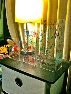
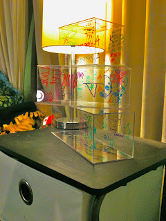
After creating and a list of a variety of ideas, we elected to make the idea of converting the catwalks that connect Jordan Hall, Gallahue Hall, and the pharmacy building from their current materials to glass. On each end of the catwalk there will be baskets that hold a wide variety of colored dry erase markers. Students, teachers, staff, and anyone else who walks through these catwalks has the opportunity to draw directly on the walls. This goes against what we are taught as children—no writing on the walls—adding an interactive aspect to the project. Moreover, these can be used for student art and also classroom interaction. Classes will have the choice to use the catwalks as white boards rather than being in a conventional classroom setting. This class interaction helps relate the project to Butler. Another way this project will be related to Butler is that any student organization can publicize their events on the glass walls. Also, the project is very playful—not only because anyone can partake in the artwork, but also because of its juxtaposed position on campus. It connects old, antique-looking buildings with a modern, not standard idea.

After creating our idea and developing the concept, we began brainstorming a name. Because the nature of the project is to be random and does not require any organization, we chose “Haphazard Hallway.” This suggests a crazy, random passageway, and also piques interest. Moreover, there will be no rules related to the project, so anyone can erase or write over someone else’s artwork.

Overall, we are very excited about Haphazard Hallway. We love the idea of going against social norms and interrupting a traditional aesthetic with a modern twist. Additionally, Haphazard Hallway incorporates our criteria of being playful, huge, related to Butler and interactive. Most importantly, we love the ability of involvement by any individual, bringing the opportunity to express oneself directly to the individual.

Friday, February 25, 2011

Alison Harre- Public Art Project Reflection

1. Although I did not see any of the pitches in class, after reading and seeing all of the proposed Art Projects I decided that if I were going to chose one of the following pieces to invest in, it would be Blue Buried Treasure. I chose this one because it stood out to me. It seemed the most interactive, which was one of my groups top values. I also felt like it was an original idea and it would be really fun for incoming students to use a treasure map and find them all.
2. I definitely think that the idea for the Jungle Jim in front of the HRC would cost the most due to the huge treadmill-like machine needed to make it.
3. Since I have not given my Public Art pitch yet, I can't accurately answer this question, but in almost every case, practice makes perfect, so I would probably take the opportunity to revise it just to make the project that I will present on Tuesday even better.

Wednesday, January 26, 2011

Alison Harre- Paper Value Project

To increase the value of this sheet of paper I printed my resume on it. I think that I added many different types of value to this sheet of paper. First of all, I added a personal value to the paper. The experiences that I list on my resume I chose for a reason. The experiences were important enough to me that I would want to share them with a future employer. I added a professional value as well as an occupational value. This is because my resume holds my future. My resume sells who I am and is a main keystone in the pursuit of my future. Also I think I added an adaptable value because my resume will be continuously changing. As I proceed through my college years I will collect more experiences that I think are important and will add them to my resume. A resume might seem very simple, but the value that can be added to it surpasses simplicity.