Showing posts with label Carly Sobolewski. Show all posts

Sunday, April 24, 2011

Milk Project- Carly Sobolewski


The brand that I would present to the Moo Moo Milk Makers would be called, "Fresh Acres Dairy Farm." The product is targeted specifically towards adults over the age of forty-five. Because of the target market I wanted to give it a nostalgic feeling. I did this by using a classic container made of glass that includes features such as a sturdy handle and an imprint on the ridge to mess-free pouring. The style of the glass is supposed to evoke memories from the past of the fresh, cold, milk delivered daily by the friendly neighborhood milkman. Even though the bottle is vintage the font and design are more modern but not too "out-there." The glass is clear so the customer will be able to see the actual product in the container. I think that is important that consumers are aware of it's condition based on sight. Also the bottles are environmentally friendly and can be recycled or refilled. The brand name is "Fresh Acres Dairy Farm," to emphasize that it is organic and produced by a farmer that treats his/her cows humanely and does not use any harmful chemicals or antibiotics. The name gives it the feeling of being natural and full of nutrients. I decided to include "Dairy Farm" to let the consumer know that the producers specialize in dairy and put all of their effort into making one high-quality product. The fact that it is 100% organic is displayed on the majority of the container. Emblems display the organic logo and on the bottom the customer can find out exactly where the milk was produced. Instead of having random black spots the cow on the bottom has one colored spot that resembles the country in which it was made. Also the manufacturing information is on the bottom. Another way that the design assures the customer that the milk is farm fresh are the earthly sprouts that surround the nutrition label/ingredients. On one of the four faces of the bottle is the type of milk displayed in a giant font and of a specific color. The model presented above is skim milk and the color theme is light blue. Other types are 1% milk which would have the word "one" enlarged on the side in a corral color and 2% milk which is like the others but orange. This way customers can associate the colors with the type of milk they usually buy ("honey, just get the blue one"). The enlarged font was chosen so that people over the age of 45 won't have a problem spotting it and reading the text. Along the bottom is the slogan which says, "Udderly Nutritious, Delicious, and Fresh,"(Get it?...Udderly). On the bottom is also states that Fresh Acres Dairy Farm milk is the most recommended product by doctors who specialize in preventing and treating osteoporosis and bone health. Nutritionally the milk is exceptional. It provides the daily recommendation of zinc, calcium, and Vitamin D along with additional nutrients such as proteins and carbs. Did I mention that one serving is only 100 calories!? It's true! You can get all the health benefits without worrying about other health problems such as unwanted weight gain. By drinking Fresh Acres it will keep you healthier which can contribute to being more energized, looking younger, and feeling satisfied. The product can appeal to any age group but I think it targeted more toward adults. Who says that people over 45 have to buy dull looking milk products. They can appreciate the design as much as anyone else. The product also comes with clever phrases that act as incentives to get the buyer to pour a glass of milk. As the amount of milk is lowered little cartoons of cows are revealed. At each level is an encouraging or clever phrase (ex: "Own that Milk Mustache!" "You have bones of Steel!" "mmm, Almost Done!" and "Looks like it's time to get MOO-re Milk." Kids and adults alike will be amused and each month the phrases will change. Sometimes they will be witty statements, sometimes quotes, sometimes facts about the product, and many other creative motives. Finally as you can see on the front panel of the milk that displays the brand name there is a logo. The logo is a cow head but I thought it would be cool to only put the black parts of the cow on the bottle so that when it is full of milk the lines would be implied. Without any actual lines and the complete image still appears. When empty it will just look like black spots. Thanks for considering my product pitch!


Friday, April 22, 2011

Art Show- Carly Sobolewski

I was excited to go to the art show because one of my favorite things to do is to find inspiration from others' creative ideas. I was there for close to an hour reading all the explanations and looking at the pieces displayed and wish I could have stayed longer. I love that it was student work, and particularly students from Butler because I could in some cases, look at their art and learn more about that person and what they value. I also think it was really cool how many different methods and materials were showcased. Pretty much all aspects of art were covered (photography, sewing, painting, drawing, sculpture, posters/graphics, etc.). I really liked the massive stuffed animals and might pay ten dollars for one. However the work that I would definitely consider paying ten dollars for would be any of the pieces by Laura Kramer. I found her cut-out magazine designs with the black backgrounds to be really pretty and something that I could see myself hanging in my room. She used materials that she'd stashed away from the past and that meant something to her. I just thought it was a really cool concept and it's one of those works that make me think, "I wanna try that." I thought the how-to books were really well made and comical as well. Having my artwork in the show made me feel proud and honored. I usually keep my art to myself and don't openly display it but this opportunity made me feel like I could really show people what I could do. I felt like my pieces held their own among the others and I'm glad that others may have been inspired by them. As for Butler having an art show I think it is a fantastic event that should be an annual occurrence forever. There are so many creative students. I see art as something that anyone can have fun doing and learn from, even if art is not their major or even a hobby. The show is something that anyone can appreciate and find something to relate to. I believe that event is one that will grow over the years and just become greater and greater. No two shows will ever be the same because no two people think alike, express themselves in the same ways, or have lived through the same experiences.

Monday, April 11, 2011

Sculpture- Carly Sobolewski

I was assigned the word droop. Honestly, I had a really hard time thinking of ways that I could manipulate the cardboard and make a sculpture that looked limp but still well-put together. Some of the first ideas that came to mind when I thought about the word droop were: a bulldog's face, a dog with long ears, a puppet, and a chandelier. I went against all of those and decided to make a vase of flowers with a few flowers slumped over the edge. When I hear the word droopy, I envision something that is wilting or aging. I associate droop with something that lacks structure. The petals that have fallen at the bottom are a sign of the slow decline in the life of the plant; a natural process of life.

Wednesday, March 30, 2011

Carly Sobolewski- Comic Strip Story

Bobby Fong was an adventurous and smart little fellow. A raccoon was lost and couldn’t find a home. Bobby decided to teach the animal to live in a tree. His friend was confused. Forty years later his ingenious idea led him to become the President of Butler University.

Wednesday, March 23, 2011

Silhouette Portrait- Carly Sobolewski


I titled my silhouette portrait; She Sees Beauty (Never in Herself). I knew from the start that the colors I wanted to feature were black and gray, but I also wanted to incorporate some source of vibrant color. I really wanted to push myself as well as my comfort zone by making a piece that is personal as well as something that expresses the emotions and struggles I deal with on a daily basis

I decided to trace my silhouette twice and make it look like the figures were facing one another and interacting. The black figure is supposed to appear as a reflection in the mirror. The pointed finger suggests that orders are being given or that the other figure is being told to remain silent (“shhh”). The silhouette in black represents the recurring, negative thoughts and personal enemy that I fight each day in regard to my body image/appearance. I chose the color black because for me it resonates feelings of power, strength, grief, and fear. Every time I catch a glance of myself in a reflective surface whether it be a mirror or not, destructive thoughts come racing into my head. My mind begins to over-think, ridicule, and pick-apart every perceived flaw. The act of looking at myself in a mirror is a scary thing that I tend to avoid but am working on ways to overcome the struggle and cope in more constructive ways.

The gray silhouette surrounded by colorful flowers is positioned with its’ head downward in order to suggest shame, doubt, weakness, and vulnerability. These are the emotions that I deal with because of negative body image. I chose to use the color gray because when I see gray I get a sense of emptiness, a bit of sadness, insecurity, and isolation. The gray is cut into rectangular, bar-like strips to symbolize prison bars. At times I feel so stuck and caught up in the thoughts and effort to be “perfect” that I can feel restrained and isolated. It is like the figure in the mirror, my own reflection, is bullying me to the point that I start to believe that what it’s saying is true. I wanted the gray figure to look vague and blurred among the flowers to represent that my identity is not clear and it sort of fades into the background. The vibrant flowers of pink, red, blue, yellow, and purple are all happy colors that make me smile. Even though I battle with myself everyday, I am capable of seeing beauty and positivity in EVERYTHING else around me (people, places, animals, nature, actions, relationships words, etc.) My surroundings are full of liveliness, opportunity, and beauty.

All of the shapes I used (squares, triangles, circles, and rectangles) are geometric. I am a person who is more comfortable when things are in order and predictable. I tend to be less spontaneous and have always been a huge perfectionist so for me geometric figures represent control.
The title of my artwork, She Sees Beauty (Never in Herself), was inspired by what I learned while doing this project and hints at what the intended meaning of the piece is. When looking in the mirror I may not see beauty in myself but I am able to see the splendor and beauty around me and that gives me hope! This project allowed me to express struggle in my life without using words, only colors and shape. It made me aware of how I see myself and inspired me to think about what I want to see change in the future.

Saturday, March 5, 2011

Carly Sobolewski- Fashion/Color Reflection

1.) During the discussion with William and Nicole I realized that each of us has a unique sense of style but also that there are similarities in the reasons for why we dress certain ways. We talked about how we dress differently depending on the situation, location, and our peers. We all agreed that as college students we should try to look more put together but also make sure that we have more comfortable clothes for outside of school and work. We all tend to shop at places with reasonable prices. Compared to Nicole and William my style was a little more casual and easy to move in because I am very active.
2.) My clothing line that I would present to Mr. Lament would be called, "Go with the Flow, " because comfort is one of my top priorities and I am always on the move so I need clothes that are flowy (I think I just made that word up!) and light. The colors that would be in the line would be mostly neutral colors (gray, navy, off-white, black, beige) because those are the colors I am usually drawn to when shopping and they can be incorporated into lots of outfits. The line would be chic and versatile. The pieces would be ones that are comfortable enough to hang out in but also could be dressed up for work situations and events. College students would likely buy the clothes. They are casual but still make you feel and look like an effort was made. Various pieces similar to the laced razorback tank pictured above would be in the collection.
3.) In the future I will hopefully be working in a rehabilitation center or independently employed as an art therapist. My typical work outfit would be chic and put together but something that I am not too afraid to get messy. Maybe a cute skirt or nice jeans and a top that complements the outfit. I believe that you'll probably see my in an apron frequently depending on the project being made. Outside of work I would wear cute tees and jeans depending on the activities and my mood for that particular day.

Wednesday, February 23, 2011

Public Art Pitch Reflection- Carly Sobolewski

1.) I really enjoyed listening to each presentation and thought all the projects were creative but if I had to pick one to help fund it would be the Butler Bubble Wand. This group's piece really stood out from the rest. It is more conceptual than all of the others and it seemed like they put alot of thought into it. The simplicity of the wand makes it beautiful and harder to interpret by prospective students and visitors. I like the idea that the true meaning intended by the group would be a little secret we have here at Butler and it would also be a daily reminder of our close community.

2.) Personally I think that the Jungle Jim idea would be the most financially demanding. The size of both the monkey bar man and the track would require a large amount of work, time and money to build. Also because it is seasonal it would need more maintenance and repair work if broken. However, as a runner I do like the idea of an outdoor treadmill because staring at a wall while running inside is extremely obnoxious!

3.) Overall I think our presentation went well. We met beforehand and practiced what we were going to say more than once. I think the flow of speech could have been a little better but I'm very proud of Caroline and Radha for working so hard. Also we didn't remember to point out that we had our models set out on our table. I think the best part of our presentation was the video just because it was unexpected, short, and sweet. We had alot of fun with this project.

Monday, February 21, 2011

Public Art Project


Radha Patel, Carly Sobolewski, Caroline Hedrick

PCA Public Art Project

The Butler Planner

At first when we were told we have to come up with an idea or plan about public art we can put on out beautiful Butler campus, we had no idea what to do. Caroline started it off by giving an idea of putting a big diploma or graduation hat on campus in which people could study or just “hang out.” Later, we came up with an idea of building a gigantic basketball with a graduation hat on it signifying how important basketball is to Butler as well as academics. The big basketball would have a couple basketball courts inside of it and it would have a wall of fame showing the history of Butler’s men and women’s basketball team. Another idea we came up with was making a big sculpture of a paintbrush that would be leaning against Lily Hall (the building). There would be a pallet on top if the paintbrush located above the roof and there would be tables on this pallet shaped as different colors of paint. On a nice sunny day students would be able to study up there and see Butler’s campus. In the end we decided none of these ideas were extremely appealing because we wanted to come up with something all Butler students would find somewhat useful and is also artistic.

We set out four different criteria for out public art project. The criteria are site specificity, how interactive it is, whether it holds significance to Butler, and how functional it is. As we were going through out list of projects and seeing how the criteria worked with them, we started talking about how we never know what is going on throughout the week and weekend because we either skip over the emails we receive or we do not know because we didn’t notice the banners around campus. We decided there should be some way students can see what is happening on campus; therefore we decided to make the “Butler Planner.” It would be located on the open space between Atherton Union and Jordan Hall, right in front of Starbucks. We chose this area because many people pass this location throughout their day and it is not far from the main buildings on campus. Students could just stop by the “Butler Planner” for a moment and see what is happening on campus.

The “Butler Planner” would have each day of the week on it and under each day it would list the activities going on throughout the campus or even at Broad Ripple. The board would light up once it gets dark. The screen would be black with white lettering and at night the outline of the planner would light up neon blue so it is easy to spot and visible. The Planner would be made out of fiberglass and the books would be made up of stone and painted with shiny paint to somewhat correspond to the fiberglass. The “Butler Planner” would look exactly like out real planner and would have the same design on the front of the cover. The books in the back of the Planner where we can sit and study would be different colors, which include green, purple, red and yellow. The green book has a saying that says “The Butler Way” and a map on it because it is leaning against the tier of books. This map would be useful for anyone who doesn’t know where everything is located on the campus. The other three books have words the Butler students either represent of strive to achieve: courage, respect and values. They are strong words and they would remind Butler student of what Butler University believes in. Also, throughout the lawn we have books that are propped open so students can sit and eat or read. These books would be different colors depending on what color fits best with its surroundings. We decided to add more to the books we could add bookmarks to the books where students can still sit and enjoy the sun and nice weather.

As a group, we loved this idea, which is why we were so passionate about it. We, as Butler students, would love something like this on campus. By working on this project, we accomplished our goal of making a public art display and making is useful to the Butler community. It fits all of our criteria pretty accurately and best of all, we loved this project and coming up with the idea. We actually had fun with this.

Wednesday, January 26, 2011

Carly Sobolewski- Paper Value Project


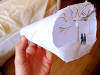
In my opinion I added artistic value to the sheet of paper by creating a tiny scene on one end. The process actually took awhile because the miniature cuts and proportions had to be so precise. The scene is of a girl and boy, or woman and man standing by a tree with a swing on what looks to be a fall or winter day. If you peek through the smaller end of the cylinder you can see the details in the cut-outs. The idea was inspired by something I used to do with my dad and sister when I was a kid. We would use cardboard or paper cut-outs to make shadows on the wall and tell stories or perform puppet shows. These memories from my childhood give it personal/sentimental value as well. The paper is no longer a flat sheet, instead it has begun to form and tell a story of its own.