Showing posts with label Kathryn Graham. Show all posts

Tuesday, April 26, 2011

Milk Project- Kathryn Graham


Upon being presented with a Request for Proposal to develop a brand name and packing for a new milk line from Melvin Meyers at Moo-Moo Milk Makers, I was shocked and horrified. I was unsure where to start, considering I HATE milk! Putting my feelings aside I jumped right in with researching the target market and found that the target market we are trying to reach are men and women over the age of forty-five. This target market tends to be conscious of their health when it comes to purchasing and consuming food and drink products. In order to meet the target consumer’s needs I wanted to let them know the product was both organic and had the recommended doses of Calcium, Vitamin D, and Zinc for their age group with out being offensive. To reach this goal I chose to simply provide the consumer with a small statement of the organic nature of the product on the front of the bottle along with a brief summary on the back of the bottle detailing the benefits of consuming this milk. The message on the back also allows the consumer to connect with the company’s goals for the product, producing a consumer/producer relationship. As for the design of the bottle I wanted to hold the milk, I chose to modernize the retro milk bottles from the 1960’s. By doing so I took a familiar and loved object from the target market's era and provide a loving memory of the past and fast forwarded it to the present for consumers allowing them to remember those good old days each and every time they purchase a bottle or drink from one. As for the material of the bottle I selected plastic instead of glass. I chose this because as people age they can become clumsier and more prone to dropping items. In this instance, there is no glass bottle to break and no potential harm to consumers from breaking glass. As for the logo and slogan I chose once again to appeal to the target market's childhood. The brand name I came up with is Dairy Delight, which gives the consumers a more positive experience when purchasing milk. When deciding on a logo for the product I wanted a retro milkman on the front in black and white. Having the image in black and white gives the bottle a more sophisticated feel along with appealing to the memory of the neighborhood milkman dropping off milk each day to your milk chute or back porch. The colors I would use in the designs across the bottle will be purple and black. It will give the packaging a classy, sophisticated feeling along with appeal to both genders. After researching some helpful information I found out that the color purple increases preference for a product as a woman ages and black appeals to both target markets. I feel by choosing these design details I developed a highly visible and sought after product that will be purchased by many in the target market.

Monday, April 25, 2011

Art Show - Kathryn Graham

The opportunity to visit the art show opened my mind up to new avenues
in art. From visiting I found I had a deeper appreciation and acceptance
for all forms of art. The show provided the opportunity for any observer
to connect with a piece of art. The diversity among the types of art was
instrumental in giving everyone this opportunity to connect with the
show in one way or another. It amazes me that such creative and
beautiful art is being made here within the dorms, Greek houses,
apartments and houses on the campus of Butler University. It shows that
no matter where you are or what you have, art can be created all around
you. The entire show over all was amazing. I loved seeing the different
artistic talents each individual possessed but also how it can all come
together in one place to show the beauty behind it. My favorite art
piece in the show was the one on secrets. The artist took words and
visuals and created a piece of art that is both bold and beautiful. A
deeper understanding and meaning can be found within the piece along
with a connection with the art on various other levels.

I would pay $10 dollars for any of the black and white photos. These photos
would be a wonderful addition anywhere in a house, dorm, or apartment.
The colors have such contrast that it allows for diversity in function
along with the beauty the black and white photos have. I was nervous
about having my work displayed in the art show. It should not have
mattered since it’s just like having your art displayed when you were in
elementary school but there was something different about the art show.
Anyone could see my work and critique it, say how awful it is, or
uncreative it is and that scares me. Having my work shown though did
make me proud and helped me see that I do have a little artistic flare
that I can show to others even though I’m not Picasso. By having a
student art show at Butler it provides an opportunity for artistic
students to show case their talents to fellow students. Also, it allows
students to appreciate the arts. But most importantly it recognizes the
new art program and what they have to offer students.

Monday, April 11, 2011

Sculpture- Kathryn Graham


My group was assigned the word "balance." I first started out by brainstorming ideas on what to sculpt relating to balance but had some difficulties doing so. Some of the few ideas I came up relating to balance were a balance beam, a yoga pose, a scale, and even the tight rope act in the circus. I did not go with any of those ideas but instead constructed a teeter- totter in which a box is placed on top of it, both relating to balance. When I hear the word balance or think about the word deeper, I realized everyone participates in some form of balance each day whether it be physically, mentally, or emotionally. Balance can relate to many aspects of life and a beautiful piece of art is one of those aspects.

Wednesday, March 30, 2011

Kathryn Graham ~ Comic Strip Story


Tony had a huge crush on Diana and asked her out. Diana said yes but secretly loved Jon. Jon found out. The next weekend they all went to the Jersey Shore. Diana decided to go out with both of them as long as she could bring her best friend Snooki.

Tuesday, March 22, 2011

Silhouette Project- Kathryn Graham


The silhouette project allowed me to learn many things about myself. Not only was I able to realize new aspects and facets about myself but also I was able to learn about my personal take on color and how that is reflected through my emotions.

When beginning this project I thought it would be easy to create a work of art that reflected my emotions through the use of color. That thought turned out to be completely wrong as I started and then continued to work on my piece. I began to critically think about the placement of colors, the shapes I would use, and the placement of the specific colors I choose. This obsession over such things began to reflect how much of a perfectionist I am along with having to be organized at all times. To reflect this feeling but at the same time trying to steer away from this I used geometric shapes for the ground of my piece and organic shapes for the figure of the piece. I choose to use geometric shapes for the ground to represent the organized perfectionist side of me that people can view from my outer being. My figure has organic shapes to portray all the thoughts and ideas jumbled inside my head and how internally I am not organized or perfect at all which my outward actions seem to portray.

As for the color in my piece, my figure consists of shades of blue, green, and pink. Each color was picked for a specific reason that I did not fully know the reason behind until my piece was completed. After researching each color I used I found out that blue represents the meanings of chastity, loyalty, fidelity, faith, modesty, and eternity. I can see myself in this color and shades thereof because I have always been loyal and modest and have faith in what I do and accomplish in life. I also used blue to signify calmness within all the craziness that goes on internally for me. Green has the meanings of love, joy, abundance, hope, gladness, and spring. All of these descriptors match me again as ideas or things that I enjoy, strive to obtain or be to others and myself. Pink stands for love, purity, kindness, energy, passion, power, and courage. My reasoning behind using pink did not match the definition I found for pink. I used to pink to symbolize the erratic thoughts, stress, and all the pent up craziness that I have inside me that people often do not see. As for using black and white for my ground it was based on the outer characteristics people possibly can see in me. Black has the meaning of independence, death, strength, protection, and mystery. I choose it based on how independent I am in my life, the strength to get me through the hardest of times I have, and the wall I put up to protect myself from getting hurt.

As for white it means light, goodness, innocence, and perfection. I used white to signify the perfection I seek in many aspects of my life along with the light I have about life. When looking at the use of all my colors together for the piece I chose them to signify that I am a colorful person in a black and white world while my inner identity is not always conveyed on the outside. No matter what my colors, though, I have to remember there is only one me!

Wednesday, March 9, 2011

Kathryn Graham- Fashion/Color Reflection


1) From the discussion our group had I was able to learn something new about people's fashion sense compared to mine. Along with being able to learn something new I was also able to connect with group members whose fashion taste was similar to mine. By having a male in the group I was also able to learn about fashion from the male point of view.
I learned that men do not like to stick out in a crowd based on their clothing. They like to dress in what they like and do not base clothing choices on what other males wear. Many often like to blend in and wear more earth tone to darker colors. Also, the male in our group liked to shop in more contemporary stores such as Gap or Pac Sun.
Female fashion sense on the other hand varied from the male fashion sense. Women want to look good and will take the time to get ready in the morning and select clothing to allow them to look put together. They tend to choose articles of clothing that are staples that can be translated into many different outfits. Colors of clothing tend to be neutral colors as well much like the male in our group.
My personal fashion sense differed from other group member's fashion sense in that I tend to dress more athletic than the others but when I do dress nice I love to dress in clothes that are contemporary and preppy. We do share similar taste though in color in that we all dress in neutral colors along with viewing our style as what we like and not what other people think. Finally, we all had a similar taste in clothing styles which would be classified as contemporary.
2) The line of clothing that I came up with for Mr. Laurent would be called C.A.S. This would stand for Classy, Athletic, and Sophisticated. I gave my line this name because it describes my style and my outlook on fashion and life. I believe this line would appeal to women between the ages of 20-30, who are working women but still like to get out and exercise when they have free time. The colors for the line include coral, white, and black because white and black are staple colors for any women with the addition of being the go to colors in times of fashion need while coral adds spunk and personality to any type of clothing. I would incorporate my favorite article of clothing into my line in a variation of the actual piece. The blazer could be made in all of the colors I chose which could be used for any season depending on the color you bought and would act as a staple in any woman's wardrobe but could also jazz up just a regular outfit.
3) Considering the field of work I am going into, elementary education, my clothing will differ from a business world look others would wear. In order to incorporate my fashion sense and style I would love to buy all my clothing from J. Crew. My work outfit would consist of a nice pair of khaki slacks with a fun white top that would be placed under a coral cardigan with beige or taupe heels and accented with a trendy necklace, bracelet or earrings depending on my mood (or activity in my classroom) for the day. My play outfit would be completely different from my work outfit. I would wear a Nike workout outfit, which would be consist of capris, a t-shirt, and a jacket with a pair of fun colored Nike sneakers in order to be comfy but still have the element of an active lifestyle I want to have. Of course I would also have to have my grocery outfit, shopping outfit, nightlife outfit, lounging outfit, etc., etc. considering that I love fashion and am an extremely successful Butler grad!


Thursday, February 24, 2011

Public Art Pitch- Reflection

1. If I were a Butler alum I would look to invest in the "Butler Bubble" wand. I would choose to invest my money in this particular project because of the greater meaning behind the piece of art. This piece of art would give meaning to past, present, and future Butler students and allow each generation to have a connection between one another. Not only does it connect the various generations but also it symbolizes a part of Butler no one but the Butler community understands drawing us together yet again. Also, it's a different type of artwork that would let your imagination ponder and develop an individual idea as to what the art symbolizes, the function of the piece, and the placement of the piece. This is why I would choose the "Butler Bubble."

2. The project that would require the most funding I believe would be the Jungle Jim. This project has many various aspects to it that I believe would contribute to a higher material cost. For example, they would have an industrial treadmill circling around Jim which has to be big enough to accommodate a large number of people. Something of this nature that has to be specifically made would elevate the price. Also, the cost of a three story climbing contraption would be greater due to insurance coverage needed because of the height of the statue on top of the moving of the treadmill. In the end, I believe all of their materials have higher cost compared to the other projects which seem use very basic inexpensive materials.

3. If we had the opportunity to be able to revise our pitch I would take the opportunity to do so. To revise the pitch I would incorporate a creative visual component that would illustrate the process of the creation of our public art piece. Also, I would incorporate more visual components to show the audience in order for them to gain a better understanding of the project. The final component that I would revise would be the delivery of the pitch. Finally, I feel that the pitch could be more creative, fun, and entertaining for the audience, getting them involved and really wanting to put this piece on campus.

Monday, February 21, 2011

Public Art Project


Jamie Kostecki, Kathryn Graham, and Katie Zeiger

Blue's Buried Treasures:

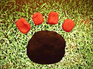
Public artwork provides an excuse for people to visit the site in which it’s displayed. It would only make sense to integrate public art into a college campus in order to motivate and draw people onto campus. That’s exactly what we’re attempting to accomplish with our five installations of artwork on Butler University’s campus that are site specific, useful, and entertaining. We call our project Blue’s Buried Treasures, and it consists of five partially buried objects that serve specific purposes and are quite large in size; we drew inspiration from Claes Oldenburg’s buried bicycle. The pieces include a rubber paw print, a graduation cap, a pencil, a bone, and a basketball. Each artwork is accompanied by a sign that contains a clue guiding the participant in a bit of a scavenger hunt around campus meant to show off some of its important sites.

The hunt begins with a giant paw print with a ten-foot diameter on the main Mall. We understand and acknowledge that many students utilize the Mall to play various sports or to do homework, so we envision the paw print being on the grassy area in front of the BU sign and behind the concrete Butler University sign. This ensures that it will not interfere with the many activities that the Mall plays host to, and it will even add to them. The paw print will be made up of the rubber material that many playgrounds utilize. The material looks like tiny cubes of blue rubber, but they’re all stuck together to provide a surface with great traction and durability. We figured that the Mall would be a great, central starting point for the “tour” of campus.

The sign on the Mall next to the paw print then leads partakers to the giant graduation cap located at the back of Irwin Library near the ResCo parking lot. The cap would be about ten feet tall and would provide comfortable shade for anyone interested in cooling off. This particular structure would be made out of black fiberglass, to ensure

durability, and the tassel would consist of rope strong enough to support 300 pounds. The tassel would serve as a helping hand for anyone who would want to climb on the structure. We placed the graduation cap near the library because students obviously have to put in a lot of time and effort into their school work in order to graduate, and many Butler students choose to study at Irwin Library.

After the library, visitors are guided to the grassy area in between the Pharmacy Building and Lilly Hall where a ten-foot-long bench lies in the form of a pencil.

The utility of this structure is obvious enough, and it would be a foot-and-a-half tall to insure accessibility for children. We picture the bench to be made up out of painted teak wood. We thought it’s important that visitors to campus see the academic buildings as well, and the pencil bench would lead them right past all of the main academic buildings. We associated a pencil with homework and academics, so it was only natural that this particular area would serve as the home for this structure.

The next site would be the Holcomb Gardens: quite the vision in itself! We thought that a partially buried bone that doubles as a slide would be a fun addition to this already playful

area. The Holcomb Gardens attracts a lot of families, and we thought it would be an excellent idea to provide some entertainment for the younger visitors as well. The slide would consist of off-white colored plastic in order to resemble the appearance of a dog’s prized possession. This specific location for the bone also has comedic value in that dogs typically choose to bury a bone in a garden.

The last stop in our scavenger hunt tour is Hinkle Fieldhouse. Our basketball team’s NCAA journey was, and continues to be, a great accomplishment for a school our size; we feel that it’s important that something be created to remind everyone of Butler’s achievement.

An eight-foot-tall basketball made out of burnt orange colored plastic would lie in the grassy area between the HRC and Hinkle parking lot. Stairs in the back of the basketball would provide a fantastic scene for picture taking with Hinkle Fieldhouse in the background. Again, the relevance of the structure to its environment is self-explanatory.

Our public art would greatly add to Butler’s campus. It would attract families from surrounding neighborhoods and encourage them to enjoy our campus as much as we do. It would also serve as fun entertainment for prospective Butler students when they visit our campus. Perhaps it could help to seal the deal in their decision to attend Butler! Public art on campus promotes our Liberal Arts education—yet another one of Butler’s unique qualities. Each structure not only would look nice and add to our campus’s physical appeal, but they all have specific functions that they serve. From a bench, to a slide, to a photo-op promoter, every one has interactive qualities that appeal to a wide audience. Butler definitely could always use some more art, and our public art installation would be the perfect solution.


Wednesday, January 26, 2011

Kathryn Graham- Paper Value Project


I increased the value of my single sheet of white paper by making a paper crane. Not only was I able to increase the value from just one beautiful piece of art but four beautiful pieces of art. By creating more I added value to the piece of paper by using it in more ways then one. Value was also added by the designs in which each crane has. Each crane has a different design allowing each one to be unique from any other paper crane out there today. It took me about 15-20 minutes to create all four of the cranes adding value. Also, I can remember in fourth grade making a thousand of these to send to a special monument in Japan adding a sentimental value.