Working on this project seemed to help me to make sense of my own life. It helped me to see and better understand how I function internally and externally. Through color, shape, size, and pattern, I was able to discover so much more about myself than I would have been able to do through a "normal" black silhouette. I was able to see how I organize my thoughts, the emotions that I convey to others and myself, and also how my internal and external worlds tend to disagree with each other on a regular basis. I wanted my work to represent the daily calm and chaos, ups and downs, and other contrasts appearing on a daily basis in my life.
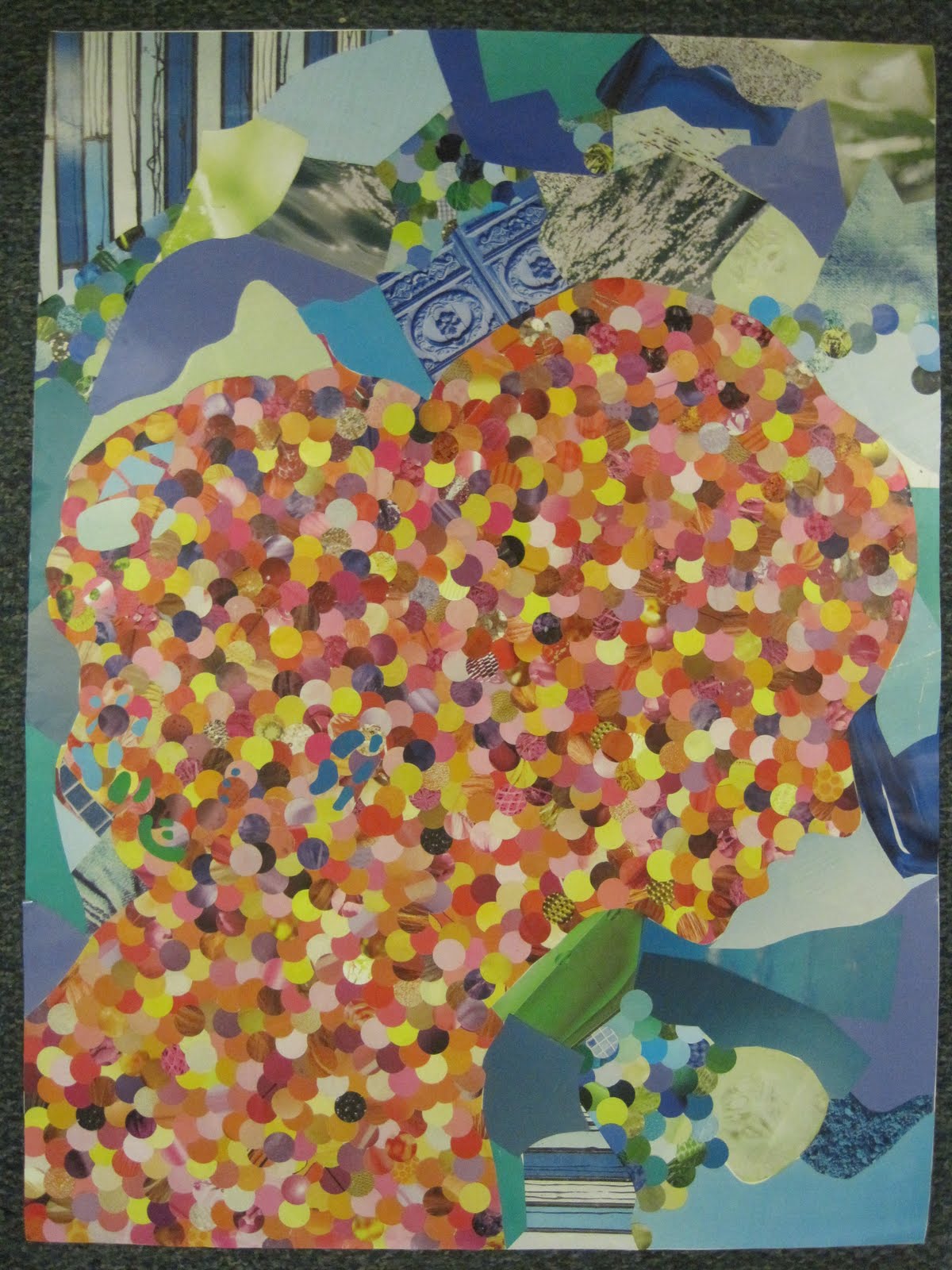
My portrait does not focus solely on a certain color, but rather a color scheme. I used warm and cool color schemes to exemplify the differences between the way my mind works and the way that I appear to others on the outside. I chose warm colors such as red, orange, yellow, and purple to explain that I am energetic, warm, and bold on the inside. I also leaned towards warmer colors for the figure party due to the fact that my red hair is very representative of my personality. It is intense, loud, unique, defining, and is supposedly linked to temper. I believe warmer colors can be used to describe my occasional fiery temper and inner strength. I found that some of the meanings of the warm colors I used are energy, desire, vigor, leadership, enthusiasm, fascination, determination, creativity, intellect, happiness, instability, and spontaneity. It is surprising to find out that almost every description in representative of how I see myself. For the ground, I choose cooler colors such as blue and green to point out the contrast between the way I see myself and the way that others see me. I believe that I give off a more relaxed and calm outward vibe to others. I try to voice my opinions to others, but usually hold back much of the emotion that lies within. I try to put on a tranquil front even when I am feeling something entirely different. I also picked these colors because I associate them with nature, something that I have a deep connection to. The cool colors symbolize harmony, stability, endurance, peace, trust, depth, confidence, integrity, and understanding. I believe these words can accurately describe the relationships I have with others. I work hard to be in harmony with others and to understand them as well.
Thinking about shape, I used both geometric and amorphous types in order to keep in mind the contrast between "inner" and "outer" self. Inside the figure I used the exact same geometric circle repeatedly to highlight my inner struggle for organization. The circles are the same size in order to keep the focus more on the color used in the figure. Since there are so many dots used here, they also describe a constant, never ending high volume of thoughts and ideas circling around inside my head. In contrast, I used more organic and amorphous shapes in the ground of my work to show that no matter how hard I try, the spontaneity of the outside world will be ever present and ready to disrupt the organization that I have in my life. I used some cool colored circles to tie the ground and the figure together and show that through contrast and differences, there will always be a connection and common ground between the two.
Looking back at an early decision I made to angle my figure on the corner surprised me later on in the project. I can see that my figure appears to be leaning forward when the poster itself is not tilted. This reflects something that I have learned in my T'ai Chi class this semester about the concept of 'yin'. I appear to be bowing, somewhat shy, and even vulnerable, all due to my body angle. It was interesting to be able to relate posture to the silhouette because it again serves to describe a yielding and shy attitude that I sometimes take on.
No comments:
Post a Comment