Sunday, December 12, 2010
Final Blog- Aisha Townsend
Art Show
- My impression of the art show was favorable. It was fun to see so many people on campus put themselves out there for the world to see. I had never been involved in any type of public display of art, so I really appreciated everybody that did submit a piece of their work.
- My favorite piece was the self portrait of the artist and also of her horse. It was well blended together so that the viewer really had to look and see that it was two different subjects being meshed together. I think it was really well done and is the one that I remember the most.
- The way I will keep PLAY involved in my life is to just to remember to have fun with life. Sometimes, I know it may come as a surprise, that I come off as old and bitter, and that is something that this class made me more self aware of. I hope to in the future to be able to take things more lightly and step back and just have fun with whatever the situation I am presented with may be.
Friday, December 10, 2010
Art Show- Parker Sheppard
Art Show - Laura Fernandez
Art show- Lili Kyurkchiyska
The concept of Play will certainly remain in my life. In my everyday activities there's not much space for being creative and playful but in order to get through the routine making things entertaining and fun to go through I will deffinately make them fun. I really like playing with play dough and it is a great stress- reliever , so I am certainly going to include playing with play dough to just feel more confident in my creative abilities. The play concept will stay in my life and it will remind me of this class :)
Final Blog Post
Final Blog Post - Phil Schroeder
Art Show-Jenny Green
Art Show Post
Katie Clark - Art Show
2. It is difficult to choose one piece of art that was my favourite from the show, i liked so many for different reasons; some for their purely artistic talent, others their meaning, some cleverness and some for their impressive creativity. Two pieces that I remember which demonstrated a real flare for drawing included a picture of someone’s eyes within a sort of horizontal watercolour painting with a script reading across the page. I liked this painting because I think eyes are beautiful as they can tell you so much about a person, if you ever see any doodles on my work pages it is often of eyes. The artist of this piece drew these eyes so well that they were almost photographic. Another piece which showed a real talent for drawing was a bird’s eye view of a city scene (or something of that nature...tall buildings/shapes) with a boy sitting in the centre of it all. The use of shading to exaggerate the effect of an above view was excellent in this drawing. Another piece which caught and held my attention was the DNA strand made up of family photos, i thought this was really clever and effective. The book of idioms which included pictures such as a cashier filled with peanuts to illustrate poor wages was also very clever. In terms of getting a message across, there were two pieces which struck me; one was a photograph of a street wall from a decaying part of the city with a person in the corner holding up an umbrella to hide themselves from the camera and the other was of a faceless girl crouched at a toilet, who clearly had bulimia. In the first picture “The umbrella project”, i interpreted it as a piece of art with a real element of realism in displaying the uglier parts of life as opposed to the beautiful sunset that we may be more willing to look at. As a psych/criminology major this kind of art really interests me, as in this case a picture really does say 1000 words. In the second piece which was in the style of an advertisement to get help if you have an eating disorder, the effect of the girls face not quite being in the shot and the caption “can you picture your face here?” was really effective and I think it is good enough to be used in actual ad campaigns.
3. In order to make sure that ‘Play’ remains a part of my life, I’ll probably try to spend more time with my younger siblings when I am home and say ‘yes’ more often when they ask me if I want to play a game with them. I remember when I was about 7 years old I would dread going to Brownies (girl scouts) but once I got there I always had so much fun, I think if I learn to say ‘yes’ more often I will automatically be integrating more play into my life.
Art Show- Michael Park
Thursday, December 9, 2010
Art Show- Cam Thompson
My absolute favorite piece from the art show was the 3-part image of a girl eating cake in the bathroom (none of the images showed her head. Like the artist explained, typical awareness ads for eating disorders tend to be in your face, graphic and kind of nauseating. This piece got the same message across about the prevalence of eating disorders and how it's easy to imaging "your" face on the girl and that such problems aren't limited to just super models and public stars.
I hope to continue the Play theme I have taken from this class by trying to make more time in my life to kick back, relax and hang out with my friends. It's easy to get wrapped up in our separate lives and school work to the point of somewhat isolating ourselves and becoming slightly oblivious to the fun, childishness, or simple pleasures in our environments. From being reintroduced to Play-Doh, to having to think back on some of my favorite childhood games for the Ultimate Toy Project, the creative exercises in this class have helped to uncover some of the novelty and pleasure I used to find in everyday happenings and classic games. I hope to be able to preserve this more playful outlook on life following this class :)
Art Show-Ashleigh Schneckenberger
Art Show - Trent Miller
Art Show - Rachel Heck
"Play" will always be a part of my life. I currently work at a nursery at a church, so I'm surrounded by little kids for three hours every weekend. They're all 3 and under and love to play with absolutely anything. Of course, I play right along with them!! Also, I am currently pursuing a volunteer position at the Children's Museum of Indianapolis. That place has many fond memories stored within its walls from when I was younger. To be able to go back and watch the kids have as much fun as I remember having will keep "play" and enjoyment of the simplest things in life forever instilled in my heart.
Thank you Professor Rao and Dr. Skinner for teaching this class!!
Art Show- JoJo Ciancio
There were a lot of excellent pieces of artwork, but there were a few that captured my attention. However, I do not recall any of the titles of the artwork. So I will describe the artwork from the best of my ability. One piece was a picture that had to do with alcoholism. The picture contained a bunch of empty alcohol bottles. The piece was made because the artist’s dad died of alcoholism and she wanted to display how negative alcohol is to oneself. This piece was very powerful and it makes you stop and think. I am fortunate enough to have no one in my family that suffers from alcoholism and this picture reiterates how lucky I am. I am very blessed. Another piece that stood out to me was a piece done by one of my teammates called, “From Somebody to Nobody.” This piece stuck with me because this teammate is a friend of mine and I felt bad for him. I can understand why he is transferring schools now. He does not feel like he belongs here, and that saddens me because he is a nice kid and I really liked him as a friend. I am going to miss him.
In the end, play is something that will never leave my life. I feel like I play almost every day. I love messing around with my brother and sister as well as my friends. Play is a part of my nature and who I am. I love playing with my little cousins and acting like a little kid. I hope I never stop playing. I will try to make sure work does not take up my entire life and that I still have time to play because I love play.
Art Show - Caitlyn Carmony
There are a few that I remember strongly. I do not remember what anything is called, but they stuck out for some unknown reason. I remember the bulimia poster with the girl eating cake in the bathroom. I think I remember this because it was interesting. I remember the picture of the alcohol bottles that had to do with alcoholism. I think this one stuck out because there is some alcoholism in my family. I remember my best friend Katie's piece, because she is my friend and I watched her make it. Finally there was a large painting of lots of colors. I have no idea what it was called but I think it is my favorite. It had white lines separating the different pieces of color and I just really liked it.
I will keep play in my life by playing every chance I get. If i see a playground, I'll be on it. If there's a board game to play, I'll play it. I won't let school and work and everything get me so down that I loose my sense of play. Play is the one thing I'll probably always have time for.
Art Show Reflection-Courtney Reynolds
2) My favorite works were the photography for sure, I just loved them, however the art that stood out to me so much that it was the first piece I thought of when trying to answer this question was called "Generosity." It was not a photo, but it stood out to me the most. The student had made a tree shape out of the images of children's faces the background resembled a sky, and in bright red letters it said "Generosity" and a red shape was attached to the branch of the tree. I automatically was intrigued by how unique the piece was, but once I read the caption I was very touched. The artist had been given a red bracelet from a little girl she met on a trip to Honduras. The artist said that she obtained a whole new perspective on generosity as a result; a little girl with barely anything to her name was willing to give such a special gift. Wow. That piece was so touching and personal so it was definitely my favorite.
3) To maintain the idea of "play" in my life I will remember that anything can be turned into something fun. We discussed this in class one day, that even a monotonous activity can be turned into something fun and creative if we just put our minds to making it that way. I will try to remember that when I'm in a dry meeting or waiting in traffic.
Tuesday, October 12, 2010
Silhouette Project- Parker Sheppard
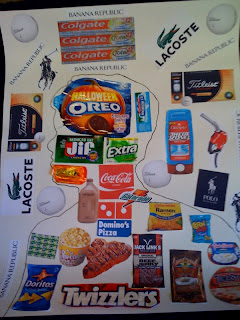 I found this project somewhat easy for me. I went through my daily routine and observed what I need and want I like. The results I found were very interesting. The items which I needed were seemed a little dull and boring, compared to what I wanted. The items I wanted appeared very bright in color and appealed to my eyes. This could be a reason that I typically buy them. The inside of my silhouette describes the items which I like and not technically needed. These are mainly my favorite snacks and food. The outside of my silhouette are items which I need instead of wanting. Body wash, gas, clothes, and golf balls are some of which are included. For the most part, I had fun doing this project and I look forward to the next project!
Sunday, October 10, 2010
Silhouette Project - Cam Thompson
nike shoebox

My blog was based on the items I use the most and the items I will e remembered by the most. The hardest part about this project was figuring out what I wanted to use on my poster board. I finally decided to do my background with a NIKE shoe box. If you know me, you know that I have a large amount of shoes. On the inside of my outline I used pictures of shoes and basketball players and just basketballs in general . I think I did a pretty good job on picking the materials I would use to do this project. I think that my silhouette poster will be unique because of the background is cardboard. The shoes on the outside represent who I am the most.
The inside is what I am and what I do the most. I love basketball so much and I will always love basketball so that's why the basketball items are on the inside.
Caitlyn Carmony - Silhouette
 I found this project difficult. It was hard for me to find brands to fill up an entire poster. I think this means I am loyal to the brands that I use. I stick with the same few things. Inside my silhouette I put clothing and other personal brands such as make up or perfumes, etc. On the outside I put other random things I use such as food, gum, cell phone, etc. I thought it was hard to see the difference between the two so I outlined my silhouette and colored the outside orange and in the inside purple. The things that I use a lot, I tried to make bigger than others. I think that I wear a lot of American Eagle, so that is why it is on there twice. I also put a big Butler Bulldog logo because Butler is important to me. I feel that my silhouette accurately describes the brands I buy and which are the most important to me.
Silhouette Project- Michael Park

Gabe Hulecki - Silhouette Project - Self Portrait as a Consumer
 I never realized how many name brands I use throughout the day and it has brought to my attention how many items I possess which have a name brand. This silhouette project has shown me materials I do not think about during the day, but I use them on a daily basis. We as consumers are constantly promoting a brand name and advertising it wherever we go. My silhouette describes the type of person I am and the types of brands I use on a daily basis. The inside of my head, the figure, includes the basic materials I use everyday. Things such as soap, hair gel, clothes I wear and the food I eat. The outer part, the ground, includes Butler University and the campus I belong to. I enjoyed learning about myself and will continue to be consciously aware of the brands I promote and advertise.
silhouette project
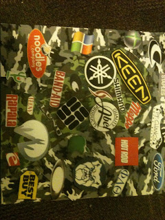
When originally assigned this project, and explained that it should show two sides of ones self, I knew exactly what I wanted my halves to represent. My life is like any other. During the school year I live in a city but in the summer time I travel thousands of miles into the bush to work at a fishing lodge in northern Canada. I can think of no starker contrasts. This project shows a unique separation. On the inside are brands I frequently use during the summer. I love the outdoors and this is why I chose to put it on the inside. Fishing equipment, outdoor clothing, boats, and other equipment are all staples of my summer life. On the outside is reflected my time in the United States. Restaurants, computers, videogames, and society are all shown here in the brands and logos.
These two sides are vastly different and almost none of the brands are reflected in the other side. This project shows exactly who I am. A person who lives in two very different, very exciting worlds and I wouldn’t have it any other way.
Silhouette Project - Grant Lewis
 For my silhouette project I decided to focus on the things I use during the week (inside the green) versus the things I use on the weekend (inside the black). I thought that this would give me an interesting point of view to see how I change as a consumer during the week as compared to the weekend. While creating this project I decided against cutting labels and advertisements out of magazines and decided to focus purely on products that I had in my room and at my fingertips so I could actually take the logos off of them. I felt that this approach would do a better job of showing me what I really use each day instead of what I think I would use or would rarely use. So since I didn't have enough logos to fill the entire page I decided to cut up two different colors of construction paper and glue them as a collage on the poster board to clearly highlight where the lines of my silhouette are. This also made the silhouette more unique and created an interesting texture throughout the entire piece.
 Silhouette Project
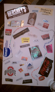
Lili Kyurkchiyska- Silhouette Project

Silhouette Project- Courtney Reynolds

My silhouette project represents me as a consumer now versus the consumer I hope to be in the future. The brands and the colors and shapes that represent certain brands are those that I feel represent the primary brands I consume regularly. The background of the project as you can probably notice from the photo is almost void of brands and is rather full of shades of green and blue. In the future I hope to buy less and use nature as provision more, hence the green. I do however have some luxury items on the outside of my silhouette.
Silhouette Project - Phil Schroeder

My silhouette project focused on the items I consume on a daily basis and how they affect me personally. On the outside of my project are all of the items that I use externally. This includes my clothing, entertainment, and car to name a few examples. On the inside are all the items I use internally or on my body such as food items, shampoo, and toothpaste. This project has brought into the light the extensive amounts of products that I consume on a daily basis. As a consumer I purchase many name brands like element clothing, Underarmor apparel, orbit gum, and Gatorade beverages. This project has also helped me to discover the amount of different products I use just in my every day life. I never really tried to make a list of every name brand item I used in a day and as the day went on the list grew larger and larger. I also noticed how I tend to only purchase name brand products such as Axe products and American Eagle clothing, even when these products are generally more expensive. This project helped me to understand the power of design and name brands because it is considered the social norm and better to wear clothes from Nike, Underarmor, or American Eagle even when a person could buy much more generic clothing for the same prices. Overall this project has helped me to understand myself as a consumer and how the world of marketing helps to add value to many different name brand items.
Ashleigh Schneckenberger-Silhouette Project
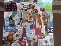
T.J. Sansone - Silhouette Project

From my collage, I learned much about myself as a consumer. I decided to include the brands and products that I buy for fun and enjoyment within the silhouette of my head, or the figure, and the brands and products that I buy out of necessity outside of the silhouette, or the ground. This duality allowed me to reflect upon the items I buy and use out of the pursuit of pleasure versus those simply out of necessity, which I do not particularly enjoy but are required for me to remain alive and to accomplish the tasks that I am obligated to complete.
In the figure, one will see that I am quite the connoisseur of technological products, such as gaming systems, games, television, websites, and all sorts of techie gizmos. In addition, the figure contains many of my favorite clothing brands and choices of food and beverage, including alcohol and tobacco. Some of these vices are worse for me than others, particularly my use of beer, liquor, and cigarettes, but seeing them on my collage has allowed me to recognize some of these unhealthy choices I make.
Within the ground outside of the figure, one will see a wide assortment of products, from stores I frequent for groceries or household supplies to hygiene and cleaning products to brands and products that I buy, even though I may not particularly enjoy them. Some notable inclusions are Kamchatka, a cheap brand of vodka that I buy for guests but never drink myself due to (numerous) bad experiences, as well as computers and software that I use primarily to complete schoolwork or work for my jobs, as a web and graphic designer and blog writer. There are also some brands of food and beverage included that I do not really consume out of enjoyment but out of necessity, such as Starbucks, to keep me awake when I am studying, and Trix, which I usually eat for breakfast since it is quick and easy to prepare.
Overall, my collage has given me a lot to think about and I am already in the process of applying its lessons to my spending habits as a consumer. I have noticed some brands and products that are not very healthy for me, as well as others that I can do without. I am also very happy with the way my silhouette project turned out. I was worried about not using all of the space allotted, but I found that there are more brands and products in my life than I had previously realized!
Silhouette Project - Katie Clark

As I was gathering materials to piece my collage together, I came to realise that I am possibly the least faithful consumer imaginable...I am a nightmare of a customer! I found so many of the same type of products that I use, however often from a variety of brands. I am therefore, a bargain shopper. The inside space of my silhouette represents me and the products I am in the habit of consuming now, as a college student, while the outer space signifies the products I imagine I will use in the future, or at least ‘aspire’ to use in some cases. Despite some of the slightly pretentious products I decided to place in the future space of my collage, a deeper reflection on my piece reveals that I am not a huge fan of big brands, although it is undoubtedly nice to own a few really nice, quality products and items, I can see myself being more into ‘brandless’ products. Back home in my market town of Beverley, I would buy fruit and soap etc from the market that was set up every Saturday, I like the idea of local produce and hand-made (as opposed to large scale factories/sweatshops) items, however it was hard to find illustrative examples of such consumerism in the magazines that I had.
Silhouette Project - Aisha Townsend
Stephanie Hodgin-Brand Silhouette Reflection

My collage is meant to represent me as a consumer and as a person. The outside of the silhouette is covered in Starburst wrappers, lined up in a geometric design. The Starburst wrappers themselves serve as the consumer part of me, because they are my favorite kind of candy that I eat daily. (This made it convenient for me to find the materials for my design). But the geometric pattern also had another purpose. Though it may be hard to see without pointing it out, the wrappers are aligned to look like the music bars that jump up when someone is listening to music. This represents how I communicate with myself; listening to music. For every situation in my life, there is always a song or artist that fits in perfectly with that particular moment.
The inside of my silhouette represents the other part of me; communicating with other people. The grid of Facebook logos shows that my ideal and constant form of communication with others is that particular networking site. It's how I learn about other people, and how other people learn about me. The exclamation point in the center is taken off of the Yahoo! logo in which I communicate with other people through emailing. I decided to use just the use of the exclamation point instead of the entire Yahoo! logo to create more simplicity in the otherwise confusing and busy portrait, but also because it's a logo that everyone recognizes without having to spell it out.
Overall, my duality was that of communicating with myself versus communicating with others. While I could have used a greater amount of labels and different kinds of labels to add diversity to the portrait, I felt that it wasn't necessary to adequately illustrate my point. I think my portrait defines who I am, both on a superficial surface as well as a deeper meaning.
Jenny Green-Collage

JoJo Ciancio- Brand Silhouette Reflection

My silhouette project represents me as a consumer who is brand loyal. From the pictures on my silhouette, one could tell that I used multiple pictures to represent the same brand. For example, if you look in the region outside of the outline of my head, the foreground, one will see the brand Nike used for the majority of the space. It is the brand that I use the most in my life as a consumer. This shows that I buy a lot of athletic wear because I need it to play football. It also shows that I am very brand loyal because I use the brand Nike the most for football. I keep buying from Nike because I feel that they produce a good product to help me play at my best. Also, in the foreground, you will see brands used that I need for nutrients to help my body grow and recover from playing football. If you look in the top left hand corner of the silhouette, you will see brands for protein, water, Gatorade, multivitamins, and fish oils. All of these brands help to improve my performance on and off the field. Each play a vital role into helping me receive the nutrients to keep my body going.
On the inside of my head one will see all the brands I use for school. These materials consist mostly of brands like Bic, Papermate, and Jansport. Most of these brands I have been using since I was a little kid. This once again reiterates the idea that I am a loyal consumer. I sometimes buy things because of their brand name, but most of all I buy things based on their reputation and performance. If the performance is good the first time, I will keep going back to that brand. Overall the brands of my project should represent the idea that I am very brand loyal.
The reason for why I divided up the brands into two different parts, school and football, was to represent the idea of a student-athlete. The reason for the colors green and brown on the outside of the silhouette is because the colors brown and green are associated with football. The color of the grass is green and the color the dirt is brown. There is more green than brown because grass is more visually abundant on the field than mud. The use of these colors is to give the idea of using colors to symbolize football. I also categorized the products. I put all the supplements and diet brands in the top left hand corner. On the right hand side of the poster, I put all the products I use when I am getting dressed. On left hand side of the poster is all of the miscellaneous stuff that I use for football.
The inside of my poster has the color blue to represent me as a student at Butler. I put the logo for Butler in the center because academics are the main reason for why I go to school here. I am here to get a degree. I put Jansport at the top of the head because it represents my backpack. My backpack carries all the products that I put on the inside of my poster. So it represents how the backpack contains all the other products. The arrows drawn inside and outside my head represent the idea that a student-athlete works together. You can’t have one without the other. However, the academic brands are on the inside because school is more important than sports.
Overall this silhouette shows an interesting concept. I really like the way my project turned out. It took a lot of time and effort but it was very rewarding. I felt so accomplished when I finished it. In the artistic sense it shows me as a student- athlete. In the business sense it shows me as a loyal costumer. Both are an accurate assessment of me and that is why I liked how I designed my silhouette.
Rachel Heck - Silhouette Project
to use on a regular basis. The technological items displayed on my silhouette that I bought include my iPod, my Sony camera, and my antique sewing machine powered by Westinghouse Electric. My iPod represents my love for music whereas my camera represents my fancy for photography. My antique New Home sewing machine powered by Westinghouse Electric represents my fondness for antiques and older technological items.
As for the creative aspect and aesthetic appeal of my project, I took advantage of the shapes and colors of the products I consume to fabricate a distinctive design. The ground of the silhouette, where my technological items are displayed, is mostly composed of circles. Most of the technology brands I sue have logos of a basic circular shape. Aside from the obvious representation of the brands by their specific logos, I use the colors of the logos to color in the circles that fill the rest of the ground of my silhouette. As for the figure, or inside, of my silhouette, I used the logos of the brands of items I consume for my biological needs to create a flower shape. The Kraft and Yoplait logos were perfect for the petals of the flowers and the quadrilateral and ovular shapes of the Suave, Crest, and Clean & Clear logos made for perfect leaves, whereas the Jif and Dole logos were perfect for the construction of a stem. The rest of the inside of my silhouette is filled with yellow to represent the sunlight providing a means for the flower to grow, as well as the color of the Wal-mart flower-like symbol representing the store where I buy all of these products.
Collage

Friday, October 8, 2010
Collage Written Explanation
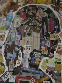
I learned a few things regarding my consumer habits as I went about this project. First of all I organized it as things I need and like to buy within the silhouette; and then all the different types of edible things I buy either for my dorm--like snacks--or things I get when I eat out on the weekends. A lot of my spending goes on food and that's because the food at Butler is hard to survive on. Every time I ran to Target this week I realized I was restocking the dorm with food/snacks. For the inside I arranged it by placing cool colors as the background before I collaged over the top of it. That kind of symbolizes that I tend to buy things that are green, blue, or violet because those are my favorite colors. Then the objects that overly the background are things I enjoy buying like clothes or shoes. I also put in things that I need and use on a regular basis such as a toothbrush, face wash, and makeup. I usually decide what I'm going to buy by what I feel is needed or sounds useful at the time.
Friday, September 24, 2010
Laura Fernandez - Public Art Project
Public Arts Project-Kyle Jordan
Jenny Green-Pitching Public Art
Gabe Hulecki - Pitching Public Art
Ashleigh Schneckenberger-Art Project
Thursday, September 23, 2010
Stephanie Hodgin - Pitching Public Art
The other groups in class did a really great job presenting; all of them seemed to have at least one reason why I thought they should definitely have a spot on campus, which made it difficult to vote at the end for a single proposal. I was really excited about the bridge project because the group explained where they got their influence for their project, which was an interesting angle to see the background planning that it took to come up with the idea. I also thought the fountain outside of Clowes was a great presentation because they truly took time to plan the materials they were going to use and took into account the cost of the production. Overall, I was surprised to see the different ideas our class members came up with!
Rachel Heck - Pitching Public Art
All of the groups did an outstanding job explaining their ideas to the class. Any of these projects would positively add to Butler's campus. However, I thought the groups who proposed the bridge project and the fountain that would go in front of Clowes Hall did a really good job presenting. They both had incredible and detailed visuals for their project. I was definitely persuaded by the group who proposed the bridge project because of where they got their idea for the structure of the bridge and the idea for the light show. That interesting background information from a personal visit to Europe added credibility to the project and greatly enhanced the presentation. All of these things considered persuaded me that they had a really neat idea that would not only be useful on the Butler campus, but also fun and exciting.
T.J. Sansone - Pitching Public Art
Our presentation went very well! Although we had not all met before this class, we really 'clicked' while working as a group and settled on an idea quite quickly. Using the cross-sections of a basketball to form a structure became the main theme after our initial brain-storming session, and from there, we moved on to discussing and settling on the features that the structure would contain, as well as the overall appearance. Looking back, we could have spent more time coming up with ideas before settling on a theme, although it all worked out great in the end!
As for the other groups, I like the range of ideas that the class came up with. Every group thought outside of the box and proposed interesting projects--any one of which would be an outstanding addition to Butler's campus. I was persuaded by the Bridge Project in particular, since I agreed that the Butler section of the canal was lacking in scenery and a glass bridge would really liven up the area. I believe that my group was persuasive as well, since every student needs a peaceful, scenic place to visit every now and then, which is exactly what our project offered, in addition to providing a social atmosphere.
Lili Kyurkchiyska- Art Proposals Reflection
Public Art Relection - Caitlyn Carmony
Mike Park- Public Artwork Reflection
Parker Sheppard-Art Proposal Reflection
Cam THompson- Reflection on Public Art Proposal
I particularly admired the way the Butler Bubbles, Holcomb Glasses, The Watering Hole and Of Treasures and Tunes conveyed their visions of their group's art proposals. The Butler Bubbles group did a great job of using humor to personally connect the audience to their idea; while the other groups really utilized their time to explain and help paint a mental image for the audience. Their presentations were very persuasive. The Watering Hole group also did an excellent job in factoring in the cost of their structure, which most everyone else ignored, including my group. Humor, along with personal connection/relevance and cost efficiency are two very persuasive strategies that my group maybe could work on for future proposals.
Wednesday, September 22, 2010
Aisha Townsend - Art Proposal Reflection
Katie Clark - Art Proposal Reflection
JoJo Ciancio- Art Proposal Reflection
All the groups did a fantastic job with their art proposals. The visual aids were impressive. Some of those 3-D models were really good. The visual aid along with what they were saying really tied everything together. One could not exist without the other.
The one group that sold me was the "Watering Hole". I really like how they incorporated cost into their speech. The idea that the water supply was going to be coming from the sewers and that the university wasn't going to have to pay for water was really interesting. They did their research and the more knowledge they had about their topic the more I was convinced. I think if our group talked about cost and other economic factors it would have been more persuasive because cost is a big deal. The less expensive you can make it the more people are going to be willing to support your product.
Pitching Public Art- Grant Lewis
Courtney Reynolds- Pitching Public Art
Reflection -Trent Miller
Public Art Project Reflection
Tuesday, September 21, 2010
The Watering Hole by Katie, Kyle and Sheila
Our group first came up with the idea of ‘The Watering Hole’ when we got together as a group and verbally projected our individual ideas with the intention that we would eventually land on something which struck a chord with all three of us. Initially we played with the concept of a water feature of some sort, and went on to develop thoughts and ideas of ways in which we could link the art piece to Butler. The location of East Mall just outside Clowes Hall was almost a given as we all thought that this was one of the areas on the Butler Campus most in need of some visual appeal, while it was Sheila’s drawing of the piece which triggered the excitement and enthusiasm amongst the group.
Once we had the picture of our Sculpture we could really get to grips with the mechanics of the art piece and the ideas of how it could function and be self sustainable and what materials it could be constructed with really started to flow. The ‘arms’ of the sculpture would be made of a smooth combination of solar panels and silver metal plating to create a certain sleekness and reflective effect which would complement the water feature. At the base of each of the four arms would be a wishing well, the walls of which would be made of high quality dark, kind of erratic looking rock, the idea being that people will throw their coins into the wells as they make a wish and the metallic reflection of the coins will compliment the appearance of the arms. From the wells, a discreet tube would run up the underside of the metal arms as they project from the wells in an arch-like form and become intertwined at the top where the water will spurt out and run down the outside of the arms back into the well.
Aside from the water feature of the sculpture, its appearance would be sophisticated and grand to tie in with the Liberal Arts theme of the University. The intertwining of the ‘arms’ is also symbolic of the crossing of paths and cultures, a theme which is of growing importance while at Butler. It’s location outside of Clowes Hall serves as a convenient gateway to the Butler Campus and therefore it would be the first object visitors would see. First Impressions are of great importance and we think that our sculpture would provide a great talking point and impress future Butler students and alumni.
Courtney, Parker, and Trent- Public Art Proposal
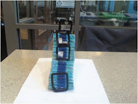
“REFLECTION”
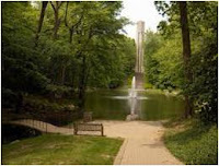
The public art piece we would like to propose for the Butler University campus is entitled “Reflection.” The location for “Reflection” is proposed to be on the steps of the bell tower on the north end of the campus. This location was chosen as a prime spot for an art piece that will encourage personal reflection. The area is surrounded by nature promoting peace and tranquility and the bell towers, which sound at the passing of every hour symbolically representing the passing of time throughout one’s journey of reflection. Out of respect for the tradition and history of the bell tower, this piece would be a temporary public art piece put on display during the month of May which is generally fair-weathered. The art piece itself would be composed of four mirror frames and one large cylindrical mirror. Each mirror frame would rest upon each of the four platforms on the steps leading up to the bell tower culminating with the cylindrical mirror directly underneath the bell tower. The proposed materials of the mirrors are black-coated wooden frames with stainless steel pieces to serve as a mirror, for safety purposes. Attaching the mirrors to the stairs would be done much in the same manner as a free-standing mirror is held upright; the mirror frames would be attached to another wood stand.
The four mirrors represent the path of discovery of self throughout one’s four-year, or more, journey at Butler. The unfinished mirrors represent the “pieces of the puzzle” to one’s life as well as the increasingly more difficult stages of each school year. The round mirror underneath the bell tower symbolizes the culmination of discovery of oneself, career path, purpose, et cetera or at least seeing oneself in a different manner.
Adding this piece to the Butler campus for the proposed month of May would add interest to the area and increase its value as a place for reflection and thought. The bell tower is already a visitor attraction; “Reflection” would be another point of interest and conversation piece. “Reflection” being installed in May, the month of commencement, could also symbolize and help celebrate the journey of Butler in students in their path of self-discovery past, present, and future.
Public Art Proposal - Cam, Caitlyn, Katie

Public Art Proposal
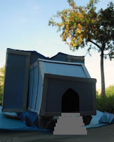
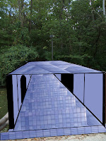
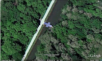
For our public art project, we propose an aesthetically pleasing and functional bridge over the canal behind Gallahue Hall. Such a bridge would attract people down to the canal, which is technically a part of Butler campus, though unfortunately a seldom used part.
The bridge would be a completely covered bridge, to provide shelter from inclement weather, heat, and cold. The structure would be made of steel or any other supportive material. The majority of the bridge would be plate glass, so as to allow pedestrians to see what is around them and down into the canal. The bridge would also be illuminated, and at night would provide a light show for visitors using color wheels in the lighting fixtures. There will be an observation area so as to allow pedestrians to stop and sightsee without blocking others trying to cross.
We proposed the idea to attract people to the canal more often. As it stands, the Canal is seldom used by anyone except student athletes running during practice or trying to access the Butler Athletic fields on the west side of the canal. We thought that a structure which allowed students to cross and also provided shelter would make a visit to the canal more pleasant. We chose the location behind Gallahue Hall because that particular area of the canal lacks this kind of bridge. There are 2 wooden bridges on or near Butler campus, neither of which provides shelter or serves any purpose other than as a crossing point on the canal. We thought that a “different” kind of bridge would be more pleasing to look at—it would attract people if for no other reason than to see it. The addition of the light show adds the element of “play” to the bridge. The bridge would be constructed so as to not invade the space of the wildlife in the canal.
We drew inspiration from Katie’s recent trip to Strasbourg, France. Europeans place a higher value on art, so most of their structures are functional as well as artistic. Also, the city of Strasbourg invested in providing light shows nightly at two different locations, projected against two already-standing structures, the Cathédrale Notre Dame de Strasbourg as well as the side of a movie theater along the Rhine River. On its own, these two locations attract people maybe only once. But with the lightshow, they attracted both locals and tourists, and got them talking about the structures as well as the particular areas of the city, bringing more people out to explore and experience everything that Strasbourg has to offer. That is the goal behind the Bridge Project—to get people to come out to the canal, see the bridge and the light show, and explore, wondering “what else does Butler have to offer?”


