Thursday, March 31, 2011

50 Word Story - Ashley

UNDER THE TABLE


Zach had already lost at Root-Beer Pong too many times. He was reflecting on his shame under the table. Others were breaking the law. Fashion law. Cops busted in! Those not wearing hats ran! Zach was left alone with crickets. The moral of the story: Don't loose at Root-Beer Pong.

Comic Strip Story- William Lamar


Puzzled, Caroline glares at her two birthday cupcakes. Expecting a pink Lamborghini, she yells about the lackluster birthday presents she received: two cupcakes and two balloons. Caroline hurls a cupcake at her mom, hitting her dead in the face, a perfect shot. Caroline runs off to eat her cupcake alone.

Keriann Roush-Comic Strip


A father took his son out to fish in the sea. They had caught many fish when suddenly a whirlpool appeared in front of their boat. “What is that?” The son cried. They were both very frightened when the animal surfaced, “OMG, a dolphin!” And everything was ok.

Comic Strip Story-Radha Patel


In this comic strip, it starts off showing a traffic jam on the highway. People are breaking and screaming because they are frustrated. One of the men in frustrated because he has to get to work and the other is frustrated because his wife is about to have a baby. The man causing this traffic jam has a flat tire. In the end, the wife has a baby boy in the traffic jam and the other man gets fired from his job.

Kaylin Beckwith's Mini Saga

The dog continually chews the lady’s shoes and ruins them. She can’t take it anymore and confronts the boyfriend about this. He considers his choices, and then self-assuredly chooses the dog. After all, the dog is his best friend, and best friends are irreplaceable, while girlfriends come and go.

Katie Zeiger- Mini Saga

There was once a famous vocalist who liked to wear snakes around her neck and dress like a school girl, her name was Britney. She rose to the top of the charts, but fell victim to the pressure fame. Now, her future can be summed up by the eternal flame.

Lauren Bacon Mini Saga

Rose missed the buzzer shot much to the dismay of his team. They left him behind with his embarrassment when Yokhim appeared and invited Rose to drown his sorrows. Rose couldn’t contain himself, and was over zealous with his indulgence. When asked, “Rough night?” Yohkim answered how he could relate.

Comic Strip Story-Kazmyn Perry

Anna's first time traveling alone. The subway is like the Matrix. Red pill, green pill; red line, green line. If only there was someone to help. Poof! Its the Super Subway King! No matter how lost you are, the Super Subway King will save you! *Only in New England though* :-)

50 word comic story


Steven was outside playing with his cat, Fluffy. He thought Fluffy was smart enough to stay out of the street, guess again. Fluffy ran into the street and was struck by a car. Fluffy stuck to the windshield like a bug, but Steven wasn’t upset, he didn’t like cats anyway.

Mini Saga Story


John was not having a good day. He slept though his alarm. Missed class and a final. But Andre had John’s back and created chaos in the class. He yelled out “I don’t want to take it either.” The protest in front of Jordan was enough to cancel the final.

Wednesday, March 30, 2011

Mini Saga 4 Panel Drawing


Jeff and Alice were newly-weds on their way to the airport for their honeymoon. Minutes after leaving the church, Alice has to go to the bathroom. After trying two bathroom bottle options, Alice screams that she is high maintenance and he should pull over immediately. Good luck, Jeff.

Marissa Nora Kampe- Mini Saga


Wilbur exited his apartment and turned around to see a crazy masked man breaking into his car. “Stop!” He yelled, thinking all hope lost when…WHAM! Out of nowhere came Batman!

“Stop!” Batman said.

“…Damn it’s Batman,” said the Thief knowing what came next.

POW! Batman sent the thief flying. Day saved!

Comic Strip Story - An Awkward Encounter


Gathering his confidence, John approached Lily to ask her to the Homecoming dance. On the way he accidentally stepped in dog poop. Offended by the smell, Lily felt awkward and made an excuse that she already had a date to the dance. Tough luck John.

Comic Strip post- Note Gone Missing...


There is something that Aaron doesn’t know. His girlfriend wrote it on a note for him that didn’t get delivered to him. Did the note get lost? Did his roommate throw it out? What was actually written on the note? The note from his girlfriend said “we’re done!” They’re done.

Ryan Rosebrough- Comic Strip Story


Spring break was coming soon and Katie didn’t have any plans. She asked her friend but to no avail. Driving home from school and idea struck her. She tells her mom she was going on a college visit to Butler. She loved it so much she eventually graduated from BU!

Comic Strip Story- Sarah Leib

Joey is getting accused by Matt saying he knows what he did. Joey acts like he did nothing wrong and that he has no idea what Matt is talking about. Joey still remains trying to play it cool but gives up and confesses to killing the class fish. Matt stands there astonished.


50 Word Story- Jamie Kostecki


Boy meets girl. Girl falls in love with boy; boy reciprocates and asks for her hand in marriage. Boy marries girl. Girl loses wedding ring. Boy is hurt and self-conscious. Girl reassures and makes a large suggestion; although the girl was first to lose, boy will be the biggest loser.

Carly Sobolewski- Comic Strip Story

Bobby Fong was an adventurous and smart little fellow. A raccoon was lost and couldn’t find a home. Bobby decided to teach the animal to live in a tree. His friend was confused. Forty years later his ingenious idea led him to become the President of Butler University.

Alison Harre- Comic Strip Story

It was the Sadie Hawkins dance, when the girls ask the boys. I have been crushing on Ben and wanted to ask him. I finally asked him and he said "if he got done working out in time." Instead I asked my back up crush, just to make him jealous.

Kathryn Graham ~ Comic Strip Story


Tony had a huge crush on Diana and asked her out. Diana said yes but secretly loved Jon. Jon found out. The next weekend they all went to the Jersey Shore. Diana decided to go out with both of them as long as she could bring her best friend Snooki.

Tuesday, March 29, 2011

Veronika Lewis- Comic Strip Story


BAM! Dave's face exuded with anger. He showed his son Mel the disaster. A car had crashed into the house. Mom screamed knowing Mel was the one to crash as a newly licensed driver. Mel seemed content because he knew state farm would obviously be there with...A NEW HOUSE!

Alexis Marin- Comic Strip Story


Pittsburgh basketball players argue with Duke about making it to the Final Four. Butler is confident yet conservative about making it. Pittsburgh and Duke play, but Butler makes the Elite Eight and wins! They celebrate their victory leaving Pittsburgh and Duke disappointed. Final Four here come the Bulldogs!

Mini Saga for Four-Panel Drawing

Husband comes home. He cheated. Uh oh! Wife questions him but he's guilty.

She has pictures of him with another woman! Gasp!

But wait! He has pictures of HER with another man! Turns out he was with the sister of the man she's cheating with!

Wife just got TOLD! BOOM!

Monday, March 28, 2011

Silhouette Project


This silhouette project helped me take a deeper look into who I am, and how I have changed within the past couple years of my life. I’ve always known that I am an “older soul,” I’ve never truly believed that I was born in the proper time period. Even when I talk to others about my personality and my “inner spirit” everyone comes to the agreement that the personality traits that I possess are not characteristic within modern-day social mores. Alas that is why I chose to do the foreground of my silhouette project in a classic black and white style. Aside for this style being a classic, tradition style it also reminding me of one my favorite past-times, photography. My love of photography, particularly my love of black and white photography is the reason why I chose to construct the foreground out of circles. To me this overlapping of black and white circles reminds me a lot of a camera flash, that bright light that has the ability to cut through the darkness and produce something that can last a person a life time. And that is what I have learned about myself through this assignment, that I have the ability to be that ‘light’ on someone’s life (as clichéd as that may sound). Alas, I have yet to talk about the background of my silhouette. It as well plays off my old soul, the lines of color are not random, they are in a pattern similar to that of television that has lost its signal. Not only does this show my affinity for the modern technological era, but it is also symbolic of me being out of touch with the modern era. I will be the first to admit that there is a disconnect between myself and the modern world, much like the signal of a television being lost. More importantly I chose to do the background in a decorum of rigid geometric triangular shapes, this signifies the rigidity of the world out outside of the bubble that I like to call my life. Overall I can say that I have learned a lot about myself through this assignment, more importantly I’ve learned that although there may be a disconnect between me and the technological world, I can still be a presence in it and should not be afraid to be myself.

Thursday, March 24, 2011

Silhouette Project

This silhouette was a very difficult project, but a good way to express who I am as a person. I used 3 different colors, or atleast attempted to. The white kind of say that inside I am a calm person, I don't like to show when I get frustrated or upset, I just stay calm at all times. The blue and gold (kind of) back round shows my high school colors, which is where I had some of the best days of my life. Also, another main reason was the combination of blue and white, which is the colors of Greece, where I lived for a few years and holds a special place in my heart because of my friends and family and the memories I have from living there.

Silhouette Collage


My silhouette collage was created using nearly all geometric shapes except where creating my silhouette require the use of half amorphous shapes. Using mainly geometric shapes was a way for me to illustrate my need for control and order in my life. I like things to be a certain way which is why my silhouette is well ordered mosaic tiles. The different colors of the tiles represent different aspects of my personality. Cool, pale blues are a calming color to me, they represent my efforts to keep my life well ordered and laid back when possible. The darker blues are more mysterious and indicate a more brooding aspect to my personality. The shades of silver are bright, they show that when I am good at something I can really shine. The pops of grapefruit color are to show that I am not always serious and do have a fun and spontaneous side. In the ground around my silhouette I used dark colors, a lot of contrasting colors, and some brighter colors to represent different elements of the world as I see it. Its a lot to look at, sort of chaotic and a little distracting, which is how the world often seems to me. I also used some of the same mosaic tiles from my silhouette in the background to show how I try to influence and control some of the world around me. I noticed when I finished my collage that my silhouette almost seems to be lost among the many elements I included. It surprised me, but seemed fitting to my personality. Sometimes I feel overwhelmed by the world, I don’t like being the center of attention and prefer to find a way to blend in to the background. Although if people care to look, I am easy enough to find.

Marissa Kampe- Silhouette Portrait


My art work has two figures facing each other. The first, on the left, starts dark blue at the tip and becomes lighter throughout, the other is purple that starts dark towards the center of the piece and becomes lighter as it move towards the edges. I tried to contrast the dark blue and purple with the ground. It starts out as light nude colors and towards the edges becomes darker pinks. The reason I did dark and lights against each is that I wanted them to stand out. I wanted the darkest darks contrasting with the lightest lights. I tried to make the area on my figure that is the eye area to have the most contrast between dark and light. I made the nude, more organic colors, very geometric by cutting them all into rigid squares and piecing them on the page as such, with very few significantly overlapping. With the purple and blue, I tried to make the pieces I cut out more organic and less structured, overlapping significantly and not paying attention to structure.

I chose the nude/pink colors for the background because I knew it would create the most contrast between my profile and the background, or rest of the world, I did this because I, just like everyone else, am different. My personality, the way I look and dress, isn’t the exact same as anyone else. I also was trying to do something ironic with the colors in that the ground is skin colored where as the figures are not; they are colorful with multiple shades of the same color. I chose purple and blue because both can be very sorrowful, deep, and sincere colors, but also can be very joyous and rich colors. I chose these because of the depth of both color, and then I made each figure fade into a lighter version of that color because I believe that for me, and a lot of other people, that there is always more than just face value, that there are different layers of color and personality for each person.

I chose two different colors for the figures, not because I have dual personalities, but it is natural for me to feel different emotions or be in different moods periodically. Another reason for the color gradient is because I am not stoic, and I feel that even if the figures were the same shade of blue or purple but with different patterns of the color, from far away it would still blend together into the same color. I was originally going to chose pink and orange or orange and red as the colors for the figures because they are my favorite colors and they are bright and happy, and usually associated with warmth, but thinking about the project and knowing it was to be a self portrait, I know that I am not bubbly and happy all the time and that I feel, as I said above, a wide range of emotions daily. Color and shape influence my life daily by what I chose to wear, the world around me, and how I perceive people and how they perceive me.

Silhouette Portrait- Alison Harre

Silhouette Project

There were many factors that came into play when I was making my silhouette. First of all, my great grandmother has a lot of silhouettes around the house of all the kids in the family. I have always thought that the simplicity of silhouettes is beautiful. The black and the white contrast each other and create a piece of art. Since I thought the originality of silhouettes are so beautiful, I wanted to keep that in my own silhouette.

I knew that I wanted to make the figure more internal and have it reflect my personality. I also wanted to make the ground reflect external things that I like to surround myself with. The figure is covered in black, which symbolizes power, which is reflected in my leadership skills. If there is an overwhelming amount of black, it can result in overwhelming emotions. This represents me because I am always overwhelmed and stressed out. I have a lot of commitments, which result in an overwhelming lifestyle. I am wearing a pair of sunglasses in my silhouette, which are gold. Gold represents optimism and happiness. The reason why there is such little gold is because I am not a very optimistic person, but I am to an extent. I always seem to prepare myself for the worst in situations. I do not think that being pessimistic is a good thing, which is why the sunglasses hide it. In fashion, red is used for making statements, or to set you apart from the crowd. The red lips that I used in my silhouette are meant to represent my bold side. I like to show the unique qualities that I have and what sets me apart from others.

The ground of the silhouette is made of comic strips from the newspaper. There are many reasons why I chose the comic section of the newspaper to represent what I like to surround myself with. Since comic strips contain many different colors I wanted that to represent the diverse people that I like to surround myself with. There are many different types of people that I am friend’s with, which is displayed in the diverse colors. In addition, I wanted the comic section to show that I like to surround myself with happiness and humor. I love to be around people that can make me laugh, it helps me keep my stress under control.

Silhouette Project- Kazmyn Perry


       Doing this collage allowed me to reflect on my own characteristics. It showed me that I'm even more complicated than I already feel. When I began to explain the meaning of the colors and shapes of the collage to my friends, they seemed to completely understand my thought process and was amazed at how I portrayed it. The self-portrait tells a lot about my personality and goals and feelings. The actual silhouette is so dynamic and full of color that is shows how many different ideas, feelings, and thoughts I possess. It tells the story of how I became the person who has many different talents and desires. 
        My collages colors are all pretty bright and evoke some type of emotion already. For the background, I used blue and cut those pieces into rectangles. This area represents the world. To me the world is full of people who stay inside their own respective boxes of rigidity and simplicity and never dare to venture out. The color blue is a tranquil color but also a color that fails to represent a spontaneous aspect. The pieces in the background dont completely cover the board and that represents the small spaces where those with individualistic mindsets and personalities must dwell. For my silhouette, I used a multitude of colors. In the shoulders, I used mostly gold with little pieces of red. The gold represents the phrase "heart of gold". It shows that I often have good intentions and would characterize myself as being innately caring, generous, and service oriented. The little pieces of red represent greed, vanity, selfishness, and a stubborn nature. These are characteristics that I hold, but ones that stand to undermine or destroy all good intentions.  
          My head has mostly pink and a little bit of orange and red. My thought process for using the pink is to describe the vibrant nature of my ideas, actions, and beliefs. It shows my passion and how dominant it is in my thoughts. I believe that everything I do has passion behind it. The pieces of red are on my lips because it shows how the passion that I have for my beliefs often leaves my mouth in an aggressive manner. To me red is the most aggressive color. The orange that is in my mind represents the idea of uncertainty. Although I can be very aggressive and at the same time very confident, there are times when doubt can set in. Those are the times when I wonder if my thoughts are too radical for the world. Doubt is my least favorite emotion. I used geometric shapes in the shoulders area to show the traditional nature of my heart and the traditional nature of the things that threaten anyone's good nature. I felt that those things could translate to anyone and would therefore need to be structured. My heart itself is the most structured thing about me. I tend to feel only what I feel is appropriate, and if I don't, I work to. The pieces in my head are amorphous to represent the sheer complexity of my mind. I don't think like everyone else, but I believe that also makes me very dynamic. 

Ashley - Silhouette Portrait


My silhouette project is a study on night and day. I have never been a morning person. In fact, I am quite terrible at them. I always wake up groggy and stiff, it takes me an hour just to get out of bed, and I can barely function once I do. Night time, however, is when I feel at my best. I am more creative at night, more productive, more motivated and inspired. Because I usually don't sleep very well, I have a lot of time at night to do all those things I should have done in the morning. In some ways, I feel like a divided person and that is what my silhouette reflects.

I used varying shades of solid blue to show the transition from day into night spanning from the left to the right of the background. I chose to have the silhouette face the night to depict how I “look forward” to the end of the day. The inside of my silhouette is composed entirely of patterns. I found as I was flipping through magazines that I identified much more with a combination of colors and designs rather than specific solid choices. I came to realize that I love patterns! My life and my room are full of them. I also wanted to create a similar gradient within the patterned silhouette as I did with the background, except this time in reverse. The brighter, happier patterns are towards the night sky and the darker, grumpier patterns are toward the day sky. This, again, reflects my attitudes towards that time of day. Over all, I choose to use a textured amorphous composition. I did not feel like the structure or smoothness of crisp solid lines defined me as a person. I am much closer to the scattered over-lapping elements shown here. I am a grab-bag of ideas and inspirations, just like this silhouette project!

Wednesday, March 23, 2011

Silhouette Portrait-Radha Patel


When I first thought about doing my self-portrait, I thought I would do my favorite colors: purple and red, but I didn’t know how these colors would signify me besides the fact that I love these colors. I started thinking about something that has been very important in my life. First I started off by thinking about college and then about who I am as a person. I realized my life is filled with love from my family to my friends and now my boyfriend. I decided to make the outside of the silhouette red hearts and the inside a golden color in different torn shapes. Every shape in this collage is amorphous and when I thought about the significance of this I realized love does not have any boundaries. When I think of geometric shapes, it reminds me of boundaries and they are clear and cut shapes, but amorphous shapes have more “free space” and are not clear and cut just like love. I wanted to make my shadow different; therefore I made my shadow as blowing a kiss to show an expression of love. I realized I possess a lot of objects with hearts including three necklaces, two bracelets, earrings, many shirts, heart pillows, a jewelry box and scarves. As I was doing the silhouette I thought about all the people I love and that love me. I realized love in my life grows more and more everyday, especially romantic love. I used a golden yellow on the inside because that is how love makes me feel. It makes me feel warm just like that color. It brightens my life and gives me a feeling of coziness. Also as I was doing the project I realized the hearts around my shadow stand for love and just like my shadow is surrounded by love, so am I. I am truly grateful for that everyday.

Katie Zeiger- Silhouette Portrait


Working on this project seemed to help me to make sense of my own life. It helped me to see and better understand how I function internally and externally. Through color, shape, size, and pattern, I was able to discover so much more about myself than I would have been able to do through a "normal" black silhouette. I was able to see how I organize my thoughts, the emotions that I convey to others and myself, and also how my internal and external worlds tend to disagree with each other on a regular basis. I wanted my work to represent the daily calm and chaos, ups and downs, and other contrasts appearing on a daily basis in my life.
My portrait does not focus solely on a certain color, but rather a color scheme. I used warm and cool color schemes to exemplify the differences between the way my mind works and the way that I appear to others on the outside. I chose warm colors such as red, orange, yellow, and purple to explain that I am energetic, warm, and bold on the inside. I also leaned towards warmer colors for the figure party due to the fact that my red hair is very representative of my personality. It is intense, loud, unique, defining, and is supposedly linked to temper. I believe warmer colors can be used to describe my occasional fiery temper and inner strength. I found that some of the meanings of the warm colors I used are energy, desire, vigor, leadership, enthusiasm, fascination, determination, creativity, intellect, happiness, instability, and spontaneity. It is surprising to find out that almost every description in representative of how I see myself. For the ground, I choose cooler colors such as blue and green to point out the contrast between the way I see myself and the way that others see me. I believe that I give off a more relaxed and calm outward vibe to others. I try to voice my opinions to others, but usually hold back much of the emotion that lies within. I try to put on a tranquil front even when I am feeling something entirely different. I also picked these colors because I associate them with nature, something that I have a deep connection to. The cool colors symbolize harmony, stability, endurance, peace, trust, depth, confidence, integrity, and understanding. I believe these words can accurately describe the relationships I have with others. I work hard to be in harmony with others and to understand them as well.
Thinking about shape, I used both geometric and amorphous types in order to keep in mind the contrast between "inner" and "outer" self. Inside the figure I used the exact same geometric circle repeatedly to highlight my inner struggle for organization. The circles are the same size in order to keep the focus more on the color used in the figure. Since there are so many dots used here, they also describe a constant, never ending high volume of thoughts and ideas circling around inside my head. In contrast, I used more organic and amorphous shapes in the ground of my work to show that no matter how hard I try, the spontaneity of the outside world will be ever present and ready to disrupt the organization that I have in my life. I used some cool colored circles to tie the ground and the figure together and show that through contrast and differences, there will always be a connection and common ground between the two.
Looking back at an early decision I made to angle my figure on the corner surprised me later on in the project. I can see that my figure appears to be leaning forward when the poster itself is not tilted. This reflects something that I have learned in my T'ai Chi class this semester about the concept of 'yin'. I appear to be bowing, somewhat shy, and even vulnerable, all due to my body angle. It was interesting to be able to relate posture to the silhouette because it again serves to describe a yielding and shy attitude that I sometimes take on.

Silhouette Project- Ryan Rosebrough

This project was not the most enjoyable project so far, yet it was still entertaining. We had to fill our paper with meaningful colors that were related our lives. This was hard for me as I do not know much about colors or what they mean. So as I made my project I decided to choose colors based on how they made me feel before I looked up actually color meanings. I feel like this made the project a bit of surprise and a little fun and mysterious until the end. Also, I believe art should first and foremost mean something to the artist before anyone else in most cases. So with this approach I decided to get started with my project.


The first color I chose was the color for the inside of my silhouette as I know myself very well and it would be easier to chose a color that represents me. I chose a dolphin grayish/light bluish color. To me these colors felt very calm and controlled which I feel represent myself very well. Most of my friends would say that I usually stay cool in heated situations and I am a generally laid back person. Also, I am a very controlled person in the sense that I can generally hold myself together in certain challenging situation. For the external colors, I chose orangy reds and redish oranges. To me these colors gave off a lot of energy and seemed a bit chaotic. This seemed very fitting, especially now that I am in college. There are always social activities, projects for classes, homework, reading, clubs, etc. going on and most of the time the outside world seems very chaotic. These were what the colors meant to me prior to looking up the true meanings of the colors.

After looking up what the colors truly meant, I found that red is the color of energy and vitality. This was not exactly what I had thought, but it fits perfectly in what I was trying to convey nonetheless. Orange is very similar to red in the sense that it stands for enduring vitality. It also represents a very dynamic color representing enthusiasm. Again, this is not initially what I thought or how it made me feel, but it fits very well in my project. Lastly blues represent a calm atmosphere which is exactly how it made me feel. It also represents a high ideals and solitude and peace. These were not apparent to me before I looked up the meaning and representation of the color, but now I definitely see how this is true.


I am extremely happy with how my project turned out in how I see the colors and in what the colors actually mean. The two are actually very similar which is pretty cool in my opinion. It was actually fun waiting to see what my art piece truly meant until after it was completed. It was almost as if it were two pieces in one.

Kaylin Beckwith's Silhouette Portrait


Kaylin Beckwith

PCA 261

Rao, Skinner

24 March 2011

Silhouette Project

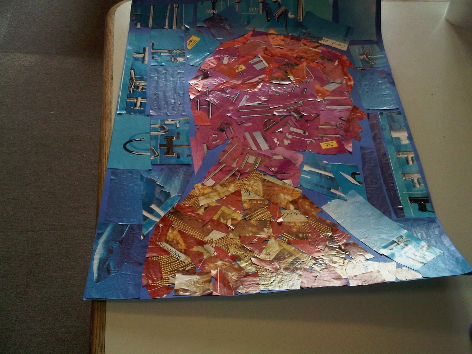
Preparation for my silhouette project began before I even picked up scissors and cut from the first magazine. I woke up the morning before we were to be traced thinking about how I wanted the final project to appear. I decided to wear a large, flowing scarf so that it would leave a noticeable mark in my outline; likewise, I wore my hair natural and curly so that I could incorporate even more squiggly lines into my outline. These two components transform a sleek, mannequin style silhouette into a silhouette that better represents me. It is a little haphazard, just like my life seems to be most of the time. Furthermore, the only curved lines in the piece are found in the body. This is because the world is rough, full of sharp edges, and dangerous- as portrayed in my background. Moreover, I am rounded. I am organic, persevering, and ever-changing.

Beyond the outline of my silhouette, color is also a key player. The background is portrayed in dark colors. This is to metaphorically say that the world is a cold and deceiving place. Fortunately, that means that we each get to bring our own light, color, and style to whatever environment we choose. The light, color, and style you project are often related to your perspective, outlook, or attitude. I chose bright colors within myself not only because I like colors in my wardrobe, but also because I believe these lively colors reflect my personality. I chose the skin tones and hair pieces because I also see myself as a realist. Although I am constantly changing, as the different tones and hair suggest, I also remain always the same, as the overall color conveys.

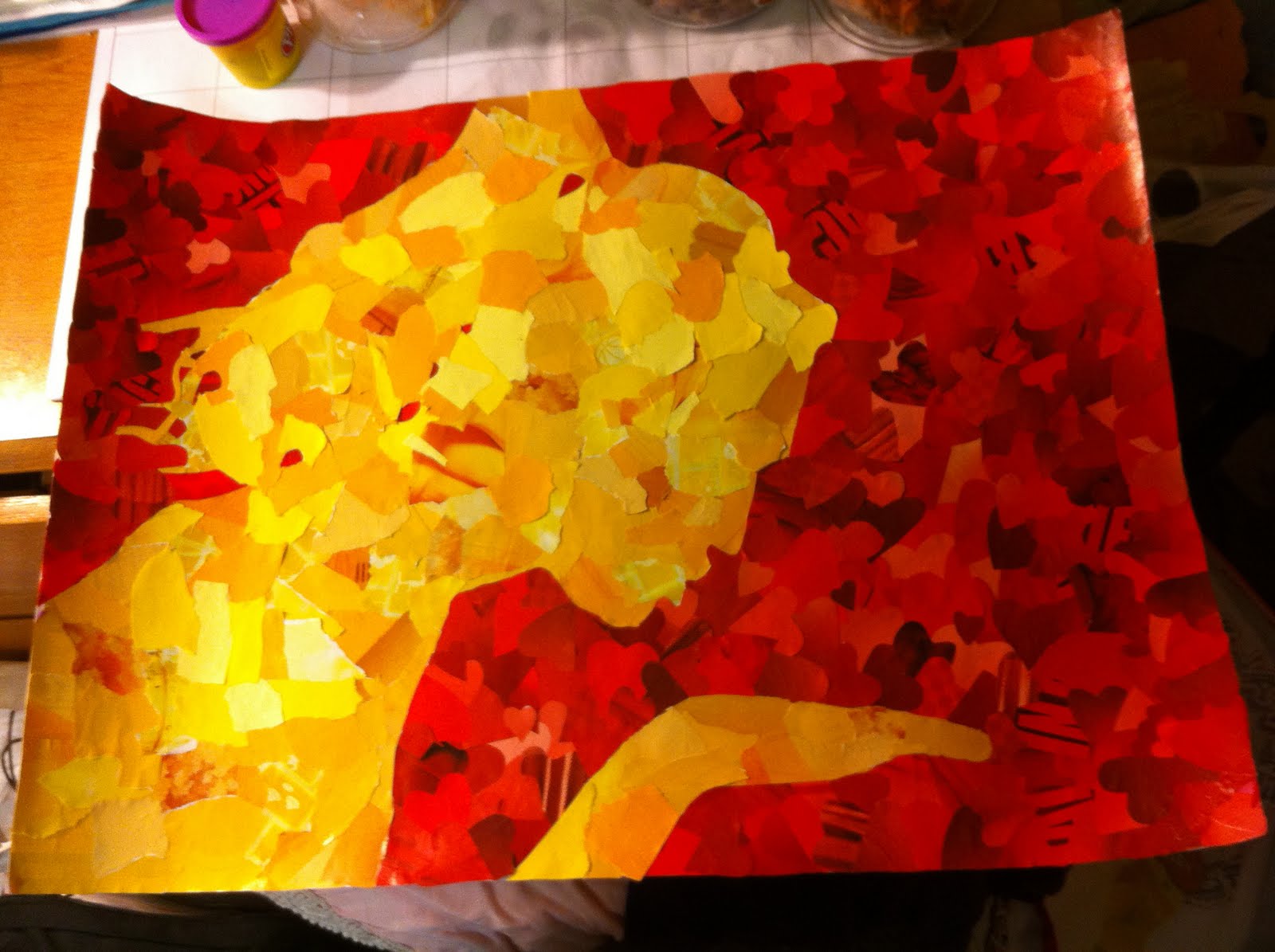
Past these two basic components, the background and the body, I also added a brain. The brain is the most important of this whole piece because it could easily be filled with light or dark pieces. Everyone has a combination of negatives and positives, sorrows and laughs, triumphs and defeats in their lives, and it is up to the individual which of these two sides are on his/her mind. Admittedly, both streams of thought entertain my mind from time to time; however, positivity wins for the majority. Positivity and strength. The colors I have chosen are not only bright, but also lively and strong. The words are meant to show these streams of thought, and they leak from the brain to the mouth. This is to prove the point that anything on your mind can slip out at any time, without warning. That is why it is best to keep your mind uplifting. As shown in my silhouette, what leads to the mouth is soon leaked into the world. I believe what you say CAN change the mind of another person, and thus the life of another person, and thus the world. This image is empowering, you impact the background, the world. My silhouette conveys my dreams; I want to leave an impact.

Silhouette Portrait- William Lamar


After reading the prompt for this assignment, I was immediately reminded of the "Great Man Theory", popularized by Thomas Carlyle, and its counter-argument by Herbert Spencer. Spencer wrote, "Before he can remake his society, his society must make him".

I thought about two opposing schools of thought: that individuals are products of the world around them; or who they are individually comes from within, regardless of environment. I feel that I am a mixture of both, being influenced greatly by the world around me, while also being an individual.

My self portrait says that while I am greatly influenced by my surroundings, I am also an individual. I tend to generally think of everything in a very linear fashion, so I chose shapes with well defined, sharp edges that were more cubic in shape. I like things to be orderly with everything having a well defined place. Upon extensive self-evaluation, I do not associate with any specific color any more than any other color. Emotionally, I think I am right in the middle, I don't really experience high or low emotional feelings. My color interaction is dynamic, so I included many colors in the shape of my portrait. My environment is very dynamic, I do not feel it could easily be given any specific shape, so all shapes in the background are organic. My outside environment has many aspects, everyone and anything can easily change it. Nature is rarely cubic and rarely has well defined lines. The colors in the background reflect how dynamic the world is, it is always changing and there are many colors. I reflected my personal interaction in the world around me by defining a line between myself and the environment, but not making that line well defined. The figure and ground can not be quickly distinguished from one another, they seem to blend together at first glance.

The most surprising thing I learned from this project is how much the outside world influences who I am currently, and who I will become in the future. I tried to think of how the outside world does not affect me, but in some way or another, I am greatly affected by it. If I was living in Alaska, I would be a much different person. If I was living in Africa during the 1600's, who I am as a person would change. I thought hard about who I am as a person and if my personality would change if my current surroundings were different.

Silouette Portrait- Mark Hirschenberger


My silhouette seems simple at first, but after looking closely it appears to be complex. This was done purposely. Picking out the colors and patterns I used for this project happened by accident. My first ideas were to pick out interesting looking colors or patterns in a magazine. I found all the normal shapes in various colors. None of these patterns or colors satisfied me. Then I noticed that there was one reoccurring pattern that appeared almost everywhere in magazines: text. By itself, text can be the most boring thing to look at. I placed the text from various magazines on an angle as the background of my silhouette. I was afraid that the text would be too noticeable from up close, but luckily enough just looks any ordinary pattern. From far away, the background looks gray because of the small black characters against the white background. I was really happy with the way this idea turned out.

I always like aquatic colors and textures when it came to pictures. To contrast the black on the white of the background, I wanted the actual silhouette to be full of rich colors. I made the bottom of the silhouette a deep, oceanic blue and made the colors gradually turn into green as the got closer to the top. It was very difficult to find the proper colors from the magazines I was using, but I feel like it turned out to be a more irregular pattern. This pattern happens to contrast the more uniform and normal pattern of the text.

Overall I tried to keep a theme of lighter colors since I usually always use a contrast of dark and light colors for art projects. I found out that I was still able to make an interesting contrast with the light colors I chose. My silhouette does not mean much to me personally; it was an interesting combination of colors that happened to turn out really interesting looking.


Silhouette Portrait


At the beginning of this project, I wasn't sure what colors I wanted to do or how I wanted to be portrayed. As I looked for blocks of colors in magazines, I found that I was skipping over a lot of blue (this is odd because my favorite color is blue). I started forming the idea for my portrait but still was unsure about my background. I know that I am disorganized and unclear in many aspects of my life and thoughts. However, I put on a calm facade to fool even myself sometimes. In tennis, I am constantly concerned every point and scared that I made the right shot selection. A player doesn't want her opponent to know that she is nervous so I must control my bodily gestures and face. This has carried over into my everyday life. As portrayed in the picture, the blue is very thin; this depicts that the nervous and disorganization can escape at any time. I guess I didn't realize how nervous and disorderly my thoughts and life were until I had to depict it. The shapes are amorphous in the portrait, though they look geometric at first (part of the facade). The background is black and white stripes that are geometric made of smaller geometric shapes.

I used reds and oranges for the center of my portrait to show bright distracting colors. This symbolizes disorder and confusion going on in my life. I used amorphous shapes to add more confusion in the mix. The blue border is thin representing the barrier that I use to hide what I really am dealing with. The blue color is the calm façade that I display when I am stressed and don’t want to let anyone know. However the barrier is thin showing that it can be disrupted at any minute, symbolizing my explosions of stress and disorder. The border is amorphous showing its fluidity depending on my mood at the day. The portrait appears geometric at first glance which is part of my disguise. The background is made of black and white stripes that are geometric and made of smaller geometric shapes. Of course black and white combination is intimidating and the stripes are similar to prison bars. I believe the society today has certain expectations that are hard to meet or are just silly to try to be. It is hard to break free from this societal prison that has pressure on me to act, be, and look a certain way. The smaller parts that make up the bars are symbolic of the smaller aspects and people that form and modify these societal rules. For example, actresses are (generally) all skinny, tanned, and wear a lot of eye make-up. Society expects us to be that way when we “dress up” to prom or formal occasions. However shows like Jersey Shore depict the casual views of society: too tight short shorts, tan, the “bump” hairstyle and muscular guys with gelled hair and who go through girls like alcohol. What happened to being yourself? Society has transformed all of us into something we may have never been. We are all imprisoned to some degree by society.