Showing posts with label Katie Zeiger. Show all posts

Tuesday, April 26, 2011

Katie Zeiger- Milk Product


Vintage Squeeze Milk is utterly delightful! This original milk product appeals to the"old soul" in us all. With the goal of aiming at a target market with forty-five or more years of experience drinking milk, it was important to change the way this product appears to the consumer, while keeping the pure and classic taste and quality of the milk, itself. After all, the important part of the bottle is what is inside, but the question remains, what can be done to get forty-five year olds to drink "Vintage Squeeze"?

This Product is far from ordinary, completely organic, containing a mere 100 Calories and an unusually high vitamin content per 20 Oz serving compared to other similar beverages on the market. Over the years, Moo Moo Milk Makers has take great pride in using only the purest milk from the finest cows to manufacture its line. This precise and quality guaranteed method of doing things has been the company's long-term key to success. The CEO of the company, Melvin Meyers, serves to exemplify the goals of his company. He strives to promote good health, longevity, and success through testaments to his product. Melvin wants other adults to experience the results that he has, and needs a way to attract this adult market to a classic milk product. Since the milk that MMMM puts on shelves is far from ordinary, why shouldn't the outside of the bottle reflect the quality of the product?

The first aspect of the design that I considered was the shape and quality of the bottle. It took some time to determine what type of bottle would be ideal for a more sophisticated market. This is precisely why I chose to use a wine bottle. This represents the"Vintage" part of my brand name. Since wine is usually a vintage, I used the style of packaging to determine the name of the product. It is important that the two aspects go together, so the consumer can associate the brand name with the packaging. The Bottle also reminded me of the the classic glass milk bottle that a milk man would leave. I thought this would appeal to the consumer because it represents something classic. The glass bottle is great for storage and does not take up much room in a refrigerator. Another important aspect of the bottle was that it is able to be sealed. This is very important, in keeping the product fresh and free of any impurity.

To accompany the first part of the brand name (Vintage), I chose the word "Squeeze". This reminded me of "freshly squeezed" orange juice, or lemonade. This points out the fresh quality of the milk. The "Squeeze" can also be thought of in a more literal sense. Think about where the milk comes from on the cow, and the process used to get the milk. Especially in the past, when life was more simple, manual labor was used to milk cows. The process of squeezing the utters to attain the milk from the cow was used. I wanted the Title to represent a simpler time, describe the sophistication and experience that the consumer has, all while pointing to the quality of the product in a humorous matter that only adults would appreciate. This is also where the slogan "... It's utterly delightful" comes in to play. It uses the anatomy of a cow to play on words and also state the origin of the milk. This tells the consumer what will happen when they drink this milk; they will be delighted and happy to be healthy.

The label features a sepia and dark tan color scheme to accompany the vintage theme and appeal to a more sophisticated target market. It also features a photograph of a man milking a cow in different sizes for aesthetic appeal, and so that the consumer can associate an organic process with the product. I used something similar to vintage, 1970s style writing to bring the consumer back to their childhood years. It was important to pick a font with some "flare" and that was fairly easy to read. The goal was to make a simple and attractive label that would highlight the product it encases. The beauty of the milk will be enhanced by the simplicity of the packaging.

On the lid to the bottle, I included a logo to support my product. Similar to a vintage date on a wine bottle cork, I wanted to place the product logo in a place where it could be seen by anyone that opens it. It includes a V and an S, to use the initials of the brand name, Vintage Squeeze. The letters are connected to each other and have ovals in the background, just like the label wrapped around the bottle.

The Vintage Squeeze brand speaks to the target market in a variety of ways, it utilizes simplicity, sophistication, humor, and class in order to appeal to the consumer. The outside of the bottle is successful in describing the quality of product inside.

Vintage Squeeze... It's utterly delightful!


Sunday, April 24, 2011

Katie Zeiger- Art Show Reflection

I really enjoyed taking a walk through the art show. It was very insightful and refreshing due to this campus not having much artwork on display most of the time. Seeing all of the different ways that people approach art and express their creativity are really interesting to me. Looking at all of the different projects, no two were exactly alike, and that is what makes art so special. I had the chance to see the art show last semester, and it was also very impressive. However, from what I remember, this year's show was slightly bigger and better than the last. The variation among projects was the thing that most impressed me. The shelter projects were incredible, but have a different appeal than painting, sculptures, photography, and drawings (also amazing). It is very cool to see all of the different styles of expression and approaches to art. A show like this is important because it shows that art can be found in many places and can be quite unexpected. Some things that stuck out to me were the numbered project series, the masks, the black and white series of photographs, the colored eyes, the 3-D tree made of magazines and cardboard, the furniture, and the shelters. For $10 I would be willing to by the chair that was crafted from an open suitcase. It had cylindrical concrete legs, and was given cushions. I liked that the suitcase was retro-looking, and seemed to be getting a "second chance" and a new purpose. The idea was creative and I thought the project looked well put together and attractive (not to mention it was made by a girl that lives down the hall from me).
It was nice to see my own work in the show because it gives me a sense of pride and accomplishment. Having people approach me to tell me that they were impressed with what I had done really meant something to me. I think that the art show allows students to see what amazing things their peers can do and how creativity can manifest itself in a variety of ways among the student populous a Butler. The Art show is important because it could spark interest in taking a course or trying something new. It gives students the opportunity to display their talent and hard-work for others to see, and maybe even the chance to sell some pieces too. The show provides an outlet for recognition, not only for students, but for the university's growing art program as well.

Tuesday, April 12, 2011

Katie Zeiger- Sculpture


My sculpture symbolizes the spatial property "balance". When I first began to look up pictures associated with the word balance, I saw scales, people with their arms out to their sides, balance beams, and acrobatics, and teeter totters. I thought all of these were interesting, but I was most intrigued by a picture of rocks leaning and stacked in order to create the ultimate balance between one another. This is where I got the idea for my project, I would cut out the pieces of cardboard and create a structure that would first balance by itself before gluing the pieces in place. The longer, thin piece that is balanced somewhat horizontally along the top of the sculpture reminds my of both an balance beam and a person finding balance by raising their arms out to their side. This piece was the most difficult to balance, and although it is not parallel to the ground, it was completely balanced at that location, showing that balance is not necessarily perfect or predictable. Also, I painted the pieces of cardboard that I used because the color green symbolizes balance, as green is representative of new balance in nature. Balance applies to life because it is usually something we strive for, mentally, emotionally, or physically. Balance, like our lives, is always changing and results in a new point of stability. Sometimes, in the absence of balance, things can be unsettling or stressful until we regain our footing and stability.

Thursday, March 31, 2011

Katie Zeiger- Mini Saga

There was once a famous vocalist who liked to wear snakes around her neck and dress like a school girl, her name was Britney. She rose to the top of the charts, but fell victim to the pressure fame. Now, her future can be summed up by the eternal flame.

Wednesday, March 23, 2011

Katie Zeiger- Silhouette Portrait


Working on this project seemed to help me to make sense of my own life. It helped me to see and better understand how I function internally and externally. Through color, shape, size, and pattern, I was able to discover so much more about myself than I would have been able to do through a "normal" black silhouette. I was able to see how I organize my thoughts, the emotions that I convey to others and myself, and also how my internal and external worlds tend to disagree with each other on a regular basis. I wanted my work to represent the daily calm and chaos, ups and downs, and other contrasts appearing on a daily basis in my life.
My portrait does not focus solely on a certain color, but rather a color scheme. I used warm and cool color schemes to exemplify the differences between the way my mind works and the way that I appear to others on the outside. I chose warm colors such as red, orange, yellow, and purple to explain that I am energetic, warm, and bold on the inside. I also leaned towards warmer colors for the figure party due to the fact that my red hair is very representative of my personality. It is intense, loud, unique, defining, and is supposedly linked to temper. I believe warmer colors can be used to describe my occasional fiery temper and inner strength. I found that some of the meanings of the warm colors I used are energy, desire, vigor, leadership, enthusiasm, fascination, determination, creativity, intellect, happiness, instability, and spontaneity. It is surprising to find out that almost every description in representative of how I see myself. For the ground, I choose cooler colors such as blue and green to point out the contrast between the way I see myself and the way that others see me. I believe that I give off a more relaxed and calm outward vibe to others. I try to voice my opinions to others, but usually hold back much of the emotion that lies within. I try to put on a tranquil front even when I am feeling something entirely different. I also picked these colors because I associate them with nature, something that I have a deep connection to. The cool colors symbolize harmony, stability, endurance, peace, trust, depth, confidence, integrity, and understanding. I believe these words can accurately describe the relationships I have with others. I work hard to be in harmony with others and to understand them as well.
Thinking about shape, I used both geometric and amorphous types in order to keep in mind the contrast between "inner" and "outer" self. Inside the figure I used the exact same geometric circle repeatedly to highlight my inner struggle for organization. The circles are the same size in order to keep the focus more on the color used in the figure. Since there are so many dots used here, they also describe a constant, never ending high volume of thoughts and ideas circling around inside my head. In contrast, I used more organic and amorphous shapes in the ground of my work to show that no matter how hard I try, the spontaneity of the outside world will be ever present and ready to disrupt the organization that I have in my life. I used some cool colored circles to tie the ground and the figure together and show that through contrast and differences, there will always be a connection and common ground between the two.
Looking back at an early decision I made to angle my figure on the corner surprised me later on in the project. I can see that my figure appears to be leaning forward when the poster itself is not tilted. This reflects something that I have learned in my T'ai Chi class this semester about the concept of 'yin'. I appear to be bowing, somewhat shy, and even vulnerable, all due to my body angle. It was interesting to be able to relate posture to the silhouette because it again serves to describe a yielding and shy attitude that I sometimes take on.

Monday, March 7, 2011

Katie Zeiger- Fashion/Color Reflection


1.) From our small group discussions in class, I learned that everyone has his or her own opinion on style and fashion. A person may only wear a certain designer, brand, color, fit, or cut, depending upon their acquired preferences, comfort, public opinion, occasion, and even by the style choices of close friends, acquaintances, and family. Although many people may choose to shop in the same stores, mock styles worn by celebrities, or insist on wearing the same outfit as their closest friend, no two people have the same style. The same shirt can be worn in a variety of ways: buttoned, unbuttoned, pressed, wrinkled, lose, tailored, tucked in, and the list goes on. Little differences usually appear from one closet to the next, and definitely from one body to the next. Clothing can lie differently on my body than it does on someone else's and color can have a different effect against fair skin tones than it does against beige or olive skin tones.
Working with my group was an insightful attempt at understanding what others base their fashion choices on. A common trend in our discussion was comfort. Especially when choosing an outfit for class, the number one requirement was comfort, followed by convenience, which usually lead to choices like sweats, t-shirts, or jeans. Also, in my group, we discussed the relationship between weather, mood, and fashion. We all agreed that we are can enjoy fashion and color choice more when the weather is warm. A person is not constantly trying to stay warm (with layer upon layer) in the spring and summer months, consequently giving them more choice in their wardrobe. Since my group consisted of all girls, we agreed that we especially enjoy summer because it gives us the option to wear dresses, and not freeze as a result. Winter and fall are dark and depressing months due to the cold and less daylight. Clothing is usually darker in color and more subdued during this time of the year. We talked about not worrying so much about how we looked as we did about staying warm.
For me, I realized that I share similar opinions with others around me pertaining to comfort and seasonal choice. I realized that I like to dress up a little bit more than others at times, but that is primarily due to the fact that I find those clothes just as comfortable as sweats and I want to look put together because it helps me 'feel' more put together. I tend to lean toward solid colors when others may choose patterns and usually prefer darker pants and skirts, and lighter and brighter colors in tops, sweaters, and accessories. I generally choose brown as a neutral because it is not as harsh against my fair skin as black tends to be. I also tend to stay away from pastel colors and beige, because they tend to wash me out.

2.) The line that I came up with for Mr. Laurent is called 'Glint'. I came up with this name because I want to it to describe the customer wearing the clothes, they will be a "tiny, quick flash of light" to a passerby. The goal of my line is to be subtle, but also to be attention grabbing at the same time. It is important that the clothing highlights the natural beauty and 'light' within each person wearing it. So to promote a glow in the customer, comfort would be key, as would be looking put together. For this line, I would choose a neutral color, like brown, and accompany that with a deeper purple and a mint green. I think these colors look flattering on a variety of skin tones, and provide a mix of darker and lighter shades that go well with brown. I want my line to represent my personal likes and fashion sense. It should be laid-back, but classy, slightly preppy, feminine, soft, and simple. Also, the occasional hint of sparkle or embellishment would be encouraged, and fitting due to the name of the line. 'Glint' could be worn by high-schoolers with a more mature style through the late twenties or early thirties. This top would work perfectly because it complies with the color scheme and has some added embellishment. It could be paired with a brown skirt or sweater.

3.) In Several years, I hope to be working as a speech-language pathologist or physical therapist. These careers require mobility and interaction with the patient, so I would need to look put-together, professional, all while remaining comfortable. With this in mind, a typical work outfit would consist of a black pencil skirt, a wedge heel for additional comfort, a colorful, flowy top (tucked in), and a cardigan. An outfit suitable for play would be dark wash, straight-legged jeans, a pair of flats or sneakers(with a pop of color), a solid color v-neck t-shirt, and a cardigan. I would use accessories as a way to incorporate embellishment or shine.

Wednesday, February 23, 2011

Katie Zeiger- Public Art Pitch Reflection

1.) Out of the six presentations that I witnessed, as a Butler alumna, I would choose to fund the "Butler Bubble" Wand project. The thing that I like most about this piece of artwork is that it is thought provoking and controversial. Although some people describe the "bubble" as being negative, I think that the "bubble" describes the close-knit community that Butler provides for its students. Also, to an outsider or visitor, this piece of art would stick out while providing something unique to remember and ask questions about. The idea for this project is ideal because it would be fairly inexpensive compared with some of the other projects, and everything from the size, subject, color, and controversy associated with this piece of art, would catch the attention of the public.

2.) I think that the "Jungle Jim" project would require the most funding due to its size and the technology required to create and operate the circular treadmill. I believe that this project was by far one of the most innovative ideas and definitely makes sense for the location it is in; however, the starting costs and the cost of maintenance would prove to be rather expensive over time. It would also cost quite a bit to protect the "Jungle Jim" from the outdoor elements, as well as from vandalism.

3.) If I had the Chance to revise my group's pitch I would not do much to change things. I might have practiced a little more on exactly what to say, or used the photo shopping tool to place our models in a photograph of the actual site. I would keep the mix of sketches, clues, maps, and models. I believe that our passion for our proposal and our clues were the things that made our presentation stand out. Our enthusiasm gave us the confidence to relax and explain everything about the scavenger hunt and what it would do for Butler. It was fun to read the clues and have the class interacting during our presentation.

Monday, February 21, 2011

Public Art Project


Jamie Kostecki, Kathryn Graham, and Katie Zeiger

Blue's Buried Treasures:

Public artwork provides an excuse for people to visit the site in which it’s displayed. It would only make sense to integrate public art into a college campus in order to motivate and draw people onto campus. That’s exactly what we’re attempting to accomplish with our five installations of artwork on Butler University’s campus that are site specific, useful, and entertaining. We call our project Blue’s Buried Treasures, and it consists of five partially buried objects that serve specific purposes and are quite large in size; we drew inspiration from Claes Oldenburg’s buried bicycle. The pieces include a rubber paw print, a graduation cap, a pencil, a bone, and a basketball. Each artwork is accompanied by a sign that contains a clue guiding the participant in a bit of a scavenger hunt around campus meant to show off some of its important sites.

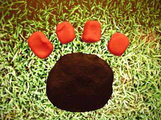
The hunt begins with a giant paw print with a ten-foot diameter on the main Mall. We understand and acknowledge that many students utilize the Mall to play various sports or to do homework, so we envision the paw print being on the grassy area in front of the BU sign and behind the concrete Butler University sign. This ensures that it will not interfere with the many activities that the Mall plays host to, and it will even add to them. The paw print will be made up of the rubber material that many playgrounds utilize. The material looks like tiny cubes of blue rubber, but they’re all stuck together to provide a surface with great traction and durability. We figured that the Mall would be a great, central starting point for the “tour” of campus.

The sign on the Mall next to the paw print then leads partakers to the giant graduation cap located at the back of Irwin Library near the ResCo parking lot. The cap would be about ten feet tall and would provide comfortable shade for anyone interested in cooling off. This particular structure would be made out of black fiberglass, to ensure

durability, and the tassel would consist of rope strong enough to support 300 pounds. The tassel would serve as a helping hand for anyone who would want to climb on the structure. We placed the graduation cap near the library because students obviously have to put in a lot of time and effort into their school work in order to graduate, and many Butler students choose to study at Irwin Library.

After the library, visitors are guided to the grassy area in between the Pharmacy Building and Lilly Hall where a ten-foot-long bench lies in the form of a pencil.

The utility of this structure is obvious enough, and it would be a foot-and-a-half tall to insure accessibility for children. We picture the bench to be made up out of painted teak wood. We thought it’s important that visitors to campus see the academic buildings as well, and the pencil bench would lead them right past all of the main academic buildings. We associated a pencil with homework and academics, so it was only natural that this particular area would serve as the home for this structure.

The next site would be the Holcomb Gardens: quite the vision in itself! We thought that a partially buried bone that doubles as a slide would be a fun addition to this already playful

area. The Holcomb Gardens attracts a lot of families, and we thought it would be an excellent idea to provide some entertainment for the younger visitors as well. The slide would consist of off-white colored plastic in order to resemble the appearance of a dog’s prized possession. This specific location for the bone also has comedic value in that dogs typically choose to bury a bone in a garden.

The last stop in our scavenger hunt tour is Hinkle Fieldhouse. Our basketball team’s NCAA journey was, and continues to be, a great accomplishment for a school our size; we feel that it’s important that something be created to remind everyone of Butler’s achievement.

An eight-foot-tall basketball made out of burnt orange colored plastic would lie in the grassy area between the HRC and Hinkle parking lot. Stairs in the back of the basketball would provide a fantastic scene for picture taking with Hinkle Fieldhouse in the background. Again, the relevance of the structure to its environment is self-explanatory.

Our public art would greatly add to Butler’s campus. It would attract families from surrounding neighborhoods and encourage them to enjoy our campus as much as we do. It would also serve as fun entertainment for prospective Butler students when they visit our campus. Perhaps it could help to seal the deal in their decision to attend Butler! Public art on campus promotes our Liberal Arts education—yet another one of Butler’s unique qualities. Each structure not only would look nice and add to our campus’s physical appeal, but they all have specific functions that they serve. From a bench, to a slide, to a photo-op promoter, every one has interactive qualities that appeal to a wide audience. Butler definitely could always use some more art, and our public art installation would be the perfect solution.


Tuesday, January 25, 2011

Katie Zeiger- Paper Value Project

I increased the value of a regular piece of paper by creating a awesome paper hat! This could be used for entertainment, imagination, or utility (maybe you really need a hat). Although this particular hat is quite small, it would work for a small child, doll, stuffed animal, or even a pet! I can remember making similar paper hats in pre-school, but instead out of newsprint. So, in a way making this also had some sentimental value to me, taking me all the way back to the age of 4.