Showing posts with label Lauren Bacon. Show all posts

Tuesday, April 26, 2011

Brand/Package/Label Project - Lauren Bacon


As I'm sure Dr. Skinner already knows, this type of project is a dream project for me. If I could have, I would have dedicated all of my energy into developing a new brand, the strategic plan, and implementation. However, to keep my sanity and to be able to balance my other courses, I limited myself. So, the first step I took was to narrow my target market and do some research. I first focused on Baby Boomers. This generation was born between 1946 and 1964. This year, the youngest will turn 47. Less of this generation is considering completely not working upon retirement, leaving 89% to still continue to hold a job. Additionally, this generation is becoming more tech-savvy with 82% using the Internet. Moreover, they held most of the nation's discretionary income in 2009 with almost 3 trillion dollars (Miller & Washington, 2011, pp. 205-206). After reading more about the generation, I chose to focus on upper-middle to upper class individuals who are cultured, stylish and young at heart.

My first idea was to separate males and females and do a "his & hers" type milk with color coding, although the same logo, but with different tag lines. After drawing up a few sketches of color schemes, I could not think of an appropriate name. So I thought back to my target market and chose to focus on the young at heart aspect. This brought me to the idea that this generation is aging, and some would prefer to slow the process, which reminded me of the Fountain of Youth, or FOY. However, this sounded too much like soy, so I tabled that idea as well and thought of words that seemed related to the Fountain of Youth. The word elixir is associated with potions or mixtures to provide or conserve youth. Then I decided to focus on the color white and went with Ivory Elixir. However, this reminded me of Ivory soap, so I decided to play with other languages. I settled on French because French culture has a fashion forward, chic, classy culture coupled with the old European style. Thus the name Elixir d'Ivoire was born. I chose a deep red and gold [it looks yellow in the drawings, but would actually be metallic gold] paired with black because it looks high class and catches the eye. I Googled French fonts and found the font I chose for the logo. I decorated the glass bottle with two French symbols = a fleur de lis and the Eiffel Tower. The tag line is "Who knew milk could be so chic?" playing into the idea that this milk is cool. This will be a more expensive brand, but since the target market has a large amount of discretionary income, they will not mind paying the premium. Moreover, they will appreciate the perception that the milk is "cultured" since it has dominant French aspects. Finally, this milk will be sold in larger cities, where people like to stay on trend and are more open-minded.

Works Cited
Miller, R.K., & Washington, K. (2011). CHAPTER 38: BABY BOOMER CONSUMERS. In, Consumer Behavior (pp. 205-207). Richard K. Miller & Associates. Retrieved from EBSCOhost.

Monday, April 25, 2011

Art Show - Lauren Bacon

When I first walked in to the art show, I noticed the furniture [I think it was furniture?] made out of what appeared to be trash or household items. I love seeing art created from simple materials. It shows the beauty in things that would normally never catch your eye. I then walked around and was intrigued by the photography that were close ups of faces. I loved the how the painted faces portrayed different adjectives. I could see how the colors correlated to which word the artist chose, especially after my research of what different colors represent from our silhouette project. Plus, I am interested in photography in general. In high school, I took a few photojournalism courses and one of my biggest regrets is not continuing pursuing the hobby. Ironically, I recently was on stumbleupon.com and stumbled upon and it was a tumblr account of someone who posted pictures with a similar technique of painted faces with strategically chosen colors. This exhibit reminded me of the site. I would have definitely paid $10 for one of these snapshots.

To be completely honest, it was almost surreal to see my artwork displayed in the art show. I always doubt my creative ability, and I was actually incredibly proud of my work. But it was also shocking, especially when some friends who went to the show not knowing my work was going to be displayed sent me texts commenting on how they have no idea I have any artistic inclination. Their kind compliments boosted my confidence, and even helped me have to courage to tell some of my other friends to go check it out, not only to support me, but also all the other student artists. This is one reason why the art show is valuable to Butler students. I'm sure there are many other shy, not-so-confident individuals who want to be creative or already are inherently talented, but never get any recognition. Small compliments go a long way, and personally, I'm more confident in my creative skills and am sure that anyone could benefit from encouraging words. Who knows, perhaps the next Picasso hasn't been discovered because he doesn't have an outlet to display his work and hear the positive reinforcement.

Tuesday, April 12, 2011

Twist - Lauren Bacon


Our group's adjective to portray in a cardboard sculpture was twist. This actually posed as a challenge to me because when I think of 'twist' I think of flexible materials similar to fabric. Cardboard is incredibly stiff, and since we had a limited amount I wanted to make sure that I did the project right. There was no room for error. So, I began to brainstorm things that seem to twist. Initially I thought of a twisty tie that closes a bag of bread. I cut a small, thin strip of cardboard and began to twist it to see what would happen. Unfortunately, it broke, so I tabled that idea. I then thought of creating a tornado. When I first started gluing pieces together, I realized a skinny base would not be able to support a wide top because cardboard is so heavy. So, I decided to just keep each layer at the same width and see where the project led me and how the final project could inspire me. After looking at what I created, it reminded me of two very different things. First, it looks like a scrunched up piece of DNA that is missing the inner chemicals that create the ladder. Second, it looks like a wishing well. Typically, I do not think of a well twisting, but because of the shape and depth, it reminded me of the creepy well in the movie The Ring. The Ring is an incredibly creepy movie, or in other words "twisted."

Thursday, March 31, 2011

Lauren Bacon Mini Saga

Rose missed the buzzer shot much to the dismay of his team. They left him behind with his embarrassment when Yokhim appeared and invited Rose to drown his sorrows. Rose couldn’t contain himself, and was over zealous with his indulgence. When asked, “Rough night?” Yohkim answered how he could relate.

Friday, March 4, 2011

Lauren Bacon - Fashion/Color Reflection

The conversation about fashion sense was interesting for me because I was in a group with Ryan and Mike. All three of us had relatively different fashion sense. However, both of them were less concerned than I was when it came to getting dressed for the day. Rather than base my fashion sense on comfort, I usually consider what I will be doing for the day. It was also interesting to discuss our own fashion sense because style varies so much between males and females. Even though fashion sense and style vary between males and females, I had one color in common with Ryan (blue) and one color in common with Mike (black).


I chose to name my line "Sass&Class." This is because I always try to wear relatively classy/classic clothing paired with one or two elements that are completely opposite. I do not like to match 100%, adding a touch of sass to my style. Being limited to only three colors was hard for me, but I ultimately decided on purple, blue, and black because purple and blue are my favorite colors, and black always looks professional. I decided that young up and coming individuals would be the target market, skewed closer to the early to mid 20s range. To the left, I uploaded a picture of my favorite pair of kicks. Most people do not expect me, a relatively girly, put together individual to wear a pair of kicks so bold and masculine. These could be in my line of clothing if the colors were changed to purple, blue, and black. I typically wear these shoes with jeans or leggings and a toned down conservative shirt, displaying my previously mentioned combination of class and sass.

Hopefully, I will be working in the advertising agency industry. Thus, I will be able to wear casual, trendy clothes to the office. A typical outfit in the office will be jeans and a trendy top with fun heels. However, when I have client meetings, it is expected to dress according to how the client dresses. So, for some meetings I will have to either be in business casual or business professional, depending on who the client is. Most likely much of my work and play clothes will be the same wardrobe based on the laid back attitude of the industry. Plus, I love advertising, and working in an agency is a goal of mine, so work and play will combine often because I will (hopefully) greatly enjoy my career.

Monday, February 28, 2011

Public Art Project- Lauren, Ali, and Kaylin


Lauren Bacon, Ali Harre, Kaylin Beckwith

PCA 261

Skinner & Rao

Public Art Project

Haphazard Hallway

The first day brainstorming for our public art proposal, the three of us agreed on four main criteria: the project needs to be huge, related to Butler, interactive, and playful. We also loved the idea of making it tantalizing, similar to the piece we saw in the atrium of the IMA. Additionally, we wanted to create something that goes against basic rules of social norms, instilling a “stick in to The Man” mantra.

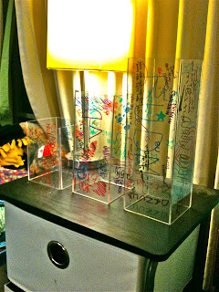
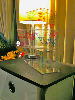
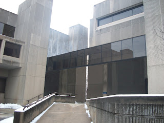
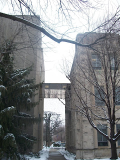
After creating and a list of a variety of ideas, we elected to make the idea of converting the catwalks that connect Jordan Hall, Gallahue Hall, and the pharmacy building from their current materials to glass. On each end of the catwalk there will be baskets that hold a wide variety of colored dry erase markers. Students, teachers, staff, and anyone else who walks through these catwalks has the opportunity to draw directly on the walls. This goes against what we are taught as children—no writing on the walls—adding an interactive aspect to the project. Moreover, these can be used for student art and also classroom interaction. Classes will have the choice to use the catwalks as white boards rather than being in a conventional classroom setting. This class interaction helps relate the project to Butler. Another way this project will be related to Butler is that any student organization can publicize their events on the glass walls. Also, the project is very playful—not only because anyone can partake in the artwork, but also because of its juxtaposed position on campus. It connects old, antique-looking buildings with a modern, not standard idea.

After creating our idea and developing the concept, we began brainstorming a name. Because the nature of the project is to be random and does not require any organization, we chose “Haphazard Hallway.” This suggests a crazy, random passageway, and also piques interest. Moreover, there will be no rules related to the project, so anyone can erase or write over someone else’s artwork.

Overall, we are very excited about Haphazard Hallway. We love the idea of going against social norms and interrupting a traditional aesthetic with a modern twist. Additionally, Haphazard Hallway incorporates our criteria of being playful, huge, related to Butler and interactive. Most importantly, we love the ability of involvement by any individual, bringing the opportunity to express oneself directly to the individual.

Wednesday, February 23, 2011

Lauren Bacon - Public Art Pitch Reflection

1.) I would be most inclined to fund the "Picnic on the Mall" public art project. I love how the chalkboard/pewter statues are set up to be interactive and that students/alumni/visitors can add to the art. The ability to change the art intrigues me. Before this course I always thought of art as something to be looked at and admired. Breaking this mold by adding an interactive aspect challenges typical norms. Moreover, the statues are placed in meaningful places throughout campus, drawing attention to the beauty Butler holds.

2.) Out of all of the proposals, I would think the "Ask Blue" project would be most expensive. First, the purchase of the touch screens will be very expensive. Second, the upkeep and repairs of the touch screen technology will also be extremely expensive. Plus, since there are four locations, this increases the cost. Finally, the physical materials to create four statues of the proposed size will add to the cost.

3.) The only thing I think I would revise would be to try and find a way to make models of the academic buildings and actually show how the catwalks would look when connected to them. We attempted to do so with cardboard, but it looked cheap and took away from how compelling the plexiglass models of the catwalks were.

Wednesday, January 26, 2011

Lauren Bacon - Paper Value Project


When I was younger, my family and I went on road trip vacations relatively often. These could be week long trips driving cross country or just a short weekend getaway to a neighboring state. Once my brother and I were old enough to read, my mom bought us what we thought was the coolest thing ever to pass the time - books of Mad Libs. This could easily entertain us for hours of our tedious drive. Thus, I decided to create my own Mad Lib to add value to this piece of paper. This adds not only entertainment and creative value, but also comedic and learning value. It is important to test and expand your vocabulary as a child, and this is one of the best ways to do so other than reading. Plus, it is fun, and hilarious stories can be created.