Showing posts with label Lori Andriot. Show all posts

Tuesday, April 26, 2011

Milk Project-Lori Andriot


For my project I knew that I wanted the name be what drew the customers to the project. With the age specifications of this project there was a need to be delicate, to ensure that no one was to be offended by naming of the product. If there’s one thing that I’ve learned in this class, in the marketing aspect, it’s that the audience, the buyer, is everything. That being said I chose to find a name that went of the words classy and sophisticated to describe the group of people that is our target audience. I also wanted to tie in of course the dairy aspect of milk in to the name. I came up with many things, the runner-up being HmooO, but alas I decided to tie in one of my favorite literary techniques; alliteration. And thus the inception of the name Sophisticated and Smooth, this title brings in two different types of taste. The first is the taste of the target audience, with is sophisticated, being the worldy people that the baby boomer generation is they know what they want out of life and thus have a distinct taste. It also ties in the smooth texture of the milk, it is as well witty and has the “moo” bolded and focused in on in the title.
After finding a title for what the beverage would be called, I had to come up with what the outer product would look like. I didn’t want anything too childish, I’ve seen many a products fail due to the fact that their packaging and their target audience were contradicting one another. However, since the beginning of this project I knew that I wanted to incorporate, somehow, the traditional glass bottles that you see in classic television shows, movies, cartoons and even, in my case, stories from my parents. And thus I decided to use said traditional glass bottles, I even decided to take it a step further and decided to make these bottles recyclable, so those that buy the bottles can take them back to their local grocer, they would be sent back to Moo-Moo Makers where the bottles would be sanitized, refilled and sent back out for purchase. This not only cuts down on production cost for the company but it also helps the environment by being recyclable and thus eco-friendly.
But what does the bottle look like? Well, choosing to go with the classic design of the glass bottle, I didn’t want the design to clutter the simplistic styling, which is why I choose to keep the sides blank and put all information on the front and back of the bottle. This is also to ensure the customer is not confused, since the bottle is transparent, with all the words and details on the bottle. It will also be easier to read this way.
On the front of the bottle there is the label, which is a composite of a cow face with the word smooth being made up of the nostrils and the “&” sign connecting it (by being a bull nose ring) to the word sophisticated. The front also has the logo on it which is “Have a pint of cold, smooth milk” which is playing off of ‘a pint’ which in Britain is 20 ounces, which is the amount of liquid in my product. As well there is also Organic Skim milk on the front so the customer knows what they are buying, instead of having to search all over the bottle to find what exactly they are drinking/buying.
On the back there is of course the nutritional information, to ensure that those buying this product know what they are drinking. It is also something that has to be on the bottle. On the back are also the ingredients, and the address to mail comments/questions/concerns. This ensures that the customers can stay in touch with the company and they can help make the company better, it’s all about the customer interaction. And lastly on the back there is a witty description, I believe that the target audience will find this description humorous and that will hopefully be an incentive to take this product home with them.
All in all, while the mark-up for this product may be simplistic, it is traditionalistic and this is a quality that I believe the targeted audience will appreciate. This product is all about the quality, it is about getting the customer to try our product and then become loyal to it because it is beneficial to their life. This product is sophisticated and smooth just like the customers that the Moo Moo Maker company made this product for.

Saturday, April 23, 2011

Lori Andriot- Art Show Reflection

I was surprised by how much I enjoyed the art show. It could have been because I felt that I was a part of this one, but during the previous one I was not as invested. When I say that, I mean that unlike this time where I took my time to walk around and see everything that was around me, during the first semester show I just perused on through and went on my merry way. There was something different about this show however, and like I said it could have been the fact that I was actually a part of it, however I believe that what drew me into this one was, understanding how much time artist put in to being a part of something like this. For example I cannot imagine the time that was put into the yogurt lounge chair, and that of course was definitely one of the first things that caught my eye in the show, mainly due to its magnitude and what it was crafted of. After getting over that initial shock I made my way up to the front of the show and found the black and white photographs that truly spoke to me. I remember reading the artist description of her work about how she felt like an old soul and how she felt disconnected from the modern world, and that spoke to me like no other piece of art there. These pieces are definitely something that I would actually pay more than $10 for, I could actually see them being something that I kept around for quite some time. But I also think that what I like about these pictures most is that I could see myself taking something like this. When I did darkroom photography in my high school, my teacher knew me for my high contrast and that’s what I REALLY loved about these photos. Aside from my love of these photos, I really would also pay for the “Painted Windows” series. I thought that these photos as well were beautifully taken and also held true meaning. Which makes me wonder what it was like for these artists to show the world something so dear to them, for me I was a little apprehensive about the whole thing. I really didn’t see what I had done as art but now that I look back on it, I’m proud of what I’ve achieved and I was proud to show it to my roomie when she wanted to know what else was mine, aside from the boat. And you can call me conceited, but I really liked it when someone would text me and congratulate me on my work, it made my day. And overall, I really enjoyed being a part of not only this art show, but also of this class.

Tuesday, April 12, 2011

Sculpture- Lori Andriot

My group had the word ROCK, which is actually more difficult than I thought it would be. I guess that’s because in modern day society we don’t use the word to mean the actual motion but it is instead used to assert how spectacular something is (I.E. That concert rocked.) Outside of this saying there are vast arrays of things that rock, boats, rocking chairs, rocking horses, all which would be a challenge to construct. However, with the word that I was given I constructed something that compares to a sail boat. Boats do in fact rock, when on the water, but it could even go along with the saying “rock the boat.” That is how I’m connecting my word to the world around me, through this saying there is a sense of conflict in life, which in fact is the way of life, but is also true of boats when being rocked, thus they too are in conflict. Aside from this though the top swirl-like things, can be seen as symbolizing ‘sea-sickness’ which happens because of the rocking motion the water makes against the vessel.

Thursday, March 31, 2011

Mini Saga Story


John was not having a good day. He slept though his alarm. Missed class and a final. But Andre had John’s back and created chaos in the class. He yelled out “I don’t want to take it either.” The protest in front of Jordan was enough to cancel the final.

Monday, March 28, 2011

Silhouette Project


This silhouette project helped me take a deeper look into who I am, and how I have changed within the past couple years of my life. I’ve always known that I am an “older soul,” I’ve never truly believed that I was born in the proper time period. Even when I talk to others about my personality and my “inner spirit” everyone comes to the agreement that the personality traits that I possess are not characteristic within modern-day social mores. Alas that is why I chose to do the foreground of my silhouette project in a classic black and white style. Aside for this style being a classic, tradition style it also reminding me of one my favorite past-times, photography. My love of photography, particularly my love of black and white photography is the reason why I chose to construct the foreground out of circles. To me this overlapping of black and white circles reminds me a lot of a camera flash, that bright light that has the ability to cut through the darkness and produce something that can last a person a life time. And that is what I have learned about myself through this assignment, that I have the ability to be that ‘light’ on someone’s life (as clichéd as that may sound). Alas, I have yet to talk about the background of my silhouette. It as well plays off my old soul, the lines of color are not random, they are in a pattern similar to that of television that has lost its signal. Not only does this show my affinity for the modern technological era, but it is also symbolic of me being out of touch with the modern era. I will be the first to admit that there is a disconnect between myself and the modern world, much like the signal of a television being lost. More importantly I chose to do the background in a decorum of rigid geometric triangular shapes, this signifies the rigidity of the world out outside of the bubble that I like to call my life. Overall I can say that I have learned a lot about myself through this assignment, more importantly I’ve learned that although there may be a disconnect between me and the technological world, I can still be a presence in it and should not be afraid to be myself.

Tuesday, March 8, 2011

Lori Andriot- Fashion/Color Reflection


1. During our group discussion I learned that many people like to still with the basics: white, black, grey. Probably more or less for convenience that for a lack of wanting to have color in their lives. Of course there were people in the class, and even in my small group, and really enjoyed wearing color, of all sorts and variation, as much as possible. I also noticed in my small group than comfort was something that was essential in a wardrobe. Whether it's a love of yoga pants, or uggs, or anything else that personally comforts you in someway, it is sought out in fashion choices. Which I understand, this is why I fight into the majority. I have more neutral clothes in my closest than anything else and although for me I don't find comfort in sweatpants (don't own a pair), I do find comfort in such things as jeans and v-neck t-shirts.
2. The clothing line that would essentially be inspired by my fashion decisions would, I hope, be named after me. And I really don't mean that to be conceited at all, however I think that were someone to design an entire clothing line around my choices, that it would only be fitting to name it after me. However if that were not to go over to well, then I would like it to be named the "colorful conundrum." This name would be fitting, because there would be a puzzling lack of color. I essentially don't wear color- except for blue. So this clothing line would be fashioned out of grays and blacks and whites, and blues- with hints of other colors. It would be a classic line of clothing that could potentially be worn by a person for a good length of their life (that is unless their clothing style were to change). The picture that I attached is my formal dress, and it holds an abundance of the things that I personally look for in clothing. Its classic, has a very retro (1940's) vibe to it, which personifies my old soul, it also is very neutral in color, yet at the same time is hard to describe in color. Alas, this clothing line would be filled with very similar options to this one, and it would be geared toward a mature audience. I'm not going to but an age limit on it because I don't feel that maturity can be described by age, but never the less those that are comfortable and mature enough to wear this line can and hopefully will.
3. In several years I hope to be a pharmacist so a typical work outfit would be business attire. Which I LOVE. So typically I would be wearing business pants and pencil skirts and nice blouses and button-down shirt. For play outfits it would probably be very similar to what I wear on a typical day now. Jeans, boots or flats, and v-neck shirts, because that's what I'm comfortable in.

Wednesday, February 23, 2011

Public Art Pitch Reflection- Lori Andriot

If I were a Butler alum able to fund one of the project that were presented on Tuesday, I would definitely choose to fund the "Ask Blue" project. I feel that with technology being as advanced as it is in this day and age, there is no reason for Butler not to go forward. I feel that this project would also increase the flow of communication on Butler's campus and thus make the largest impact to the student population. This project holds the ability to grow with the students on campus.

I think that the "Jungle Jim" project would be the largest to fund. As great of an idea as it is, the ability to fund this project would be rather difficult. I think that it would be problematic to fund the concept of an on running industrialized treadmill throughout tolerable seasons. It would also cost a lot to pay an energy bill for a constantly running treadmill, and would cost a lot for upkeep.

I would revise our presentation. Although we had to chance the way in which we presented last minute due to the loss of a group member, I think that we needed to extend on the benefits that our project would bring to campus. I also think that perhaps we should have added on to our vision of the project, because I do not believe that it came across as we envisioned it.

Monday, February 21, 2011

Public Art Project - Nicole, Lori, Marissa


Picnic on the Mall

As a group, we believe that Butler University would greatly benefit from a work of public art that truly represents the everyday lives of the people who Butler exists to serve: its students. This belief served as the starting point of the public art project that we would like to propose to the Butler Community: Picnic on the Mall. This piece will include 20 individual statues, placed strategically among those areas of campus which students frequent most and representing the activities that a Butler student may engage in as he or she goes about a typical day on campus. Although the statues will be dispersed, a portion of them will be centralized on Butler University’s Mall to represent a common meeting place for students. The picturesque statues will be life-sized and molded to symbolize a variety of student demographic qualities to represent Butler’s emphasis on diversity. A list of the statues to be created, as well as their proposed locations, is attached for your review.

In addition to serving as an aesthetically pleasing and welcoming token on Butler’s campus, these statues will serve a dual function as an advertising tool for student activities. Each statue will be coated with a pewter-toned chalkboard paint so as to invite interaction between Butler University students and the statues. It is our hope that students will utilize the provided buckets of chalk, located at the foot of specific statues, to write information regarding upcoming events on the corresponding statue for students to view as they walk by on their way to class, lunch, or a sporting event. For example, if a meeting of the Ultimate Frisbee Club is occurring soon, a member of that club could advertise this event’s time and location on the statue of a Frisbee player, located on the Butler Mall. Students interested in Frisbee would know that any available information could be found on the statue, and would therefore be able to connect with students already involved with the Frisbee Club. In this way our statues serve an important facilitative function along with their aesthetic value. As a safety note, lights will be installed at the foot of each statue and will be illuminated on a timer when night falls so that students feel safe on campus and do not mistake a statue for a person wandering campus at night, as well as so they do not run into a statue in the dark.

When considering a public art project, we as a collective group believe that a piece of public art on Butler’s campus must meet four criteria. First, it must be interactive for the students who will be experiencing the artwork on a daily basis. We believe that our piece, “Picnic on the Mall” will invite Butler students to interact with the statues by using them for advertising as well as by causing students to want to take photographs with the statues, perhaps using them in scavenger hunts or other activities. Second, we believe a public art piece must be representative of Butler University. “Picnic on the Mall” is designed specifically to represent the different types of students and different student activities that occur at Butler University, and the image of the statues will be noticeable on campus without feeling out of place among our architecture. Third, we believe that a piece of public artwork should be aesthetically pleasing and visually interesting. Due to the intricate detail that will be shown on our statues, they will fulfill this criteria quite nicely. Lastly, we believe that Butler’s next piece of public art should be interesting to students in that students will be inspired and will enjoy the artwork. We believe that students will enjoy discovering new statues across campus and will especially enjoy identifying with those statues that depict activities that each individual student is him or herself interested in. The dark, neutral pewter color of the statues is purposeful in that it helps to represent ambiguity and the fact that the statues can represent a number of Butler students at once.

As we have demonstrated, we believe that “Picnic on the Mall” will make a welcome and coveted addition to Butler’s campus. In addition to pleasing current students, we believe that the statues will intrigue potential future students of Butler University to picture themselves around our campus participating in the various activities depicted by the statues. Similarly, we envision Butler alumni desiring to come back to campus to view these statues and to reminisce about the experiences that they cherished when engaging in these activities during their time as Butler students. In this way, we believe that our piece of public artwork is very site-specific and will add a certain element of appreciation to Butler University’s campus as a whole. Works similar to this have been done in other places, such as the city of Carmel, IN, and have added a great deal to the landscape of those locations. We encourage you to consider our proposal to make “Picnic on the Mall” the next big addition to our beloved Butler University.

Statues on Butler’s campus:

Statue Activity
Location

Basketball player
Hinkle walkway/entrance

Runner
Canal

Football player
Near Butler Bowl (bleachers)

Carrying Starbucks
By bushes by Starbucks

Two friends talking
On Holcomb steps

Carrying food
By Atherton

Walking backwards (giving tour)
By Robertson

Playing the guitar and singing
By Clowes

Dancing
By Lilly

Frisbee player – throwing Frisbee
On the Mall

Student traveler w/ Globe
By Holcomb Observatory

Student carrying backpack
Outside Jordan Hall

Reading on a bench
Outside Irwin

Laying in the sun
On the Mall

Rollerblading/longboarding
On a sidewalk by the Mall

Campus golf
On the mall – further down

Girl with bucket of chalk
Starbucks patio by C-club

Jumping in Star Fountain
Star Fountain

Couple holding hands
By belltower balcony

Yoga
Holcomb Gardens


Wednesday, January 26, 2011

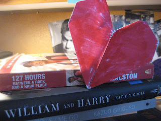
Lori Andriot- Paper Value Project


I crafted an origami heart in order to increase the value of a single piece of paper. This paper heart holds many values: sentimental, personal, and creative. Personally this heart hold sentimental value since I made them all the time for my parents when I was younger. However there can also be a creative/personal value; such as displaying the heart on books (I love books!). Hearts like this one can also be given during the Valentine season, which is just around the corner!