Showing posts with label Kaylin Beckwith. Show all posts

Monday, April 25, 2011

Kaylin Beckwith Milk Product


Kaylin Beckwith

Rao, Skinner

Final Project

26 April 2011

PT Milk

For our final project, we were asked to create an innovative and original product design for Moo Moo Milk Makers adult milk beverage. In order to do this, I first considered the adult age group. What type of milk are they used to? What associations do they make with milk products? Furthermore, what type of design best reaches this audience? After several prototypes, the answers to these simple questions led me to me final design.

The adult age group was to consist of individuals forty-five years of age and older. This means that they were born in the nineteen sixties or even earlier. Not being of that era myself, I tried to think of what American pastimes were present. Maybe I have simply watched too many episodes of Leave it to Beaver, but it seems to me that the 40s, 50s, and 60s emphasized friendliness and quality much more than today. It was not about doing something the easiest or most convenient way, it was about doing it right. I then remembered that milk used to be delivered door to door by a neighborhood milkman. Subsequently, I thought of all the jokes that older people tell about milkman and housewife rendezvous; and of course, the offspring that resulted of these rendezvous. Fathers used to joke that they did not know if the kids were theirs, or the milkman’s.

That is why my product is named PT Milk, for Paternity Test. This is meant to be a joke that only people of an older generation will understand. I realized that I had achieved my goal when I explained to friends my design and they had never heard of such a thing. One girl even called it “outlandish.” However, when I called my parents, they laughed for a good ten minutes. Also, that is not all that my product stands for. It has a joke that is a funny touch, and the slogan even goes with it, but the slogan also speaks for the quality that the older generation remembers and seeks in products today.

Quality is spoken for in the slogan (“The quality milk you remember, without the milkman!”), but it is furthermore supported in the labels underneath the Nutrition Facts. These series of labels not only mean that the milk is certified organic, but also that the cows were not injected or fed with any hormones. These are very important in not just advertizing quality, but actually providing it as well. The shape of this bottle was employed to represent the old fashioned shape of milk bottles while still being made of plastic in order to be easily recycled. Lastly, the brand name, Nutrition Facts, certifications, and company address are all given on a simplistic and organized label in order to be simple to read, easy to understand, and attractive to older consumers. People of this age are not interested in bells and whistles, they are interested in quality. And that is exactly what my product offers.

Art Show, Kaylin Beckwith

Kaylin Beckwith

Rao, Skinner

26 April 2011

Blog Post- Art Show

Art Show

I was enchanted by the Art Show. Originally, I thought that I would be able to just zip in and out of there on my way to work, but I could not stop looking at all of the pieces. I walked up and down the aisles, read the nameplates, analyzed each work, and then repeated the process several times. The showing of student works not only evoked pride in the professors of Butler, but also allowed students to display their works, and allowed underclassmen students to see what all they are capable of accomplishing in future years. That is what I especially enjoyed. I liked looking at all of the other classes and what projects they had completed, I cannot wait to learn some of the techniques they employed, learn from some of the professors that teach such things, and simply see what works I create. I liked many pieces, but I especially liked the series of photos of paint on students faces that each represented different things. I could not look away from these pieces. Each student was trying to get across a different emotion or message, and I must say that I thought they were successful. It was incredible to see how the paint, the facial expression, and the photography came together to form such works. And I loved the creativity of it as well. We put messages on our faces everyday, but it was genius to plan such things. I would pay $10 for a number of those photographs. I remember thinking that I wanted to take the one about protecting the environment home to hang in my room. Lastly, I did enjoy having my artwork displayed in the show. It was an honor to have my work displayed next to such talented artists.

Tuesday, April 12, 2011

Sculpture-Kaylin Beckwith


My group was assigned the word twist. When thinking of my project, I wanted to create something ordinary, but in a new and fascinating way. Cardboard was a great inspiration for this idea because it is typically used only for boxes; and, pardon my play on words, but I wanted to think outside of the box. I also wanted to have a sense of motion in my project; I do not believe twist can be stationary. As exemplified in class, twist is described with a hand motion and not with words. Furthermore, I kept in mind that it had to hold something. Finally, I decided what my object would be- an Oreo cookie. As you can see the top half of my cookie is abstract, and shown as a swirl. This is because, if you are a person who eats the frosting first like myself, you have to twist the top off in order to eat your Oreo. This is a universal action to those of us who enjoy the creamy center. Everyone knows you cannot just pull the cookie apart, you have to twist it. Also, my Oreo cookie outside holds the delicious creaminess on the inside, and thus my project meets all of the criteria in a fun, playful, and delicious way.

Thursday, March 31, 2011

Kaylin Beckwith's Mini Saga

The dog continually chews the lady’s shoes and ruins them. She can’t take it anymore and confronts the boyfriend about this. He considers his choices, and then self-assuredly chooses the dog. After all, the dog is his best friend, and best friends are irreplaceable, while girlfriends come and go.

Wednesday, March 23, 2011

Kaylin Beckwith's Silhouette Portrait


Kaylin Beckwith

PCA 261

Rao, Skinner

24 March 2011

Silhouette Project

Preparation for my silhouette project began before I even picked up scissors and cut from the first magazine. I woke up the morning before we were to be traced thinking about how I wanted the final project to appear. I decided to wear a large, flowing scarf so that it would leave a noticeable mark in my outline; likewise, I wore my hair natural and curly so that I could incorporate even more squiggly lines into my outline. These two components transform a sleek, mannequin style silhouette into a silhouette that better represents me. It is a little haphazard, just like my life seems to be most of the time. Furthermore, the only curved lines in the piece are found in the body. This is because the world is rough, full of sharp edges, and dangerous- as portrayed in my background. Moreover, I am rounded. I am organic, persevering, and ever-changing.

Beyond the outline of my silhouette, color is also a key player. The background is portrayed in dark colors. This is to metaphorically say that the world is a cold and deceiving place. Fortunately, that means that we each get to bring our own light, color, and style to whatever environment we choose. The light, color, and style you project are often related to your perspective, outlook, or attitude. I chose bright colors within myself not only because I like colors in my wardrobe, but also because I believe these lively colors reflect my personality. I chose the skin tones and hair pieces because I also see myself as a realist. Although I am constantly changing, as the different tones and hair suggest, I also remain always the same, as the overall color conveys.

Past these two basic components, the background and the body, I also added a brain. The brain is the most important of this whole piece because it could easily be filled with light or dark pieces. Everyone has a combination of negatives and positives, sorrows and laughs, triumphs and defeats in their lives, and it is up to the individual which of these two sides are on his/her mind. Admittedly, both streams of thought entertain my mind from time to time; however, positivity wins for the majority. Positivity and strength. The colors I have chosen are not only bright, but also lively and strong. The words are meant to show these streams of thought, and they leak from the brain to the mouth. This is to prove the point that anything on your mind can slip out at any time, without warning. That is why it is best to keep your mind uplifting. As shown in my silhouette, what leads to the mouth is soon leaked into the world. I believe what you say CAN change the mind of another person, and thus the life of another person, and thus the world. This image is empowering, you impact the background, the world. My silhouette conveys my dreams; I want to leave an impact.

Tuesday, March 8, 2011

Fashion/Color Reflection- Kaylin Beckwith


During our group discussion, I was intrigued by others’ sense of fashion. One person loved big bold patterns, while another enjoyed the simplistic idea of dresses, and still another enjoyed the utility value of a basic jacket. I found that I could relate to each person’s preferences; It seemed as though aspects of each person’s fashion sense could be found in my own fashion sense. For example, I do not have many items with bold patterns; however, I love to mix and match patterns in my personal style. I do not have many dresses, but on the off-occasion that I do employ a dress, I can feel the boost of positivity it gives my day. And Lastly, on most days, especially when I am just going to class or not feeling like putting much effort into my outfit, I sport a basic, comfortable jacket or hoodie as a means of utility rather than style. Each person’s personal fashion sense differed from my own; however, could easily be found intertwined with mine.

These sneakers seem to be a staple of my wardrobe in the spring, summer, and fall. They are quite simple, but utilize a fun, interesting pattern that I can contrast or compliment with whatever outfit I decide to wear; furthermore, they are comfortable, cute, and one of my favorite colors. The clothing I came up with for Mr. Laurent could be constructed all around these shoes. It would consist of striking, fun colors such as a rich yellow/gold or a pale and true robin’s egg blue, and these colors would be contrasted with the most prominent color of the line- charcoal gray. It would also hold small, intricate or simple, patterns that would often contrast each other, such as wearing a tiny floral print on a shirt with small stripes on shorts/pants. The clothing of this line would include sneakers or fun shoes such as these, in many colors or patterns; shirts, soft and loose, and often in color; sweaters, large and simple, often in dark colors; and jeans or skirts that add to the overall effect. I would also like to include several dresses that add to the collection. The name I came up with for the collection is “Sweet Comfort.” This was chosen because the fun, flirty patterns remind me of candy or ice cream in the summer- sweet. And although the outfits are fun, and diverse, they are also everyday comfortable wear-hence, comfort. I decided that women in their late teens and twenties would buy this line, perhaps even into their thirties for the more mature pieces of the collection.

As a successful Butler graduate, I would continue to wear the clothes found in my “Sweet Comfort” collection. I want to somehow work in an organization centered around children, so my work and play clothes will probably interact. In this sense, I think the line is perfect. Money will simply allow me to expand my choices into finer pieces than that which are currently available to me. On days where I am in the office or giving a presentation, I will have to leave my collection and wear more professional and rigid clothing such as pencil skirts and heels; nonetheless, I will still keep it comfortable and loose by adding an oversized sweater or something of the sort. On days where I am with the children, I may not want to wear my favorite pieces from the collection; however, instead I will wear jeans and a basic Tee or top, in order to be an active participant in whatever activities are going on. In this way, my collection will simply be dressed up or down according to my daily plan, making it a truly compatible and practical collection of clothing.

Monday, February 28, 2011

Public Art Project- Lauren, Ali, and Kaylin


Lauren Bacon, Ali Harre, Kaylin Beckwith

PCA 261

Skinner & Rao

Public Art Project

Haphazard Hallway

The first day brainstorming for our public art proposal, the three of us agreed on four main criteria: the project needs to be huge, related to Butler, interactive, and playful. We also loved the idea of making it tantalizing, similar to the piece we saw in the atrium of the IMA. Additionally, we wanted to create something that goes against basic rules of social norms, instilling a “stick in to The Man” mantra.

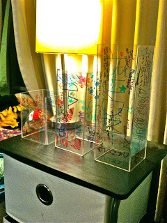
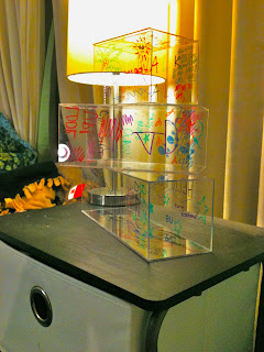
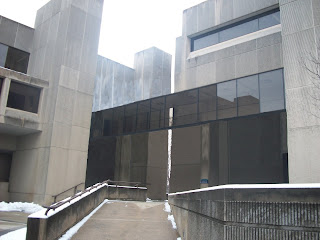
After creating and a list of a variety of ideas, we elected to make the idea of converting the catwalks that connect Jordan Hall, Gallahue Hall, and the pharmacy building from their current materials to glass. On each end of the catwalk there will be baskets that hold a wide variety of colored dry erase markers. Students, teachers, staff, and anyone else who walks through these catwalks has the opportunity to draw directly on the walls. This goes against what we are taught as children—no writing on the walls—adding an interactive aspect to the project. Moreover, these can be used for student art and also classroom interaction. Classes will have the choice to use the catwalks as white boards rather than being in a conventional classroom setting. This class interaction helps relate the project to Butler. Another way this project will be related to Butler is that any student organization can publicize their events on the glass walls. Also, the project is very playful—not only because anyone can partake in the artwork, but also because of its juxtaposed position on campus. It connects old, antique-looking buildings with a modern, not standard idea.

After creating our idea and developing the concept, we began brainstorming a name. Because the nature of the project is to be random and does not require any organization, we chose “Haphazard Hallway.” This suggests a crazy, random passageway, and also piques interest. Moreover, there will be no rules related to the project, so anyone can erase or write over someone else’s artwork.

Overall, we are very excited about Haphazard Hallway. We love the idea of going against social norms and interrupting a traditional aesthetic with a modern twist. Additionally, Haphazard Hallway incorporates our criteria of being playful, huge, related to Butler and interactive. Most importantly, we love the ability of involvement by any individual, bringing the opportunity to express oneself directly to the individual.

Thursday, February 24, 2011

Public Art Pitch Reflection

Kaylin Beckwith

PCA 261

February 24, 2011

I really enjoyed the yellow bubble wand, and this is the project that I would choose to fund given the chance. This public art piece is fun, airy, and bright. It also has a great sentimental value that I think all of the Butler students can understand. I enjoyed how the group not only explained the greater meaning, but turned it into a positive when it is usually commented on in a derogatory sense. True, the Butler Bubble separates us from the surrounding Indianapolis area; however, the bubble can also represent our tight-knit community and sense of permeability.

Although I really enjoyed the proposal, I believe that the Butler Planner and accompanying books would be the most expensive project to fund. The electronic screen needed for the planner would be expensive, along with precautions needed to keep it safe from vandalism and weather, a person needed to keep information up to date, and the continued electrical power needed for the project. All of these expenses listed are for the planner alone, and then there are also the additional costs of the books and benches construction. This will also be hefty due to the large nature of the main books, plus the addition of the smaller bench books and so forth. If this project were to be chosen, I would say get the fundraising started now!

Unfortunately, due to illnesses my team is enduring, my group has not yet given its presentation.

Thursday, January 27, 2011

Kaylin Beckwith- Paper Value Project

To increase the value of a single piece of paper, I decided to write a puzzle note and mail it. To begin this process, I cut the paper in half and created an envelope with one of the halves. Then, with the remaining paper I wrote a note, cut it into pieces, and then labeled each letter with a number so that the message can be reassembled again. In doing this, the note not only has sentimental value because of the message and the time put into the project, but it also has a slight value of entertainment and excitement. This idea in itself also has creative value. I hope that enough value was added to this single sheet of paper for the receiver to enjoy it!