Showing posts with label Radha Patel. Show all posts

Tuesday, April 26, 2011

Milk Product - Radha Patel


When we first received this project in class, I had no idea what I would be doing for this project. It was so different from the rest of the projects, but it made sense with what the class was meant for. When I first entered the class I thought it would be about designing different products in a way that would make them aesthetically pleasing. Instead it surprised me that we did two different silhouettes, a public art group project and a sculpture. This project was something similar to what I was expecting and also the hardest for me.

The first day I actually sat down to think about the project, I started off by trying to figure out a good brand name for it. At first I had no idea. I couldn’t think of anything original. I came up with “Milky Way,” but I didn’t like that very much because it was already the name of a candy bar. Then I decided to maybe change the name to “Milky J” where the “J” stands for jug, but I didn’t think that would come across very well. Finally, I decided to call it “Milk Mug” because when people usually think of buying milk, they think of buying a milk jug, but this would be milk in a container shaped like a real mug. I had to think hard about the material this mug would be made out of and came to a conclusion that it is best if we stick to plastic since I’m sure milk stays longer and the best in that.

This was an adult beverage; therefore I thought the mug-shaped concept would go well because many adults drink coffee in the morning, but instead, now they could drink milk. The mug would be fairly big, which is why I put a small opening on the top for them to either be able to pour it, or if they could, drink it from the container. As you can see, it says “drink or pour” above the opening. My next obstacle was what colors to make the container. At first I thought I should do normal colors like blue, black or white, but then I decided to do pink, brown, white and gray. I wanted to do brown, pink and white because those are the colors of the kinds of milk my brand name would sell. The milk could either be regular, strawberry flavored or chocolate flavored. The mug could go along with either kind of milk; only the top white strip would either be white, pink or brown depending on what kind of milk it is. On the drawing it is white.

I put a slogan, a unique logo, the nutrition facts and the manufacturer’s information, but it still looked very plain. That was when I decided to add the cow on the side of the mug. I made the color of the cow coordinating with the whole mug. I made the spots in the logo and the cow gray because I didn’t think black went well with brown. I think the cow gives it a little more artistic touch and makes it a little less boring even thought it is a drink for adults.

As a result, I had a very good time doing this project even thought a lot of thought went into it about details. I was short on some art supplies, but everything worked out pretty well in the end. I actually really like what I have to offer in this project because it may look like it is easy to design something, but it is not. It takes a lot of thinking and time. Now I just hope Melvin Meyers likes my design also.

Monday, April 25, 2011

Art Show - Radha Patel

When I first entered the Reily room with all the different artwork, I immediately knew I was going to enjoy the show. I looked at the artwork last semester also because I wanted to take an art class and I was amazed. Everything in the art show is extremely unique and shows the talent students have in art. This time I noticed more different techniques and different kinds of artwork. I loved the different chairs one of the classes made. It was very unique to each person and I never really noticed any 3-D art last semester. For example, one chair was made out of tennis equipment. I interpreted this as the person having a unique relationship with tennis. Also, one of the pieces really stuck out to me. I loved it. It was something I would want to put in my house. The piece was by Laura Kramer and it was a sort of tree branching out. It reminded me of a family so I thought it would be perfect to put in a house. The leaves were cut out of the cardboard toilet rolls and they were bent to look like leaves. Each leaf had different colors from magazines. All together it looked amazing. I would definitely pay more than 10 dollars for this piece of artwork. The different faces made out of clay were fun to look at also. Some of them really made me laugh. It’s amazing to see how much art has to offer. Right across from that was out class’s artwork and I didn’t realize how great our pieces looked until I saw all of them together. I loved the artwork we did in this class and I was especially pleased with my big silhouette. I spent so much time on it and it felt good seeing it displayed. I think it is great that Butler puts up this art show because it makes every student feel recognized for his/her hard work. I know I did. It feels good hearing compliments for something you spent hours working on. It shows the effort and dedication each student puts into his/her art. I am glad I took this class and that I attended the art show. It was fun exploring my creative side this semester.

Monday, April 11, 2011

Sculpture-Radha Patel


I made a pencil holder with an elephant on it. The elephant is what explains my word. My word is droop and an elephant's trunk also droops. I couldn't show this with cardboard, but an elephant's ears kind of droop too. Its' skin looks droopy also even if it is firm. Things droop all around us, but we usually never think of the word droop unless we are upset or in a sad mood. I know I am in a droopy mood right now because I am very sick; therefore if I see ice cream melting, I would think of the word droop since I am not in a happy mood. Also, ice cream does not sound too good right now. When I think of droop, I think of things sagging like skin (either an animals' or old persons') or something melting, but it could be something like I did with my sculpture also.

Thursday, March 31, 2011

Comic Strip Story-Radha Patel


In this comic strip, it starts off showing a traffic jam on the highway. People are breaking and screaming because they are frustrated. One of the men in frustrated because he has to get to work and the other is frustrated because his wife is about to have a baby. The man causing this traffic jam has a flat tire. In the end, the wife has a baby boy in the traffic jam and the other man gets fired from his job.

Wednesday, March 23, 2011

Silhouette Portrait-Radha Patel


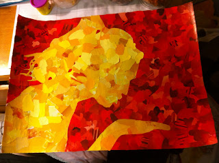
When I first thought about doing my self-portrait, I thought I would do my favorite colors: purple and red, but I didn’t know how these colors would signify me besides the fact that I love these colors. I started thinking about something that has been very important in my life. First I started off by thinking about college and then about who I am as a person. I realized my life is filled with love from my family to my friends and now my boyfriend. I decided to make the outside of the silhouette red hearts and the inside a golden color in different torn shapes. Every shape in this collage is amorphous and when I thought about the significance of this I realized love does not have any boundaries. When I think of geometric shapes, it reminds me of boundaries and they are clear and cut shapes, but amorphous shapes have more “free space” and are not clear and cut just like love. I wanted to make my shadow different; therefore I made my shadow as blowing a kiss to show an expression of love. I realized I possess a lot of objects with hearts including three necklaces, two bracelets, earrings, many shirts, heart pillows, a jewelry box and scarves. As I was doing the silhouette I thought about all the people I love and that love me. I realized love in my life grows more and more everyday, especially romantic love. I used a golden yellow on the inside because that is how love makes me feel. It makes me feel warm just like that color. It brightens my life and gives me a feeling of coziness. Also as I was doing the project I realized the hearts around my shadow stand for love and just like my shadow is surrounded by love, so am I. I am truly grateful for that everyday.

Wednesday, March 9, 2011

Radha Patel-Fashion/Color Reflection

(The Purple dress would be something part of my fashion line)

I learned that many people like to have a comfortable fashion sense. They will have those specials days where they will wear dresses or suits, such as prom night, but usually they like being comfortable. Some people just think about the comfort, while others think about being comfortable in a “cute or fashionable” way. That is what I think my fashion sense is. I do not usually wear sweats unless I am at home or in my room all day. I tend to wear jeans and a cute shirt with a jacket if it is chilly. This doesn’t mean I do not like dressing up because I also love dresses. I loved dressing up for prom, senior dinner and graduation last year. I like shopping for the dresses for these types of occasions. The people I talked to in class agreed with me. As per colors, the two girls I was talking with liked more blues and blacks, whereas I like color. I love the colors purple, red and turquoise in my clothing. I also like black because it sticks out in dresses.

Based upon my fashion sense, I came up with a clothing line called RP Fashions. I decided the three colors for this line would be purple, red and black. My favorite color is purple and I was told it is a great color on me and is a fashionable color also. Red is also a good color to wear on almost any skin color and black makes almost everyone look slimmer. This would be a line for girls who would either like to wear comfortable clothes, dresses or Indian clothing. I would put a little Indian touch to the clothing to make it different compared to other clothing lines. People interested in buying something a little different and colorful would buy clothing from my fashion line.

If I had to wear something to work, I would probably wear comfortable dress pants, probably gray or black and either a blouse or nice swearer, which is a color such as lavender or red. I like ruffles a lot; therefore I would wear ruffle blouses sometimes. If it were a normal day, I would probably wear jeans with a nice top or a tank top with a cardigan. If I were in a mood to wear something even more comfortable, I would probably wear yoga pants.

Wednesday, February 23, 2011

Public Art Pitch Reflection

If I were to pick one of the projects to be funded on campus, I would probably choose the scavenger hunt. Some people may think it wouldn’t be so much “fun” for current Butler students because it is more for kids and alums, but personally I enjoyed reading each hint and going to the next piece of art. I also thought everything incorporated represents Butler University as a whole pretty well. I thought the way it was set out all over campus was pretty neat. I would love going on this scavenger hunt on a nice sunny day just to get my mind off of schoolwork. It would also give prospective students and children something exciting to do on campus when they visit rather than just walking around and getting a tour. Butler definitely has a beautiful campus, but I remember most of my tours of different universities being the same and not very exciting. If Butler had this different edge to it, I know more students would prefer to attend this university to others.

Personally, I think the Jungle Jim would require the most funding. Not only because it is a huge project, but also because there would be many technical things involved in building it. Also, it would be harder to maintain than the rest of the projects due to its size and technology. It is definitely a very creative idea, but it would be hard and expensive to manage before and after it is built. Building this would also take much more material and workers, which would get expensive, but if it weren’t for the cost, this idea was also very good.

I think we did fairly well on the presentation, but I would change a few things. If I could revise anything about our project, I would have tried to have a table in the front of the room to put our model on so people could see it better. I think that would have helped, but we never really thought about it beforehand. I also would have practiced more as a whole group, but overall it went well and we touched on everything we wanted to. I definitely loved our idea and was excited about it, which is probably why we put more effort into it. It is easier to do more things for something you love or are passionate about. I thought the best part of our presentation was that we had a video. It set us apart from all the other presentations.

Monday, February 21, 2011

Public Art Project


Radha Patel, Carly Sobolewski, Caroline Hedrick

PCA Public Art Project

The Butler Planner

At first when we were told we have to come up with an idea or plan about public art we can put on out beautiful Butler campus, we had no idea what to do. Caroline started it off by giving an idea of putting a big diploma or graduation hat on campus in which people could study or just “hang out.” Later, we came up with an idea of building a gigantic basketball with a graduation hat on it signifying how important basketball is to Butler as well as academics. The big basketball would have a couple basketball courts inside of it and it would have a wall of fame showing the history of Butler’s men and women’s basketball team. Another idea we came up with was making a big sculpture of a paintbrush that would be leaning against Lily Hall (the building). There would be a pallet on top if the paintbrush located above the roof and there would be tables on this pallet shaped as different colors of paint. On a nice sunny day students would be able to study up there and see Butler’s campus. In the end we decided none of these ideas were extremely appealing because we wanted to come up with something all Butler students would find somewhat useful and is also artistic.

We set out four different criteria for out public art project. The criteria are site specificity, how interactive it is, whether it holds significance to Butler, and how functional it is. As we were going through out list of projects and seeing how the criteria worked with them, we started talking about how we never know what is going on throughout the week and weekend because we either skip over the emails we receive or we do not know because we didn’t notice the banners around campus. We decided there should be some way students can see what is happening on campus; therefore we decided to make the “Butler Planner.” It would be located on the open space between Atherton Union and Jordan Hall, right in front of Starbucks. We chose this area because many people pass this location throughout their day and it is not far from the main buildings on campus. Students could just stop by the “Butler Planner” for a moment and see what is happening on campus.

The “Butler Planner” would have each day of the week on it and under each day it would list the activities going on throughout the campus or even at Broad Ripple. The board would light up once it gets dark. The screen would be black with white lettering and at night the outline of the planner would light up neon blue so it is easy to spot and visible. The Planner would be made out of fiberglass and the books would be made up of stone and painted with shiny paint to somewhat correspond to the fiberglass. The “Butler Planner” would look exactly like out real planner and would have the same design on the front of the cover. The books in the back of the Planner where we can sit and study would be different colors, which include green, purple, red and yellow. The green book has a saying that says “The Butler Way” and a map on it because it is leaning against the tier of books. This map would be useful for anyone who doesn’t know where everything is located on the campus. The other three books have words the Butler students either represent of strive to achieve: courage, respect and values. They are strong words and they would remind Butler student of what Butler University believes in. Also, throughout the lawn we have books that are propped open so students can sit and eat or read. These books would be different colors depending on what color fits best with its surroundings. We decided to add more to the books we could add bookmarks to the books where students can still sit and enjoy the sun and nice weather.

As a group, we loved this idea, which is why we were so passionate about it. We, as Butler students, would love something like this on campus. By working on this project, we accomplished our goal of making a public art display and making is useful to the Butler community. It fits all of our criteria pretty accurately and best of all, we loved this project and coming up with the idea. We actually had fun with this.

Thursday, January 27, 2011

Radha Patel-Paper Value Project


I made a scrapbook page paper out of my piece of paper to add value to it. I have been scrapbooking for about 3 years now and it has become a big part of my life. It gives us a way to show our memories through a small book. I have made one for myself, my sister and I am working on one for my parents. Last year I made four of them for my friends from high school to capture our memories so they can keep them forever. Scrapbook pages cost from 40 cents to a dollar normally. That is much more than a regular sheet of paper and I'm sure I can use this somewhere in one of the scrapbooks I make in the future. By making this scrapbook page, I added utility, personal and decorative value to this piece of paper.