Showing posts with label Milk Product. Show all posts

Tuesday, April 26, 2011

Branding Project - Ashley


Mine.

Mine brand milk is designed and marketed for the 45-65 year old empty nesters. The tag line is “This one's just for you.” and the concept is tailored toward a sophisticated, witty target audience.

There is currently a large demographic of Baby-Boomers who are gradually becoming empty nesters. After years of shopping for a family, it is finally time to stock their kitchens with the food they really want to eat. This is an adult milk, with no trace of the kid-friendly cartoons found on other designs on the shelves.

The shape of the bottle is reminiscent of vintage mild bottles without recalling a complete retro style. The black frosting is unique and projects a sleek, simple design. It is also effective in helping keep UV rays away from the milk, which can cause premature spoilage. A clear decorative element remains so that consumers can still gauge when they need to buy another Mine bottle.

The name of the product and design of the front panel encourages customers to pick the bottle up amongst a sea of other cartons. It says it is the right choice.The back panel reads, “Mine. Go ahead, say it. Because, after all, you've bought milk for bottles, for coffee, for shakes, for cereal, for cocoa, for dinners, for diets, for cookies, for him, for her, for all of them. But not his time. This one's just for you.”

Mine milk is simple, unique, witty, and sophisticated – just like the people it is trying to attract.


Brand/Package/Label Project - Lauren Bacon


As I'm sure Dr. Skinner already knows, this type of project is a dream project for me. If I could have, I would have dedicated all of my energy into developing a new brand, the strategic plan, and implementation. However, to keep my sanity and to be able to balance my other courses, I limited myself. So, the first step I took was to narrow my target market and do some research. I first focused on Baby Boomers. This generation was born between 1946 and 1964. This year, the youngest will turn 47. Less of this generation is considering completely not working upon retirement, leaving 89% to still continue to hold a job. Additionally, this generation is becoming more tech-savvy with 82% using the Internet. Moreover, they held most of the nation's discretionary income in 2009 with almost 3 trillion dollars (Miller & Washington, 2011, pp. 205-206). After reading more about the generation, I chose to focus on upper-middle to upper class individuals who are cultured, stylish and young at heart.

My first idea was to separate males and females and do a "his & hers" type milk with color coding, although the same logo, but with different tag lines. After drawing up a few sketches of color schemes, I could not think of an appropriate name. So I thought back to my target market and chose to focus on the young at heart aspect. This brought me to the idea that this generation is aging, and some would prefer to slow the process, which reminded me of the Fountain of Youth, or FOY. However, this sounded too much like soy, so I tabled that idea as well and thought of words that seemed related to the Fountain of Youth. The word elixir is associated with potions or mixtures to provide or conserve youth. Then I decided to focus on the color white and went with Ivory Elixir. However, this reminded me of Ivory soap, so I decided to play with other languages. I settled on French because French culture has a fashion forward, chic, classy culture coupled with the old European style. Thus the name Elixir d'Ivoire was born. I chose a deep red and gold [it looks yellow in the drawings, but would actually be metallic gold] paired with black because it looks high class and catches the eye. I Googled French fonts and found the font I chose for the logo. I decorated the glass bottle with two French symbols = a fleur de lis and the Eiffel Tower. The tag line is "Who knew milk could be so chic?" playing into the idea that this milk is cool. This will be a more expensive brand, but since the target market has a large amount of discretionary income, they will not mind paying the premium. Moreover, they will appreciate the perception that the milk is "cultured" since it has dominant French aspects. Finally, this milk will be sold in larger cities, where people like to stay on trend and are more open-minded.

Works Cited
Miller, R.K., & Washington, K. (2011). CHAPTER 38: BABY BOOMER CONSUMERS. In, Consumer Behavior (pp. 205-207). Richard K. Miller & Associates. Retrieved from EBSCOhost.

Milk Product - Radha Patel


When we first received this project in class, I had no idea what I would be doing for this project. It was so different from the rest of the projects, but it made sense with what the class was meant for. When I first entered the class I thought it would be about designing different products in a way that would make them aesthetically pleasing. Instead it surprised me that we did two different silhouettes, a public art group project and a sculpture. This project was something similar to what I was expecting and also the hardest for me.

The first day I actually sat down to think about the project, I started off by trying to figure out a good brand name for it. At first I had no idea. I couldn’t think of anything original. I came up with “Milky Way,” but I didn’t like that very much because it was already the name of a candy bar. Then I decided to maybe change the name to “Milky J” where the “J” stands for jug, but I didn’t think that would come across very well. Finally, I decided to call it “Milk Mug” because when people usually think of buying milk, they think of buying a milk jug, but this would be milk in a container shaped like a real mug. I had to think hard about the material this mug would be made out of and came to a conclusion that it is best if we stick to plastic since I’m sure milk stays longer and the best in that.

This was an adult beverage; therefore I thought the mug-shaped concept would go well because many adults drink coffee in the morning, but instead, now they could drink milk. The mug would be fairly big, which is why I put a small opening on the top for them to either be able to pour it, or if they could, drink it from the container. As you can see, it says “drink or pour” above the opening. My next obstacle was what colors to make the container. At first I thought I should do normal colors like blue, black or white, but then I decided to do pink, brown, white and gray. I wanted to do brown, pink and white because those are the colors of the kinds of milk my brand name would sell. The milk could either be regular, strawberry flavored or chocolate flavored. The mug could go along with either kind of milk; only the top white strip would either be white, pink or brown depending on what kind of milk it is. On the drawing it is white.

I put a slogan, a unique logo, the nutrition facts and the manufacturer’s information, but it still looked very plain. That was when I decided to add the cow on the side of the mug. I made the color of the cow coordinating with the whole mug. I made the spots in the logo and the cow gray because I didn’t think black went well with brown. I think the cow gives it a little more artistic touch and makes it a little less boring even thought it is a drink for adults.

As a result, I had a very good time doing this project even thought a lot of thought went into it about details. I was short on some art supplies, but everything worked out pretty well in the end. I actually really like what I have to offer in this project because it may look like it is easy to design something, but it is not. It takes a lot of thinking and time. Now I just hope Melvin Meyers likes my design also.

Katie Zeiger- Milk Product


Vintage Squeeze Milk is utterly delightful! This original milk product appeals to the"old soul" in us all. With the goal of aiming at a target market with forty-five or more years of experience drinking milk, it was important to change the way this product appears to the consumer, while keeping the pure and classic taste and quality of the milk, itself. After all, the important part of the bottle is what is inside, but the question remains, what can be done to get forty-five year olds to drink "Vintage Squeeze"?

This Product is far from ordinary, completely organic, containing a mere 100 Calories and an unusually high vitamin content per 20 Oz serving compared to other similar beverages on the market. Over the years, Moo Moo Milk Makers has take great pride in using only the purest milk from the finest cows to manufacture its line. This precise and quality guaranteed method of doing things has been the company's long-term key to success. The CEO of the company, Melvin Meyers, serves to exemplify the goals of his company. He strives to promote good health, longevity, and success through testaments to his product. Melvin wants other adults to experience the results that he has, and needs a way to attract this adult market to a classic milk product. Since the milk that MMMM puts on shelves is far from ordinary, why shouldn't the outside of the bottle reflect the quality of the product?

The first aspect of the design that I considered was the shape and quality of the bottle. It took some time to determine what type of bottle would be ideal for a more sophisticated market. This is precisely why I chose to use a wine bottle. This represents the"Vintage" part of my brand name. Since wine is usually a vintage, I used the style of packaging to determine the name of the product. It is important that the two aspects go together, so the consumer can associate the brand name with the packaging. The Bottle also reminded me of the the classic glass milk bottle that a milk man would leave. I thought this would appeal to the consumer because it represents something classic. The glass bottle is great for storage and does not take up much room in a refrigerator. Another important aspect of the bottle was that it is able to be sealed. This is very important, in keeping the product fresh and free of any impurity.

To accompany the first part of the brand name (Vintage), I chose the word "Squeeze". This reminded me of "freshly squeezed" orange juice, or lemonade. This points out the fresh quality of the milk. The "Squeeze" can also be thought of in a more literal sense. Think about where the milk comes from on the cow, and the process used to get the milk. Especially in the past, when life was more simple, manual labor was used to milk cows. The process of squeezing the utters to attain the milk from the cow was used. I wanted the Title to represent a simpler time, describe the sophistication and experience that the consumer has, all while pointing to the quality of the product in a humorous matter that only adults would appreciate. This is also where the slogan "... It's utterly delightful" comes in to play. It uses the anatomy of a cow to play on words and also state the origin of the milk. This tells the consumer what will happen when they drink this milk; they will be delighted and happy to be healthy.

The label features a sepia and dark tan color scheme to accompany the vintage theme and appeal to a more sophisticated target market. It also features a photograph of a man milking a cow in different sizes for aesthetic appeal, and so that the consumer can associate an organic process with the product. I used something similar to vintage, 1970s style writing to bring the consumer back to their childhood years. It was important to pick a font with some "flare" and that was fairly easy to read. The goal was to make a simple and attractive label that would highlight the product it encases. The beauty of the milk will be enhanced by the simplicity of the packaging.

On the lid to the bottle, I included a logo to support my product. Similar to a vintage date on a wine bottle cork, I wanted to place the product logo in a place where it could be seen by anyone that opens it. It includes a V and an S, to use the initials of the brand name, Vintage Squeeze. The letters are connected to each other and have ovals in the background, just like the label wrapped around the bottle.

The Vintage Squeeze brand speaks to the target market in a variety of ways, it utilizes simplicity, sophistication, humor, and class in order to appeal to the consumer. The outside of the bottle is successful in describing the quality of product inside.

Vintage Squeeze... It's utterly delightful!


Milk Product- Alison Harre


Alison Harre

Rao, Skinner

Aesthetics and Design

26 April 2011

Pure Nutrition

The proposal for the final project was to market and design a brand of milk for the company Moo-Moo Milk Makers. This milk isn’t any ordinary milk. It is milk that is organic, contains more calcium, vitamin D, and zinc, and is only 100 calories. Given this information each candidate had to come up with a product that fit those requirements. The objective was to create this healthy product for men and women who are older than the age of 45. After brainstorming about many ideas, the product soon began to fall into place.

After doing market research on the given age rage, I generalized this target market as the baby boomers. This is a group of people that were primarily born post World War II. Given this information about this group of people, a marketer can assume character traits about the baby boomers. Typically baby boomers like tradition and tend to dwell on the simplicity of the olden days. They tend to stay away from new, confusing, and advanced technology, but rather like classic, quality, and simple products. In addition, most baby boomers are at or approaching retirement. This is relevant because it means that this target market has more discretionary income and is willing to spend that money on premium products such as Pure Nutrition.

Pure Nutrition is a product and service company. Pure Nutrition sells its milk in stores and also delivers to households. When brainstorming ideas for this product relating to the target market, the first thing that came to mind was milk delivery. In St. Louis, which is where I am from, Oberwies has a very popular milk delivery business. This reason is the main reason why I wanted to create a competitor for Oberweis. In a way, milk delivery takes many people back to the basics of the 50’s and 60’s. Milk delivery is a premium and quality service that this target market’s age range is accustomed to.

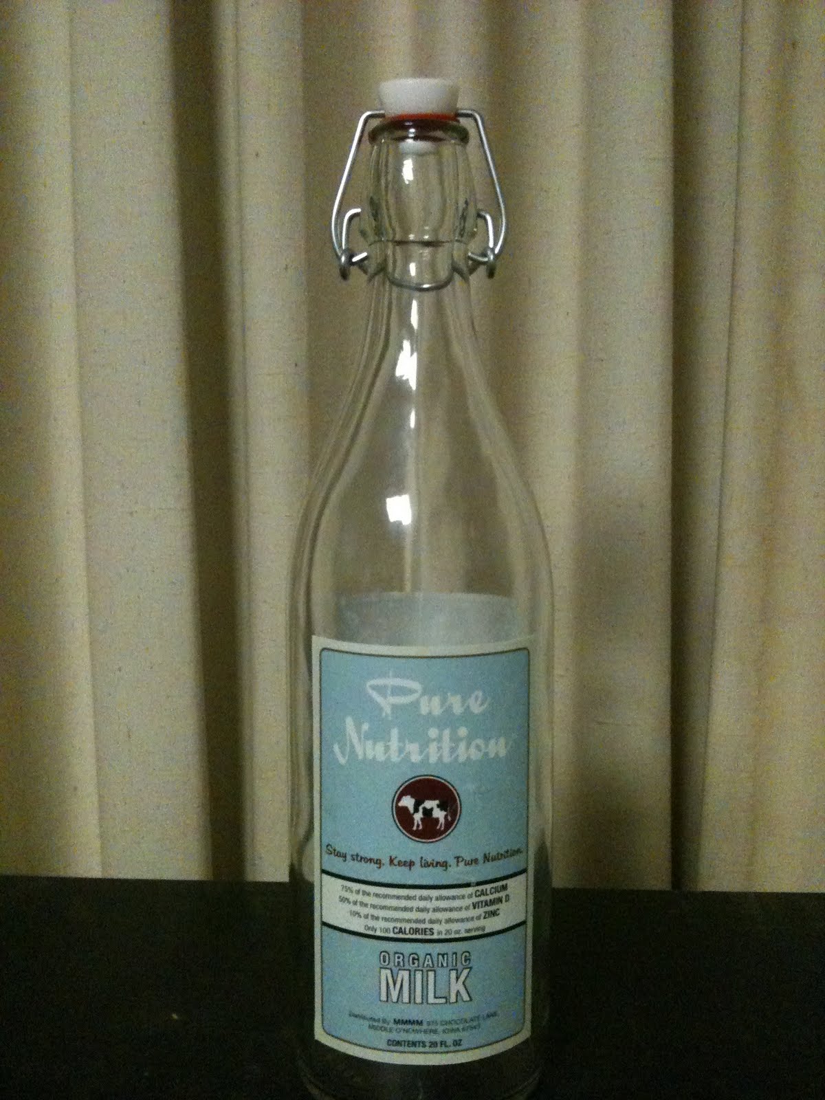
Pure Nutrition will only be served in a glass bottle. This is because glass is the only material that milk tastes the best in. In addition, glass is considered valuable, high-priced, and a premium especially when compared to plastic. Glass is also classic and appropriate for the target market. The most important factor when choosing glass is the fact that it’s durable, recyclable, and economically friendly. The packaging will consist of a 20-ounce bottle and a gallon bottle. The arrangements for sales will be purchasing a 20-ounce bottle from the store, purchasing a gallon from the store or delivery, and a 4-pack of 20-ounce bottles (equivalent to half gallon) that can be delivered or purchased.

When creating the label I wanted something that was simple and seamless, especially excluding any crazy fonts. I researched a lot of 50’s ad campaigns to see if there was a reoccurring theme in any of the campaigns. One that I noticed was the use of classic colors such as red, yellow, blue, black, and white, which I incorporated into my label. I had a lot of difficulty when trying to choose a benefit that I felt was the most important. I thought that all of the benefits of this milk was important, which is why I incorporated them all.

I really enjoyed doing this project. Since I am interested in becoming a marketing major I really wanted to put a lot of effort into this project. I have never had the opportunity to come up with a product and market it on my own, since I have typically worked in groups for this type of project. I wanted to take full advantage of my creativity to see where it could potentially take me. I think that Pure Nutrition offers this target market a healthy and premium product that they are surely to purchase and become loyal customers of.

Stay strong. Keep living. Pure Nutrition.

Monday, April 25, 2011

Kaylin Beckwith Milk Product


Kaylin Beckwith

Rao, Skinner

Final Project

26 April 2011

PT Milk

For our final project, we were asked to create an innovative and original product design for Moo Moo Milk Makers adult milk beverage. In order to do this, I first considered the adult age group. What type of milk are they used to? What associations do they make with milk products? Furthermore, what type of design best reaches this audience? After several prototypes, the answers to these simple questions led me to me final design.

The adult age group was to consist of individuals forty-five years of age and older. This means that they were born in the nineteen sixties or even earlier. Not being of that era myself, I tried to think of what American pastimes were present. Maybe I have simply watched too many episodes of Leave it to Beaver, but it seems to me that the 40s, 50s, and 60s emphasized friendliness and quality much more than today. It was not about doing something the easiest or most convenient way, it was about doing it right. I then remembered that milk used to be delivered door to door by a neighborhood milkman. Subsequently, I thought of all the jokes that older people tell about milkman and housewife rendezvous; and of course, the offspring that resulted of these rendezvous. Fathers used to joke that they did not know if the kids were theirs, or the milkman’s.

That is why my product is named PT Milk, for Paternity Test. This is meant to be a joke that only people of an older generation will understand. I realized that I had achieved my goal when I explained to friends my design and they had never heard of such a thing. One girl even called it “outlandish.” However, when I called my parents, they laughed for a good ten minutes. Also, that is not all that my product stands for. It has a joke that is a funny touch, and the slogan even goes with it, but the slogan also speaks for the quality that the older generation remembers and seeks in products today.

Quality is spoken for in the slogan (“The quality milk you remember, without the milkman!”), but it is furthermore supported in the labels underneath the Nutrition Facts. These series of labels not only mean that the milk is certified organic, but also that the cows were not injected or fed with any hormones. These are very important in not just advertizing quality, but actually providing it as well. The shape of this bottle was employed to represent the old fashioned shape of milk bottles while still being made of plastic in order to be easily recycled. Lastly, the brand name, Nutrition Facts, certifications, and company address are all given on a simplistic and organized label in order to be simple to read, easy to understand, and attractive to older consumers. People of this age are not interested in bells and whistles, they are interested in quality. And that is exactly what my product offers.

Milk Product- Ryan Rosebrough

When this project was first assigned, it seemed very daunting; however, as time passed the milk project seemed more and more manageable. After the first couple of days, ideas started to come to me and I began to pick up inspiration from products and items around me. Once I began to draw my ideas and sketched on paper, things became fluid and I rarely hit a hitch in my designing.


As I began designing, I paid close attention to the target audience. The thing that kept coming to my mind was when I thought of the target age group was the famous cartoon Tom & Jerry. In these cartoons, the classic “milkman” made common appearances in the episodes. The milkman would come and deliver glass bottles of milk to the house in which Tom and Jerry lived. During the time of this cartoon, members of the target audience were children most likely watching this cartoon. Milk was still classically delivered to each house and the idea of milk delivery was reinforced through this cartoon as well. From this I thought it would be a good idea to bring a nostalgic approach to my design by using glass bottles.


The next idea that I had was to incorporate the milkman’s attire into the milk bottle in some way. Through scribbling ideas out on paper I decided that I would give each individual milk bottle a fabric bowtie around the “neck” of the bottle. Along with this, the milkman hat is also a keystone feature of the milkman. For this I decided to emboss the hat on the front of the bottle and as I like the idea of incorporating a sense of touch to my product. When the consumer feels the embossed logo on the glass bottle, they will connect this feeling to my product. I decided to use this as my company logo.


To add a twist on the traditional round glass shape, I decided to make the bottles have edges. My inspiration for this came from the Naked Juice bottles that I see in C-Club. The idea of changing the traditional shape of packages is appealing to me as I feel it make products stand out among the crowd. I also decided to give my bottles a foil cap similar to those on Danimals Drinkable Yogurt which is precisely where my inspiration for this idea came from. The foil caps would be color “coded” similar to how cartons of milk are already (red= whole, green= skim, etc.).


My next challenge was to design some type of packed for my glass bottles. I was stumped… completely stumped. I had no clue what I was going to do until my room walked in with a new pair of shoes. I know this may seem odd, but the lid of the shoebox was perfect for packaging by milk bottles in a unique fashion (it is extremely hard to explain but hopefully I can make some type of visual aid for this). This package would be white and black with cow spot designs on it and the brand name across the front. The nutrition information would be contained on the back and the address would be contained on the side. Each package would contain four bottles of milk.


Lastly, the four main features that are important to this milk must be displayed in one way or another. These features are as follows: organic, vitamin D, calcium, and zinc. Since there are four health features and 4 bottles per package, it made sense to have each bottle contain a unique feature somewhere on the bottle. For this, I decided to print these health attributes on the back of the bottles (which one can see in my sketches).


After adding all of these ideas up and putting them together, I had created my very own unique milk product which I spent a massive amount of time on. I would like to introduce everyone to my new product— The Milkman’s Best.

Mike Tsamasiros - Milk Project


For this project, it was not easy to think about what exactly would catch an adult's eye when they were looking to buy milk. But when you really think about it, the main thing older people are worried about is their health. So I needed to think of a brand name that would make it look like a healthy product. Also, normally people think that healthy products do not taste very good. And that is pretty much because they actually don't. So I also figured that my product name would show that it isn't just healthy, but it is also delicious. So my brand name is Cow-Ci-Yum.

The "Cow" stating that it is obviously milk, the "Yum" stating that it is a fine tasting product. Together, it sounds like "calcium" which everyone knows helps build strong bones. For my slogan, I chose to pick something simple that would get straight to the point. So for my slogan I used " A Cow's Mix of Health and Deliciousness." I made this up simply because it tells you exactly what the product is about, and it is not to boring but not to silly.

I chose to stick with the simple color of blue. I do not know exactly why, but when I think of milk, I think of the color blue. Blue seems like a strong and healthy color, and that is exactly what milk is, strong and healthy, so I figured it made perfect sense. This project required a lot of creative thinking and it really put my mind to the test. I think that the brand name and slogan I came up with are perfect for adults because it pretty much gets straight to the facts. Adults have their main focus on health, and that is exactly what my product was about.

Milk Project- Veronika Lewis


When given the assignment for the milk product the first thing I thought of was our target audience. When I think about adults and people of an older generation I think of sophistication, as well as the desire to go back to being young and spry. I think of the desire to keep up with their health and get a many vitamins and minerals as necessary into their bodies. As people grow older, it;'s frustrating to start to see themselves not being able to do stuff they were able to do as a kid because their bones are weaker and they move ten times slower still working up a sweat, That's why I decided to name my product, "4theBones" representing how the milk will keep bones healthy enough for adults to have strength to do things they did when they were young that they still dream and strive to do. It is spelled with a "4" rather than a "For" because 4 represents the four essential nutrients in milk that help the body greatly. They are Potassium, Calcium, Vitamin D, and Vitamin A. My slogan, "Keeps ya MOOvin' and Groovin' All Day Long", also represents that youthful feeling along along with my logo. I added the "MOO" just as a cute little corny slogan representing the sound of a cow that makes this amazing milk. Movin' and Groovin' sounds like a phrase of the 70s which brings adults back to their younger times. I drew a cow on a scooter for my logo because it keeps moving and riding with much energy and strength. Riding a scooter is probably something a lot of adults did as a kid and reminisce about, wishing they were still strong enough to do it. I wanted to stick with my "back in the day" feeling when I picked out my bottle. I picked a glass bottle because it had an old "milkman" feel to it. It's like when the milkman used to deliver milk around the neighborhoods. Although my bottle is a lot smaller, it is a representation of that time and type of milk bottle. The only modern feel I tried to contrast the old feel with was with the font, red and blue colors, and bolded print. I want adults to feel just as good, healthy, and strong as they did when they were young by drinking this delicious milk.


Milk Product- Mark Hirschenberger


Mark Hirschenberger

PCA 261

April 26, 2011

Milk Project

Milk is not really a necessity to people, but it is very nutritious and helpful to the health of the human body. I never would have guessed that something like milk could have a target market. The Request for Proposal asked to essentially bring a whole marketing plan to a milk product. I was to try to sell a milk product to a target market over the age of 45. People over the age of 45 tend to be conscious of their health when it comes to purchasing and consuming food and drink products. My plan was to let the target market know that this product was intended for the health of people of an older age without offending them in anyway. I thought of the name “Dairy-Licious” for the milk product because it gives off a “cute” vibe to the person buying the product. Other health conscious foods that one would find in the super market have brand names which are not as playful and same too serious. I want the target market to know that they are drinking milk, not a supplement or medical drink. I used the bright blue and yellow on the label so it can stand out from other organic milk products yet appeal to the older target market. On the backside of the bottle I displayed the nutrition facts and ingredients that go into the milk itself. The side of the bottle contains a description of the Milk from the makers of Dairy-Licious. This message from Dairy-Licious is important because it adds the feeling of some sort of relationship with the producers and consumers. This is something that you won’t see on ordinary milk labels. I chose a glass bottle to be the container for the milk. Glass bottles are more expensive and I want the consumers to realize that the milk is of high enough quality of to be in a high quality bottle.

Sunday, April 24, 2011

Milk Project- Carly Sobolewski


The brand that I would present to the Moo Moo Milk Makers would be called, "Fresh Acres Dairy Farm." The product is targeted specifically towards adults over the age of forty-five. Because of the target market I wanted to give it a nostalgic feeling. I did this by using a classic container made of glass that includes features such as a sturdy handle and an imprint on the ridge to mess-free pouring. The style of the glass is supposed to evoke memories from the past of the fresh, cold, milk delivered daily by the friendly neighborhood milkman. Even though the bottle is vintage the font and design are more modern but not too "out-there." The glass is clear so the customer will be able to see the actual product in the container. I think that is important that consumers are aware of it's condition based on sight. Also the bottles are environmentally friendly and can be recycled or refilled. The brand name is "Fresh Acres Dairy Farm," to emphasize that it is organic and produced by a farmer that treats his/her cows humanely and does not use any harmful chemicals or antibiotics. The name gives it the feeling of being natural and full of nutrients. I decided to include "Dairy Farm" to let the consumer know that the producers specialize in dairy and put all of their effort into making one high-quality product. The fact that it is 100% organic is displayed on the majority of the container. Emblems display the organic logo and on the bottom the customer can find out exactly where the milk was produced. Instead of having random black spots the cow on the bottom has one colored spot that resembles the country in which it was made. Also the manufacturing information is on the bottom. Another way that the design assures the customer that the milk is farm fresh are the earthly sprouts that surround the nutrition label/ingredients. On one of the four faces of the bottle is the type of milk displayed in a giant font and of a specific color. The model presented above is skim milk and the color theme is light blue. Other types are 1% milk which would have the word "one" enlarged on the side in a corral color and 2% milk which is like the others but orange. This way customers can associate the colors with the type of milk they usually buy ("honey, just get the blue one"). The enlarged font was chosen so that people over the age of 45 won't have a problem spotting it and reading the text. Along the bottom is the slogan which says, "Udderly Nutritious, Delicious, and Fresh,"(Get it?...Udderly). On the bottom is also states that Fresh Acres Dairy Farm milk is the most recommended product by doctors who specialize in preventing and treating osteoporosis and bone health. Nutritionally the milk is exceptional. It provides the daily recommendation of zinc, calcium, and Vitamin D along with additional nutrients such as proteins and carbs. Did I mention that one serving is only 100 calories!? It's true! You can get all the health benefits without worrying about other health problems such as unwanted weight gain. By drinking Fresh Acres it will keep you healthier which can contribute to being more energized, looking younger, and feeling satisfied. The product can appeal to any age group but I think it targeted more toward adults. Who says that people over 45 have to buy dull looking milk products. They can appreciate the design as much as anyone else. The product also comes with clever phrases that act as incentives to get the buyer to pour a glass of milk. As the amount of milk is lowered little cartoons of cows are revealed. At each level is an encouraging or clever phrase (ex: "Own that Milk Mustache!" "You have bones of Steel!" "mmm, Almost Done!" and "Looks like it's time to get MOO-re Milk." Kids and adults alike will be amused and each month the phrases will change. Sometimes they will be witty statements, sometimes quotes, sometimes facts about the product, and many other creative motives. Finally as you can see on the front panel of the milk that displays the brand name there is a logo. The logo is a cow head but I thought it would be cool to only put the black parts of the cow on the bottle so that when it is full of milk the lines would be implied. Without any actual lines and the complete image still appears. When empty it will just look like black spots. Thanks for considering my product pitch!